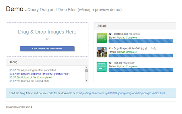
jQuery File Uploader is a jQuery plugin to drag and drop files, including ajax upload and progress bar. The idea for this plugin is to keep it very simple; unlike other options/plugins that mess up a lot with the markup and provide some really ‘hacky’ ways to make it available for prehistoric browsers.
The focus will be for modern browsers, but also providing a method to know when is the plugin is not supported; with an easy interface to use on any design you come up. Dual licensed under the MIT and GPL licenses.

Requirements: jQuery frameworks
Demo: http://danielm.herokuapp.com/demos/dnd/image-preview.php
License: MIT, GPL License
PSD2HTML.com is a technology-savvy company that is committed to high quality conversions of graphic web design into HTML and CMS like WordPress, Joomla and Drupal to provide a better user experience for websites.
Once you see how much they can help in terms of overall design, responsiveness, and growth, you won’t want to leave their sides. They have a research lab that is on the cutting edge of technology and are determined to keep it that way to give you, the customer, more of what you are looking at now and in the future.

PSD2HTML.com is making it possible to learn more about their services firsthand by providing prizes to a few lucky people. There will be a total of three prizes given – $200, $300, and $400 worth of services given to the winners.
This giveaway contest makes it possible for three lucky winners to learn more about what PSD2HTML.com has to offer the masses. As much as $400 can be given away so that the money can be used on improving site design.
Ready to learn how to win some of the services to improve the look of your website? It’s as simple as leaving a comment under the posts. Let us know what service is of interest to you from PSD2HTML and how you think it can change the way you operate your business. A winner will be chosen from those who make a comment under the post. Hurry, because the deadline is 26th April and the winners will be chosen shortly after.
Winners (Updated: 26th April 2014)
1. gwippich ($400)
2. David DuVal ($300)
3. SergeyDruid ($200)
Flickerplate is a cool jQuery plugin that lets you flick through content. This plugin is by definition a jQuery plugin and so is required. It also requires Modernizr for touch detection and the jQuery.Finger library for touch events. Both jQuery and a custom build of Modernizr are supplied.
Flickerplate is configurable through a variety of ways. You can either setup the options through the Javascript call or you can set the options via data attributes on the actual element. Some options can even be set globally and on each list item.

Requirements: jQuery frameworks
Demo: http://getwebplate.com/plugins/flickerplate
License: Apache License
Dat is an open source tool that enables the sharing of large datasets, the goal being a collaboration flow similar to what git offers for source code. The dat project is officially a project of the US Open Data Institute, a not-for-profit organization based in the United States, but they work towards sharing data across the galaxy.
However, it isn’t quite ready for prime time yet, but if you want to play around with the pre-alpha version of dat please check out the dat repository on GitHub.

Requirements: –
Demo: http://dat-data.com/
License: BSD License
Jeet is the most advanced, yet intuitive, grid system on the market today. You can think of it like the spiritual successor to Semantic.gs.
By making use of the power of pre-processors, we can now pass real fractions (or float numbers) as context that generates a percentage based width and gutter for grids. We’re able to do this while maintaining a consistently sized infinitely nestable gutter.
Jeet allows you to express your page grid the same way a human would describe it. No more needlessly nesting elements. No more rigid twelve column rules. Enjoy building faster with less code, and more flexibility with Jeet.

Requirements: –
Demo: http://jeet.gs/
License: License Free
Gridlover gives you adjustable css for font sizes, line heights and margins. The default css output is for body, p and h1 – h4 headings, but you can of course apply your adjusted values to any element by editing the css.
Simply drag the numbers in the top toolbar left and right to adjust their value. Elements in Gridlover are always kept aligned to a pixel perfect baseline grid. The font scale in Gridlover is calculated by stepping up the font size by the scale factor for each heading level. Line heights are fitted to the font size.

Requirements: –
Demo: http://www.gridlover.net/
License: License Free
Picturefill is a Responsive Images approach that you can use today that mimics the proposed picture element using spans, for safety sake. Picturefill natively supports HD(Retina) image replacement. While numerous other solutions exist, picturefill has the added benefit of performance for the user in only being served one image.
Picturefill works best in browsers that support CSS3 media queries. Internet Explorer 8 and older have no support for CSS3 Media Queries, so in the examples above, IE will receive the first data-src image reference. Picturefill supports a broad range of browsers and devices, provided that you stick with the markup conventions provided.

Requirements: JavaScript frameworks
Demo: http://scottjehl.github.io/picturefill/
License: MIT, GPL2 License
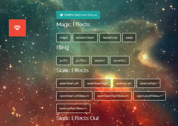
Magic CSS3 Animations is a package of CSS3 animations with special effects that you can freely use for your web projects. Simple include the CSS style: magic.css or include the mynified version: magic.min.css. The project is now hosted on GitHub. There are special effects like bling, perspective, rotate, slide, tin, bomb and etc.

Requirements: CSS
Demo: http://www.minimamente.com/example/magic_animations/
License: License Free
Designmodo is has shared with us an article: Playing with CSS3 Animations, which is a personal experience he had while trying to build advanced visual animations with CSS keyframes. We will create a simple fluid menu based on four squares. Clicking on one of them will display an overlay showing related content, closing the overlay will reverse the process showing the default menu. All delays will be managed directly with CSS — no javascript timeout().
All demos have been tested on Chrome, Safari, Firefox, Opera, IE11 and IE10 (also on iOS). They are not intended for production; they are simply provided as tangible case studies. Additionally, you may have to implement some fallbacks for users (especially those using old IE browsers), something beyond the scope of this article.

Requirements: CSS3
Demo: http://designmodo.com/demo/css3animations/
License: License Free
Bourbon provides Sass mixins and eliminates vendor prefixes, for faster CSS coding. Neat provides a lightweight grid framework. Bitters provides basic variables and structure to a Bourbon/Neat project. Refills are prepackaged patterns and components, built on top of Bourbon, Bitters, and Neat.
Simply click the “Show Code” link under the component/pattern you want to copy to your project and use the “copy” buttons to get the code to your clipboard. If a component uses Javascript, that code will be included at the bottom of the HTML file. Each component/pattern has a set of variables at the very top of its Scss file. These pull out the most important properties of the component/pattern to enable quick changes of color, size and general appearance.

Requirements: Bourbon, Neat, Butters frameworks
Demo: http://refills.bourbon.io/
License: MIT License


