If you are just getting started as a web designer, or you’ve not yet acquired a great deal of experience, you may be hesitant in selecting website or portfolio-building tools; not knowing how steep the learning curve might be, and not knowing if the tool will do the job. Ease of use is important. Fortunately, ease of use is characteristic of most top-tier website and portfolio-building tools.
Top-of-the-line tools are not only typically easy to use; they can make building an awesome website or portfolio a piece of cake. The tools featured here, are powerful in the capabilities they bring with them, and extremely to use.
Almost all feature drag and drop functionality, each one is innovative in its own way, and they aren’t loaded down with features you have no need for. Elegance is sometimes described as the perfect combination of power and simplicity. If that is true, these best tools could easily be called “elegantâ€.
Check them out. Pick one you need. You’ll get great performance, and you will experience a definite uptick in productivity along with an early return on your investment.
Cornerstone

Cornerstone gives you a wonderful opportunity to put the fun back in website design. This innovative editor/page builder was first introduced as a core feature of one of Themeco’s premier WordPress themes. Cornerstone caught on immediately, and Themeco will soon release it as a standalone web building tool that could be used with any WordPress theme.
Typically, page building and editing follows a process of create, save, and review. This front end page builder removes the middle step from the process. Its two interactive displays allow you to see your changes as you make them. This shows you immediately how any change you make will affect your layout at that point in time. This eliminates any need of going back to undo a number of steps before trying again.
There is much more to Cornerstone than what is presented here. Visit the website to see for yourself what this exceptional tool has to offer, including its extensive element library that is constantly being updated. Check it out today!
SnapPages

SnapPages is simple and powerful website builder that anyone can use. It’s a superb choice for building portfolio websites, which need to be especially well structured. This tool is ideal for a web designer looking for an easy way to build websites. It’s a super choice for beginning designs as well.
Power and simplicity is a great combination, andSnapPages will not load you down with a host of features (bells and whistles) you have little or no use for. If you do some or all of your design work on a laptop or tablet, the drag and drop editor is optimized fortouchscreens, and cloud hosting translates into quick loading.
This is a great tool for bloggers, and for anyone wanting to create portfolio or eCommerce websites. With SnapPages, you can integrate PayPal, Square, or shopify into your website, or connect with social media sites.
XPRS

XPRS by IM Creator is growing, and growing fast. This is not your typical website-building tool. Select from one or more of its 500+ pre-built themes, cut them into strips, and start creating your awesome website. There aren’t many ways to build a website that are quicker and easier. More than one user has likened using XPRS to using Lego blocks; build what you want, and have fun doing it!
One of the primary reasons for this website-building tool’s increasing popularity lies in its purchasing plans. These plans range from free – for artists, students, and nonprofit organizations, to the white label plan – a plan designers who serve multiple clients have fallen in love with. This plan offers unlimited licensing, which makes its$250 price tag seem ridiculously small.
Whether you choose free or white label plan, or the commercial license plan at $7.95/month, you’ll like what you get.
AllYou.net

Building a portfolio-type website might appear to require a great deal of effort, Since a portfolio-type website needs to be extremely well structured, building one would appear to require a great deal of effort. TheAllYou.net authors thought otherwise. They created a front end editing tool that when used in conjunction with their customizable templates, makes creating a portfolio website, or any website, a snap.
If you visit their website, to find out more about this innovative web-building tool, you’ll be invited to take a free 14-day trial spin. There’s no obligation, and you won’t be asked for a credit card number – that’s an offer too good to ignore.
Themify Builder

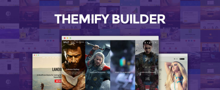
Themify Builder is another website-building tool we were certain belonged in our listing of best tools. Like the others we’ve selected, it is both powerful and ridiculously easy to use. It’s just a matter of drag, drop, and select. You can use Themify Builder with anyWordPress theme, and without having to resort to using a single line of code.
Try it, and you’ll keep it once you discover you will be able to see a live, front end preview of your layout, and watch your design come to life while you edit. Themify Builder features, animations, background video, and parallax scrolling, and more.
Divi Builder

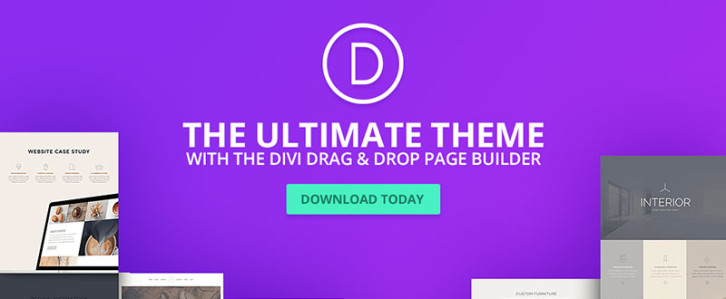
If you are at all curious about what the advantageous of using Divi Builder might be, just ask a DIvi WordPress theme user. Here is another example of an editor/page builder that helped to make its parent theme so popular that it was introduced as a standalone tool. It is powerful, easy to use, and it can be used with any WordPress theme. We suggest you visit the Elegant Themes Divi Builder home page and view the demo. The demo illustrates the ease of use and the power of the functionality that typify this design tool.
Portfoliobox

As its name implies, Portfoliobox is an excellent choice for a portfolio website designer, although it will serve you well for building any other type of website. You can create your website right in your browser, and you are not saddled with having to work from a preset theme. There isn’t one. You are free to use your imagination. Modern and trendy templates are included in the package, along with web hosting and a free domain for the PRO customers, and coding is not required. There is an additional bonus – you can try it out for free!
As you browse through this selection, you may have noticed several common threads, namely ease of use, portability, flexibility, and affordability. All offer demos, and several offer free trials or can be used free of charge under certain conditions.
Since almost all operate on a drag and drop principle, they are easy to use, and the interactive editing features several offer are definitely productivity boosters. If you give one or more a try, we would like to hear your thoughts.
Â
Traditional job searches are opaque and one-sided, particularly when it comes to salary negotiations. Candidates often don’t know the market rate for their skill set and level of experience, or how offers they receive stack up to the other opportunities that are out there.
Hired is on a mission to change all that. We are big believers in the idea that greater transparency in the job searching process benefits everyone. Candidates know how much they’re worth so that they can more easily evaluate offers and find a role that pays fairly. And companies know how their pay stacks up to their competitors so that can recruit and hire with insight.
In an effort to foster this transparency and shed light into software engineer salaries in the US and the UK, today we’re sharing the results of an intensive study. Our data science team spent many hours digging into this information to find out not only how different tech hubs like New York, San Francisco and London stack up against one another in terms of salary, but also how that translates into quality of life in those markets. While most people know that software engineer salaries are particularly high in San Francisco, they often don’t fully understand how the cost of living impacts those figures. The report also looks at how starting your career in a tech hub like San Francisco or New York can impact your earning abilities when you move to another city. In our UK report, we paid special attention to how salaries for software engineers correlate with years of experience and company size, as well as identifying the EU countries where London companies are finding their talent.
To find out more, please download our US report here and our UK report here.

This content is sponsored via Syndicate Ads.
Muzli 2 is connecting passionate people with the inspiration that drives them. By default, Muzli will load only the bare minimum of content and wait for you to show interest before fetching the entire feed. In addition, you now have access to the normal stuff available in the default Google new tab; like quick links to your most visited website and a regular ol’ Google search.
For those of you who prefer seeing everything, every time, like you’re used to- the option to disable the minimal view is accessible through the options in the user menu on the to right corner.
Simply hover over the sidebar to reach the “Edit†menu and enable, disable or reorder your favorite sources. You can fine tune your source list at any time and the changes you make are reflected immediately. Every post includes a number which indicates how viral/popular it is. They aggregate the number of social media signals from almost all of the relevant sources including Facebook, Google, Pocket and many more. Try the Muzli 2, we think it’s awesome & it’s completely free!

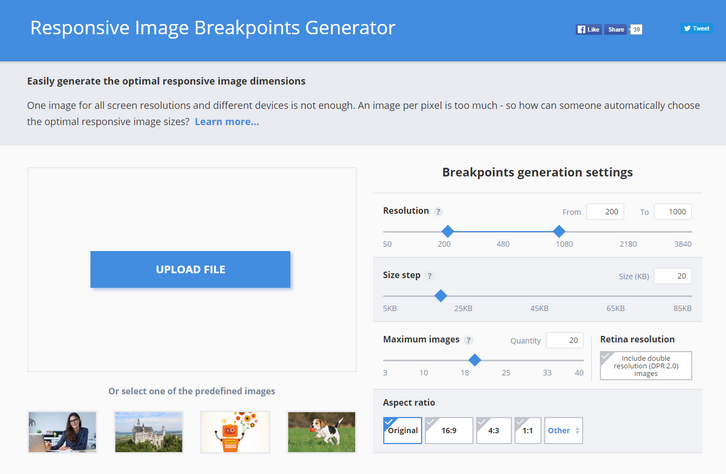
One image for all screen resolutions and different devices is not enough. An image per pixel is too much – so how can someone automatically choose the optimal responsive image sizes?
Responsive websites, even the most modern ones, often struggle with selecting image resolutions that best match the various user devices. They compromise on either the image dimensions or the number of images. It’s time to solve these issues and start calculating image breakpoints more mathematically, rather than haphazardly.
Responsive web design requires developers to determine the image dimensions that best fit their website. This breakpoints generator tool helps developers automatically find the optimal image sizes needed for the best viewing experience in web and mobile apps on a variety of screen sizes.
Common responsive image solutions tend to generate images based on a fixed set of image width values, disregarding the actual saving in file size bytes. To solve this problem, Responsive Image Breakpoints Generator uses Cloudinary’s advanced algorithms to easily generate best matching breakpoints for each uploaded image.
The algorithmic concept is to find image width values that offer a significant reduction in file size. Images are analyzed to find the best breakpoints on an image by image basis, rather than creating all possible image resolutions, and enables developers to easily create ‘picture’ and ‘img’ HTML5 elements based on the calculated breakpoints.

Requirements: –
Demo: http://www.responsivebreakpoints.com/
License: License Free


