Today’s front-end developers don’t just need to understand how to write CSS, we need to know how to write it efficiently. And what “efficiently†means can depend on your project and environment. Perhaps you have a team with several members working in the CSS and you need an efficient way to work together. Or maybe you have a huge enterprise site and you need your CSS optimized for speed. You could even be working with a legacy system that restricts access to HTML, which means you need efficient selectors to effectively style elements without ids or classes. You might even face all these situations and more.
Whatever your goals for CSS are, the best way to reach them is to know your options, and that means understanding all the selectors available to you. Most of us are already familiar with id and class selectors, and I introduced you to the beauty of attribute selectors in “Understanding CSS Selectors.†But there’s so much more.

In this two-part series, I’ll look at the new selectors in CSS3, starting with structural pseudo-classes.
What’s a Pseudo-Class?
CSS pseudo-classes target elements that can’t be targeted with combinators or simple selectors like id or class. You use pseudo-classes to select elements based on their attributes, states, and relative position. For example, you are probably already familiar with pseudo-classes for link states: Read the rest of this entry »
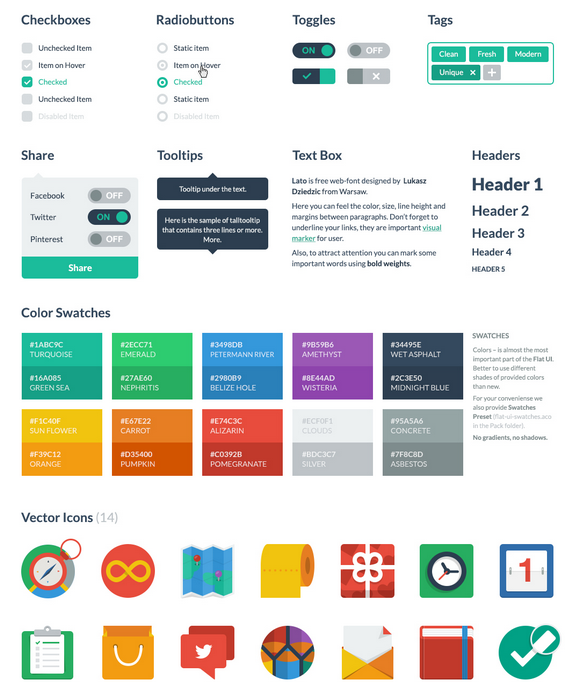
Flat UI Free is made on the basis of Twitter Bootstrap in a stunning flat-style, and the kit also includes a PSD version for designers. Flat UI Free contains many basic and complex components which are great for designers to have at hand: buttons, inputs, button groups, selects, checkboxes and radio-buttons, tags, menus, progress bars and sliders, navigation elements and more.
Colored, stylish icons can easily be modified and used in a wide variety of projects, as they contain original layers. Glyphs are also available in psd, html/css and svg formats. The kit also includes color swatches – no worrying over color choices here – with 10 colors that perfectly suit each other. Flat UI Free is made using the Lato typeface, which can be downloaded for free.

Requirements: –
Demo: http://designmodo.com/demo/flat-ui/
License: Creative Commons 3.0 License
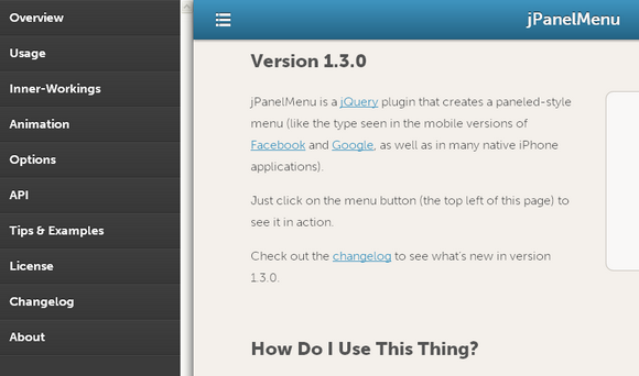
jPanelMenu is a jQuery plugin that creates a paneled-style menu like the type seen in the mobile versions of Facebook and Google, as well as in many native iPhone applications.
Animation is handled by CSS transitions, for browsers with support. CSS transitions are hardware-accelerated on supporting devices, so the animations are silky smooth. For browsers that do not support CSS transitions, the jQuery animation engine is used as a fallback.

Requirements: jQuery Framework
Demo: http://jpanelmenu.com/
License: License Free
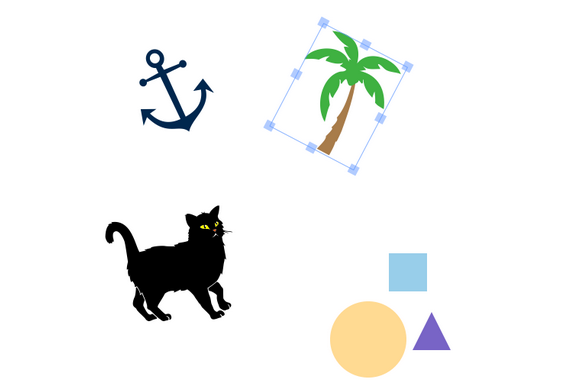
In this article, I’ll introduce you to Fabric.js—a powerful JavaScript library that makes working with the HTML5 canvas element a breeze. Fabric provides a missing object model for canvas, as well as an SVG parser, a layer of interactivity, and a whole suite of other indispensable tools. It is a fully open-source project, licensed under MIT, with many contributions over the years.
I started developing with Fabric three years ago after discovering the pains of working with the native canvas API. I was creating an interactive design editor for printio.ru—my startup that allows users to design their own apparel. The kind of interactivity I wanted existed only in Flash apps in those days. Now, very few libraries come close to what is possible with Fabric, so let’s take a closer look.
Why Fabric?
Canvas allows you to create some absolutely amazing graphics on the Web these days, but the API it provides is disappointingly low level. It’s one thing if you simply want to draw a few basic shapes on a canvas and forget about them. If you need any kind of interaction, to change a picture at any point, or to draw more complex shapes, the situation changes dramatically. Fabric aims to solve this problem.

Native canvas methods allow you only to fire off simple graphic commands, blindly modifying the entire canvas bitmap. Do you want to draw a rectangle? Use fillRect(left, top, width, height). Want to draw a line? Use a combination of moveTo(left, top) and lineTo(x, y). It’s as if you’re painting a canvas with a brush, layering more and more oil or acrylic on top, with very little control. Read the rest of this entry »
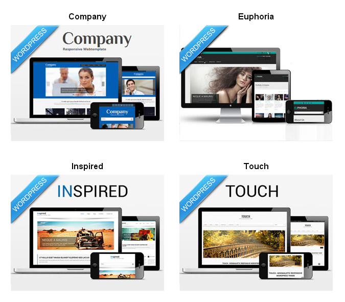
Whether you’re starting a number of websites yourself or you’re a Web Designer constantly creating new websites for clients, if you use WordPress, you know there are countless themes available. While WordPress themes are always quite customizable, it’s so much easier to just find what you’re looking for somewhere else. But it can be quite time consuming if you have a particular need outside of a generic theme.
That’s why this Mighty Deal from DXThemes is perfect for you as it contains 17 different WordPress themes covering a wide range of categories. Save yourself time and especially money by just grabbing this bundle and getting your themes up and running in a matter of minutes.

This massive collection of high-quality WordPress themes normally costs $289, but for a limited time only, you can get all 17 premium themes included in this bundle for just $17. That’s over 90% off the regular price and works out to just $1 per theme.
We love that neat little “pull to refresh” feature on our devices, but wouldn’t it be awesome if it was for the web? Well, that’s what Hook is here to do.
They took a concept from mobile phones and tablets and made it work for the web. Simply scroll down a bit, and then back up to the top. The page will be automatically refreshed. Hook is as simple as it gets for all kinds of users. From developers to novices, just follow the easy set of instructions and you’ll be Hooking in no time.

Requirements: JavaScript Framework
Demo: http://usehook.com/
License: License Free
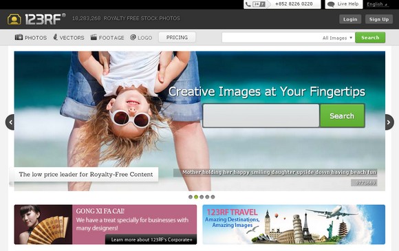
The cost for stock photography, especially royalty-free images are much lower compared to assignment photography. Stock photography saves you model, photographer, location, props, art direction and editing costs. 123RF.com is your one-stop royalty-free photo library offering stunning, practical stock photos at the most affordable price.
123RF.com collaborates with fellow photographers and make stock photos affordable for everyone. New images added daily from photographers all over the world and other great content providers. They have simplify the process of buying and submitting stock photos too.

123RF.com is very kind to giveaway 3x 123RF’s 30 Days Subscription Plan that worth $89 each to our readers. Winners can download up to 5 Royalty Free Images and/or Illustrations for the next 30 Days. Just leave a comment below in order to win this contest. We will pick 3 readers and announce the results on 17th March 2013. Best of luck.
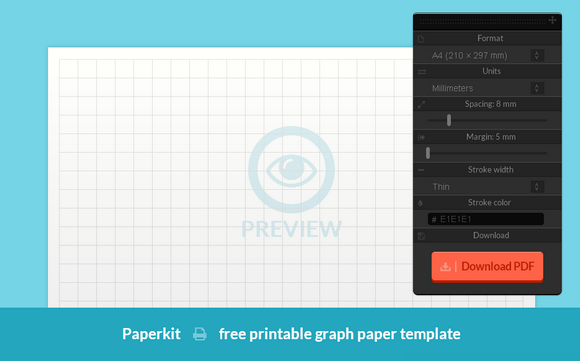
With Paperkit you can easily generate online the exact type of graph paper (grid paper) that you need. Use the toolbar to adjust the settings. You have full control over spacing between grid lines, margin size, stroke color and width as well as paper size. A live preview will help you evaluate your design. There are five formats available: A4, A3, legal, tabloid and letter. You can use units that you are comfortable with (millimeters or inches).
Once you decide on the parameters of your template and you are satisfied with its design you can download it to your hard drive. A blank template will be provided as a ready to print PDF file. It will open in a new window – you can immediately print graph paper or save it by clicking the right button. Whether you need to write something down, draw a sketch or a wireframe you can easily adjust the paper to your needs.

Requirements: –
Demo: http://paperkit.net/
License: License Free
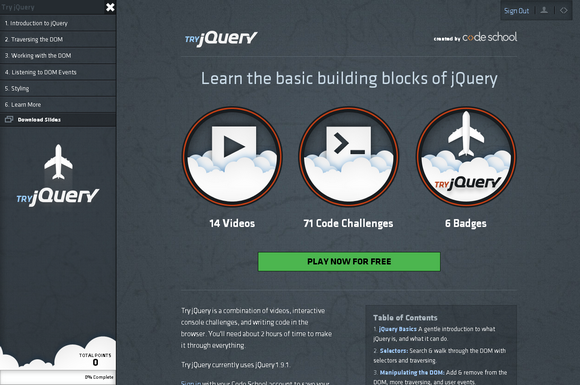
Try jQuery is a combination of videos, interactive console challenges, and writing code in the browser. You’ll need about 2 hours of time to make it through everything. There is a gentle introduction to what jQuery is, and what it can do.
It tells you how to search and walk through the DOM with selectors and traversing. Add & remove from the DOM, more traversing, and user events. Listen for events, handle them, and change the default event behavior of web browsers. Before landing, tame CSS with jQuery and animate elements on the page.

Requirements: jQuery Framework
Demo: http://try.jquery.com/
License: License Free
If you haven’t been living under a rock for the past year or so, you know that responsive Web design is one of the biggest trends these days. Introduced by Ethan Marcotte, the concept is simple: develop a site using methods that enable it to adapt and respond to different devices and resolutions.
When I first learned of this, I was instantly intrigued — particularly with the notion of using media queries, which I immediately applied to my own freelance site. I even wrote an article about the process: “Respond to Different Devices with CSS3 Media Queries.†(I strongly encourage you to read that article before delving further into this one. Go ahead. I’ll wait.)
As a result of my first media queries endeavor, I quickly realized I was missing a key part of the responsive design equation: flexibility.
Challenges with Fixed Widths
My freelance site is a fixed-width design, meaning all the width, margin and padding settings are specified in pixels. Traditionally, this has been my preference when building sites because it’s easier and faster for me.
But when writing the media queries for my fixed-width site, those easier and faster aspects rapidly disappeared. Why? Because with a fixed-width design, I found that I needed extremely detailed and verbose media queries to adjust for every single pixel value in my CSS. I was basically creating an entirely new layout for every potential resolution. Not easy. Not fast. Not fun.
Then I had the pleasure of listening to Mr. Marcotte speak at In Control 2011. He discussed responsive design as a theory and then dove into practicalities, like the fluid grid. Read the rest of this entry »


