WebAppers

/ best free open source web resources /

Graphic Resources

Easily Start Responsive Websites with Sassaparilla

Posted · Category: CC License, Framework

Sassaparilla is a set of default rules and style that starts everything we do at fffunction in a consistent manner. It’s not a boilerplate or a theme. Sarsaparilla on the other hand, is a nice refreshing root beer. Sassaparilla uses the power of Sass via SCSS and Compass to create flexible stylesheets that we can re-use and add to over time.

Compass is a library of common elements, equations and helper styles that is kept up-to-date by a community of developers and is useful for rapid development and leaner code. Both Sass and Compass are Ruby Gems and will need to be installed via command line or terminal. You can compile using a GUI like Codekit or go hardcore and just use command line. Either way it’s pretty easy to get up and running.

sassaparilla

Requirements: Sass and Compass Library
Demo: http://sass.fffunction.co/
License: Creative Commons License

Taming the Scalable Vector Graphics (SVG) Beast

Posted · Category: Information

This article recently appeared on BuildNewGames.com, a collaboration by the teams at Bocoup and Internet Explorer.

With the large number of varying screen resolutions available on today’s HTML5 gaming
devices, it is now advisable to give some consideration to incorporating vector graphics into your games.

SVG, or Scalable Vector Graphics, is an open standard, XML-based format developed by the W3C for representing vector graphics. Using SVG files for HTML5 game development is the main focus of this article.

Vector Graphics

Adobe Flash developers have long enjoyed the ease with which they can create attractive and, somewhat more importantly for browser-based games, scalable vector graphics.

Advantages of employing vector graphics for HTML5 game development include:

  • Scalability without loss of clarity
  • Manipulation of individual components
  • Client-side, rather than server-side, processing
  • Potential for animation and, almost certainly, interaction.

Let us address each in turn, using the following SVG file created using an
open source vector graphics editor.

SVG beast

Scalability

The capability to scale vector graphics without losing image quality is the primary benefit of using SVG files. Given the varying screen resolutions of the devices on which people are today playing HTML5 games, SVG files provide the most pleasing result when scaled.

Let’s use our beast SVG file to demonstrate.

zoomed in on vector
zoomed in as image

The image on the left is the result of scaling the vector graphics version of our beast. Lines remain clean and clarity is retained.

In the the image on the right, the result of scaling the bitmapped version of the same region of our beast produces a rendered result with considerably less definition. Edges of primitives are noticeably pixelated.

Read the rest of this entry »

How to Create a Retina-ready Responsive Menu

Posted · Category: License Free, Menu

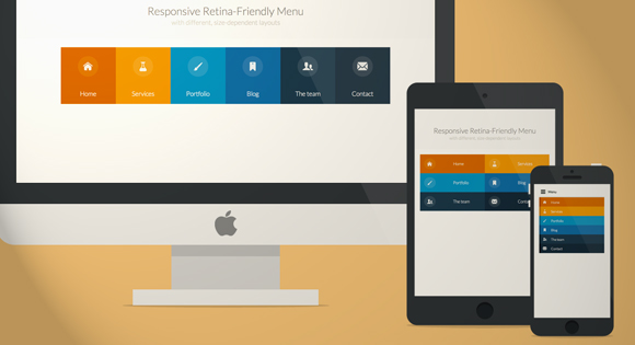
Codrops has shared a tutorial: Responsive Retina-ready Menu that teach us how to create a colorful Retina-ready and responsive menu inspired by the colors of the Maliwan manufacturer of the Borderlands game.

The menu automatically changes to one of three different layouts depending on the browser window size: a “desktop” inline version, a two columns tablet-optimized version and a mobile version with a menu link to display and hide the navigation for smaller screens. To make the menu fully retina-ready, we use an icon font so that the icons of the menu won’t get pixelized on resize.

responsive-menu

Requirements: jQuery Framework
Demo: http://tympanus.net/Tutorials/ResponsiveRetinaReadyMenu/
License: License Free

Beautiful Animated Filtering & Sorting Ordered Content

Posted · Category: CC License, Gallery

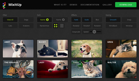
MixItUp is a light-weight but powerful jQuery plugin that provides beautiful animated filtering and sorting of categorized and ordered content. It plays nice with your existing HTML and CSS, making it a great choice for fluid, responsive layouts. It’s perfect for portfolios, galleries, blogs, or any categorized or ordered content.

MixItUp uses jQuery to decide which elements to hide, show or re-position based on your filters, and then applies the power of CSS3 transitions to smoothly animate these elements to their new locations. MixItUp is optimized for the current generation of modern, CSS3-ready browsers. Due to its light-weight and efficient approach, It works beautifully and smoothly on all modern devices including smartphones and tablets.

mixitup

Requirements: jQuery Framework
Demo: http://mixitup.io/
License: Creative Commons 3.0 License

Pretty Neat jQuery Mobile Theme Based on Flat UI

Posted · Category: Forms, MIT License

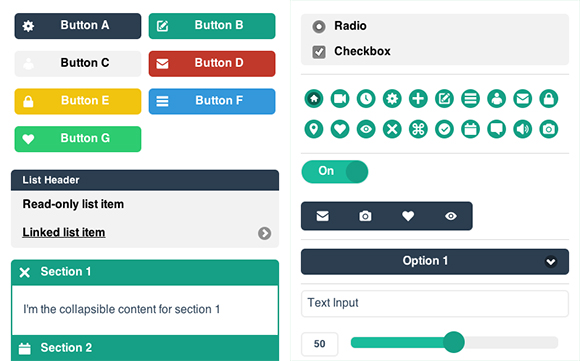
Flat Design is a new trend labeled by the community as an interface striking similar to Windows 8 and Microsoft’s Metro UI because it leaves behind drop shadows, subtle textures and gradients in favour of solid colours, clean layouts and sharp typography. Here you will find an excellent theme for jQuery Mobile based on Flat-UI. It looks pretty clean and modern. It’s totally free, and I hope you will find it useful too.

flat-ui-jquery-theme

Requirements: jQuery Framework
Demo: https://github.com/ququplay/jquery-mobile-flat-ui-theme
License: MIT License

An Open Source Self-hosted & Anti-social RSS Reader

Posted · Category: MIT License, Tools

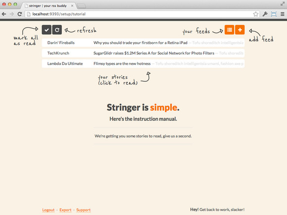
Stringer is an open source self-hosted, anti-social RSS reader. Stringer has no external dependencies, no social recommendations/sharing, and no fancy machine learning algorithms. But it does have keyboard shortcuts and was made with love.

Stringer is written in Ruby and built on Sinatra with a PostgreSQL datastore. It deploys easily to Heroku and is a self-professed work-in-progress. The project is released under MIT licensed and hosted on GitHub.

rss-reader

Requirements: –
Demo: https://github.com/swanson/stringer
License: MIT License

Progressive Enhancement for Browser-based Games

Posted · Category: Information

This article recently appeared on BuildNewGames.com, a collaboration by the teams at Bocoup and Internet Explorer.

Browser-based games are uniquely positioned at the intersection of the web and games, inheriting all the capabilities and resources of the web and browser technology. However they also face many of the same problems associated with developing for the web, while still retaining the intrinsic challenges of game development. One fundamental challenge of web development is providing access to the diversity of devices accessing the web, allowing users to interact with content regardless of platform or connectivity. One strategy for working with such diversity — progressive enhancement — is of significant benefit to browser-based game developers, and can help realize the full potential of games on the web.

Progressive Enhancement

Progressive enhancement is a web development strategy whose basic principle is to begin with the simplest representation of content, adding complexity as required, up to the limitations of the means of access. Its goal is to always provide content regardless of the capabilities of the device used to access that content. In practice, this means starting with pure content (text, images, etc.) and adding features to enhance the representation of the content (fonts, colors, etc.) toward aesthetic and utilitarian goals without creating dependencies on those features.

progressive-enhancement

As more people use mobile devices for web browsing, web developers have adopted a “mobile first” approach, taking into account the reduced technical capabilities of mobile browsers and networks, simplifying the display of content to maximize performance and accessibility. By applying this same approach, browser-based game developers can create games playable on a wide spectrum of mobile devices operating on unreliable networks, while allowing for increased capabilites and advanced features on other devices. Simply put, using progressive enhancement in browser-based games can allow more players to play more often.

Read the rest of this entry »

200 Free Vector Map Icons for Google Maps API

Posted · Category: Icons, License Free

Map Icons Designer is a set of 200 Map icons in PSD Vector Shape & PNG format. They can be used as Google Map Icons, Location Markers, Point of Interests (POI) on any Maps. It includes icons for tourism, sports, restaurants, hotels, transportation and etc. It’s sutiable to use them in Google Maps API.

There are 10 different type of location pins. They can be resized and can easily change colors. You can use the royalty-free map icons for any personal, commercial project including web design, software, application, advertising, film, video, computer game, gui design, illustration, for you or for your clients, without having to pay additional licensing fees.

google-map-icons

Requirements: –
Demo: http://www.webiconset.com/map-icons/
License: License Free

Create Free Responsive Portfolio Websites with Dunked

Posted · Category: License Free, Tools

Dunked is one of the simplest, easiest, and most versatile portfolio simple-to-use solution to allow creative folk to showcase their work. It’s Responsive, Retina & Ready to go. you can choose from a growing collection of professionally designed templates to reinvent your portfolio. Their pixel-perfect templates are customizable, easy to use, and focus on one thing only – your content.

Each template is fully responsive and will adapt itself to any mobile device. iPad, iPhone, Android, it doesn’t matter. Your work will always looks its absolute best. Upload images from your computer, embed your latest videos from YouTube or Vimeo, and add your mixes from SoundCloud. When you’re done, manage your content through a simple to use drag and drop admin interface.

dunked

Requirements: –
Demo: http://dunked.com/
License: License Free

A True Responsive jQuery Lightbox Plugin for Free

Posted · Category: MIT License, Popup

Magnific Popup is a free responsive jQuery lightbox plugin that is focused on performance and providing best experience for user with any device. The majority of lightbox plugins require you to define size of it via JS option. Magnific Popup does not – you can use relative units like EM’s or resize lightbox with help of CSS media queries. Update content inside lightbox without worrying about how it’ll resize and center.

Plugin has an option to automatically switch to alternative mobile-friendly source on small screen size. Default controls are made with pure CSS, without external graphics. For the main image there is a built in way to provide appropriate source for different pixel density displays. Magnific Popup displays images before they’re completely loaded to take full advantage of progressive loading. For in and out transitions CSS3 is used instead of slow JavaScript animation.

magnific-popup

Requirements: jQuery Framework
Demo: http://dimsemenov.com/plugins/magnific-popup/
License: MIT License

Page 124 of 322...«120121122123124125126127128»...
Supported By

Deals

Web Browsers Icon Set
Food Icon Set
Flat Icon Set

Flat Icon Set

100 icons