Intern is a complete test stack for JavaScript designed to help you write and run consistent, high-quality test cases for your JavaScript libraries and applications. It can be used to test any JavaScript code. Its functional testing capabilities can even be used to test non-JavaScript Web sites and apps, if you really want.
If you need to support IE 6–8, there is also a version of Intern for legacy browsers. Intern is available under the terms of the New BSD License.

Requirements: Node.js
Demo: http://theintern.io/
License: BSD License
The Mobile Playing Field
Today, a large portion of site traffic comes from mobile devices—namely smart phones and tablets—in addition to traditional PCs. Across the globe, mobile devices now account for 12 percent of Internet traffic, and it’s scaling up faster than desktop Internet traffic. The fraction of mobile Web traffic is sufficiently higher in nations with high smartphone penetration (for example, 20 percent of US-based Web traffic is via mobile browsing). What’s more, this figure is expected to grow significantly over the next 10 years, as smartphones evolve and mature in terms of hardware and software and adoption picks up in South America, Asia and Africa.
Site owners have begun to take advantage of this trend over the past several years and have primarily relied on native mobile apps for top sites such as Facebook, Hulu and the New York Times. Moreover, up-and-coming Web services such as Pulse, Flipboard and others have even taken to a mobile-first approach, by building apps for iOS and other ecosystems before building a Web site experience. Native apps allow developers to create unique phone-first, touch-optimized experiences for users to interact with their content to take advantage of features like camera integration, geo-location and offline data storage.
Targeting users on mobile natively makes good sense, especially within the US, where more than 50 percent of mobile users own a smartphone. While mobile apps offer site owners a way to connect with users on new form factors, new ways to monetize across platforms and new mobile-scenario-centric experiences to empower and delight their users, they offer an incomplete opportunity for developers compared to the ubiquity and reach of the Web. There are a couple of problems that affect a native mobile-only approach.
Problem 1: Cost of Supporting Multiple Platforms
Creating similar content and experiences across multiple platforms is costly and requires site owners to choose platforms for which to optimize. Additionally, this translates to a limited Web site experience for users who seek out your content from other platforms, especially when you need to prioritize your development investments. Read the rest of this entry »
BundleHunt has partnered with 14 of the world’s finest web designers and developers to bring you the first-ever $7 Mega Creativity Bundle.
Don’t miss out on this visually stunning Lifetime creativity Bundle. With SmashingMagazine e-book bundle, Themify WordPress Themes, adobe certified training courses, Vector Icons sets, design elements and more… you can create virtually anything you put your mind to.
With $463 worth of files for only $7. Don’t miss your chance to get the Creativity Bundle. Hurry and get your copy before it’s too late. It’s One Day Left only.

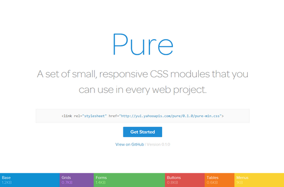
Pure is a set of small, responsive CSS modules that you can use in every web project. Pure is ridiculously tiny. The entire set of modules clocks in at 5.7KB minified and gzipped, without forgoing responsive styles, design, or ease of use. Crafted with mobile devices in mind, it was important to us to keep our file sizes small, and every line of CSS was carefully considered. If you decide to only use a subset of these modules, you’ll save even more bytes.
Pure builds on Normalize.css and provides layout and styling for native HTML elements, plus the most common UI components. It’s what you need, without the cruft. Pure has minimal styles and encourages you to write your application styles on top of it. It’s designed to get out of your way and makes it easy to override styles.

Requirements: CSS
Demo: http://purecss.io/
License: BSD License
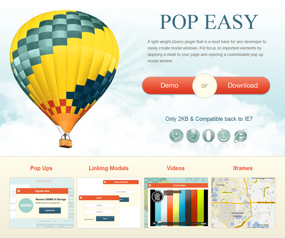
PopEasy is a light weight jQuery plugin that is a must have for any developer to easily create modal windows. Put focus on important elements by applying a mask to your page and opening a customizable pop up modal window.
To use multiple modals on one page, you must sync the href attribute of the trigger to the id of the div you wish to open. This works the same with transitioning from one open modal to another. Just place a link in the modal you wish to leave with an href attribute matching the id of the next modal.

Requirements: jQuery Framework
Demo: http://thomasgrauer.com/popeasy/
License: License Free
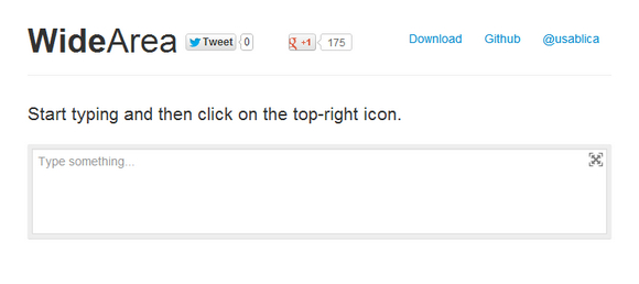
WideArea is a simple and lightweight JavaScript and CSS library (2KB JS and 4KB CSS) which helps you to write better, simpler and faster. it’s free and open-source (including commercial use). Published under MIT license.

Requirements: JavaScript Framework
Demo: http://usablica.github.io/widearea/
License: MIT License
Selectize is a jQuery-based custom <select> UI control. It’s useful for tagging, contact lists, country selectors, and so on. It clocks in at around ~7kb (gzipped). The goal is to provide a solid & usable user-experience with a clean and powerful API.
It allows users to create items on the fly. It supports Remote data loading,for when you have thousands of options and want them provided by the server as the user types. It’s a lot like Chosen, Select2, and Tags Input but with a few advantages. It is licensed under the Apache License, Version 2.0.

Requirements: jQuery Framework
Demo: http://brianreavis.github.io/selectize.js/
License: Apache License
Before You Get Started
Responsive Web design is intended to ensure that a site’s layout and content scale fluidly to the available screen real estate. This is a great approach for focusing your investments on improving site content and user functionality while ensuring that users have a good experience regardless of what device and screen size they use to visit your site. If you didn’t read the first article in this series, “Why the Web Is Ready for Responsive Web Design,†be sure to read it first.

It’s worth taking a step back, however, to think through your site’s experience and understand whether the device with which a user accesses your site changes the user’s expectations of the site’s functionality. Is the user checking your site for quick updates with her cellphone while she’s on the go? Is he sitting down, 10 feet away from a large TV screen, looking to immerse himself in a relatively passive consumption experience of rich content, videos and games? Are other users sitting down at their PCs, looking to get the most from your site content? Most of all, how do these expectations affect the site layout and functionality that you provide at those corresponding screen sizes?
What Kind of Site Is This?
Planning the content hierarchy for your site across different form factors is definitely the first step to having a great responsive-site experience. Consider the following examples, which evaluate and compare the top experiences that customers want to have when they access your site from a 4-inch phone while they walk or take public transportation, when they’re sitting at their computer desk, and when they’re lounging on their couches in their living rooms. Read the rest of this entry »
Flatdoc is the fastest way to create a site for your open source project. It is a small JavaScript file that fetches Markdown files and renders them as full pages. Essentially, it’s the easiest way to make open source documentation from Readme files. There is no server-side components, no build process needed.
Flatdoc is deployable via GitHub Pages, you can also fetch GitHub Readme files. A gorgeous default theme is provided and it’s responsive. It is licensed under MIT License.

Requirements: JavaScript Framework
Demo: http://ricostacruz.com/flatdoc/
License: MIT License
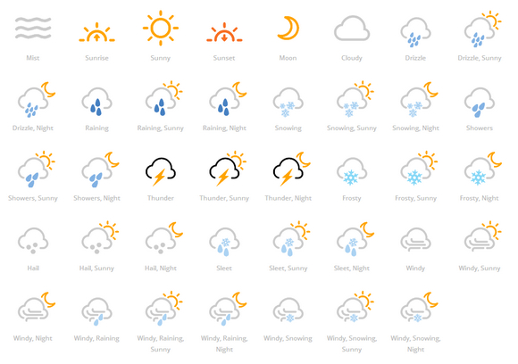
Forecast Font is a web-font for creating multi-layered weather icons. It was created to enable you to have more control over the look and feel of the icons, rather than only having a single colour or style.
Flat, single-colour icons might be what your after and thats cool but with Forecast font you have all the flexibility to colour, style or even animate various parts of the icons. Create something a little different from the norm. Even better they are fully scalable for use on all devices, no need to create cumbersome image sprites or use multiple images to create your weather icons.
Requirements: –
Demo: http://forecastfont.iconvau.lt/
License: MIT License


