Circletype.js is a tiny (2.7kb) jQuery plugin that lets you set type on a circle. You can use any font, adjust letter-spacing as usual with CSS, flip it around so it reads counter-clockwise instead. You can also Set the radius manually or let CircleType.js figure it out for you. It play well with FitText.js. And best of all, it works in fluid and responsive layouts.

Requirements: jQuery Framework
Demo: http://circletype.labwire.ca/
License: GPL, MIT License
While meeting some game studios, I often have the same question coming over and over: if I’m writing/porting my game in HTML5, will it run well on the various targeted devices? Will it be playable or will the gameplay suffer too much? To answer to that question, I often use my own experience based on what I know and what worked well during my own tests. But I also had the feeling it wasn’t enough to provide some good advices.
In the meantime, there were some obvious facts. For instance, we all know that mobile devices can’t animate as many sprites as desktop PC and preserve 60 fps. We know also that combining SVG and Canvas is a good idea to write games that scale across devices but this could also impact the performance. Moreover, even if GPU and hardware acceleration is available on mobile, their hardware architectures differ a lot from the PC and this impacts also a lot the performances. There is dozen of scenarios like that to address and to be aware of while writing HTML5 games for mobiles. But in which proportions?

With my friend David Catuhe, we then decided to measure these various scenarios and build a benchmark framework to have a better idea on what to pay attention for. It’s named the HTML5 Potatoes Gaming Bench framework. The concept is then to help you benchmarking your targeted platforms and to obtain indicators for your future games: number of simultaneous sprites supported, SVG & Canvas composition performance, usage of videos, etc. It’s a tool we’d like to provide you to help you benchmarking your own scenarios for your games. Read the rest of this entry »
Pongstagr.am is a jQuery plugin that lets display your instagram media to your website using Bootstrap Front-end styles and modal-plugin.
For the most part, Instagram’s API only requires the use of a client_id. A client_id simply associates your server, script, or program with a specific application. However, some requests require authentication – specifically requests made on behalf of a user.

Requirements: jQuery Framework
Demo: http://pongstr.github.io/pongstagr.am/
License: Apache License
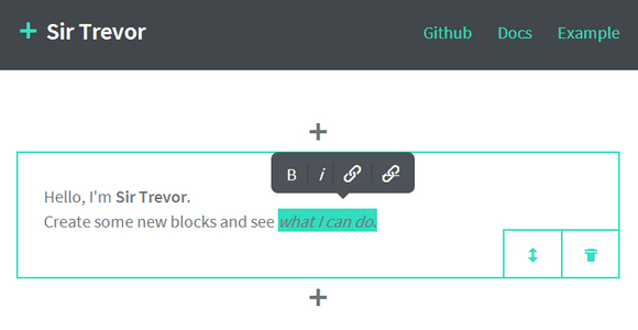
Existing WYSIWYG content editors were designed for immutable display media. In contrast, Sir Trevor is rich content editing entirely re-imagined for the web: an intuitive editor for web content which does not presuppose anything about how it will be rendered.
No HTML is stored, only structured JSON and clean Markdown. Sir trevor content is made up of blocks. And you can easily add your own as well. Sir Trevor has been tested on the following modern browsers: IE10+, Chrome 25+, Safari 5+, Firefox 16+.

Requirements: Underscore (or LoDash), jQuery (or Zepto) and Eventable
Demo: http://madebymany.github.io/sir-trevor-js/
License: MIT License
Wrangle is a responsive, touch-friendly selection plugin for jQuery or Zepto. Wrangle offers a unique method of multiple selection: by drawing a line through items to select them. It gives your app a new way to perform multiple selections: a mouse, a finger or a stylus.
The plugin is lightweight and designed to be exstensible and adaptable. It’s also highly experimental, due in no small part to the diversity of touch implementations in various devices and browsers.

Requirements: jQuery or Zepto Framework
Demo: http://zurb.com/playground/wrangle-jquery-plugin
License: MIT License
Designers checklist advices is a personal project by Adrien Heury, french UI/UX designer at NOE interactive and working sometimes with his sister under the name Heury & Heury. You can read a lot of design related list based articles. I am sure designers will find it usefull and there will be more “checklists advices” of designers in the future.

Source: http://adrien-heury.net/designers-checklists/
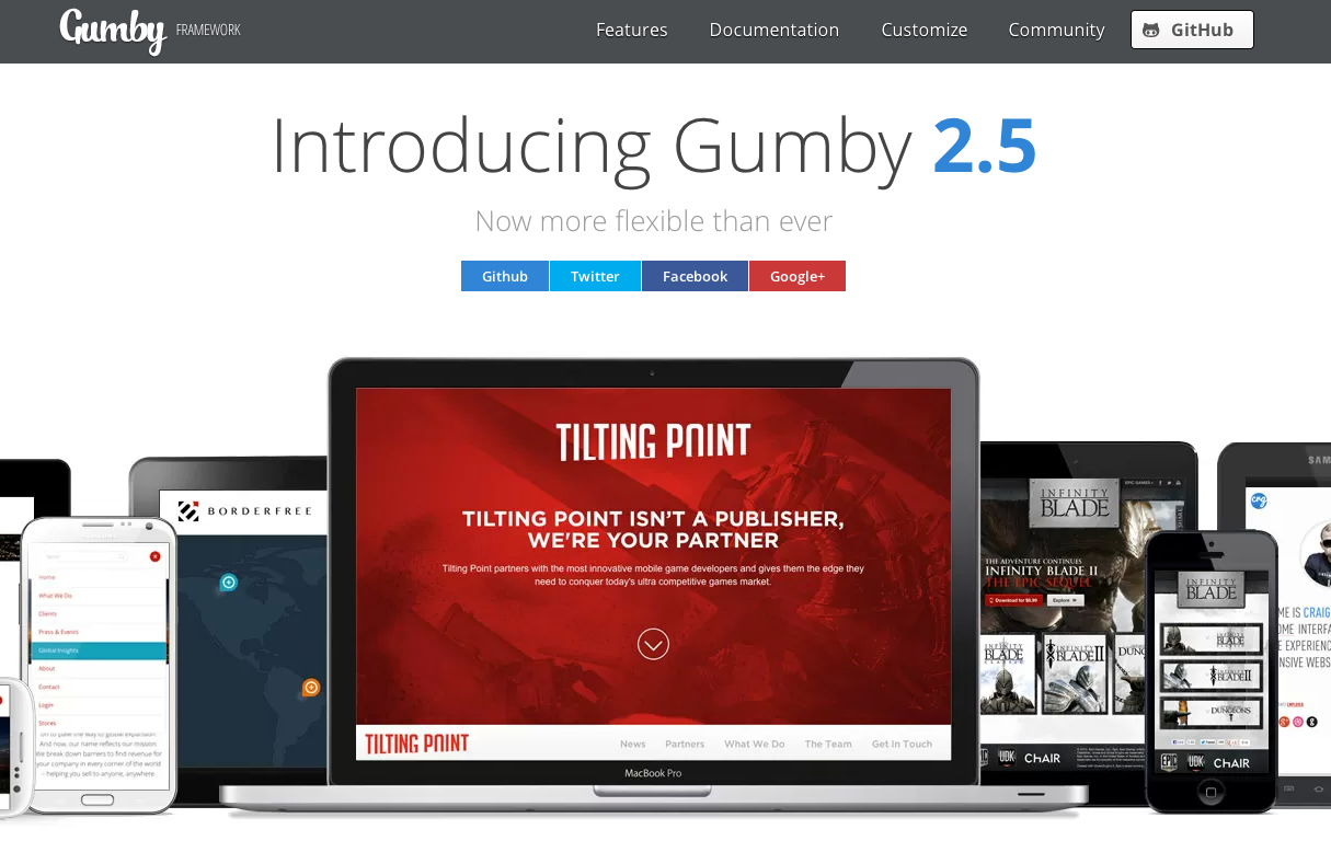
Gumby Framework is a flexible, responsive CSS Framework, Powered by SASS. Create rapid and logical page layout and app prototypes with a flexible and responsive grid system and UI kit. It is built with the power of Sass. Sass is a powerful CSS preprocessor which allows us to develop Gumby itself with much more speed — and gives you new tools to quickly customize and build on top of the Gumby Framework.
Gumby is developed following the latest standards and specs. In order to stay on the cutting edge, Gumby supports modern web browsers like: Chrome, Firefox, Opera, Internet Explorer 8 – 10.

Requirements: –
Demo: http://gumbyframework.com/
License: MIT License
An effort to make beautiful forms for web applications that make data entry less painful. Grid forms is a front-end library which handles the boiler plate necessary to build grid based forms.
Grid forms are dense forms designed for use in applications that require lots of data to be entered regularly. It’s a tiny Javascript/CSS framework that helps you make forms on grids with ease. You can also include Scott Jehl’s Respond.js if you want the form to be responsive in ie8.

Requirements: JavaScript / CSS Framework
Demo: http://kumailht.com/gridforms/
License: MIT License
Progress bars have become quite popular lately, and there are lots of plugins that can help you add one to your site. But how do you make one yourself? The problem is that there are plenty of implementations already, so Tutorialzine has published a tutorial, teaching us how to code buttons that have built in progress meters.
They will be perfect for displaying progress while submitting forms or loading content via AJAX. They will also use CSS3 styles and transitions to make them easy to customize.

Requirements: –
Demo: http://demo.tutorialzine.com/2013/10/buttons-built-in-progress-meters/
License: License Free
Designers overlook it. Developers demand it. There’s always been a need for discernible web design in Photoshop. Nobody likes inheriting muddy PSDs. PSD Validator can find out how good your PSD file is structured using some of the rules from Photoshop Etiquette.

Requirements: –
Demo: http://www.psdvalidator.com/
License: License Free


