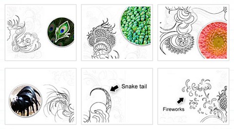
As a designer, we all have experienced the hard time of finding new ideas and inspirations. That’s why Nick La from WebDesignerWall has chosen to talk about this topic in his presentation at the FOWD conference. In this post, he has done a recap of the keynotes – Finding Inspiration From Your Environment. Read on to find out how his work habits and environment influence his design.

Next time you are outside, try to pay more attention to you environment, you may find a lot of interesting things that you can incorporate into your design. Enjoy your life and design more beautiful things!
Source: http://www.webdesignerwall.com/general/finding-inspiration/
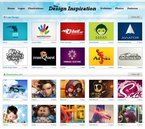
The Design Inspiration is created by a group of designers who are seeking various design inspiration every day. To make every designer’s life easier, they have decided to feature some of the best logo designs, illustration art, websites, photos and patterns from the most talented designers around the world. The site updates every day, so that you can get the fresh and top quality design inspiration daily.

Source: http://thedesigninspiration.com/
Pattern Tap was born out of the love for the best interface designs on the web. They wanted a place where we could come and easily find the stuff we were looking for. Sometimes it was a matter of some inspiration for pulling off a horizontal nav bar with a ton of sections, sometimes it was just trying to visually separate some content.
They didn’t find any central place to find all this stuff, so they made their own. Pattern Tap is here to satisfy and encourage the inspiration needs of my interface design peers and peeps. They aspire to be the design tap for your next inspiration need.

Source: http://patterntap.com
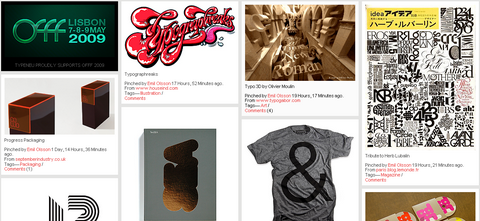
3D Typographic design is now more popular and we can notice a surge for 3D Type work on portfolio sites, DzineBlog has collected 45 Beautiful 3D Typography Deisgns For Inspiration, these designs are really inspiring, and I love them a lot.

Source: 45 Beautiful 3D Typography Designs For Inspiration
TypeNeu is an odyssey in typography. TypeNeu reports on the past, present and the future of typographic culture, with main focus on typefaces and applied typography in different forms. You can see many different typography from book, fashion, illustration, magazine, packaging, poster, print and etc… Please enjoy and get some inspiration.

Source: TypeNEU – An Odyeesey in Typography
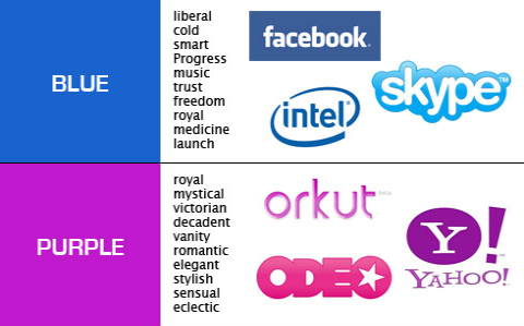
One of the key elements of building a strong brand is color selection. Every color has a different feel and various associations. By choosing a color or a combination of colors for your brand identity, you will take on those associations. Colors will evoke certain emotions and feelings towards your brand so it is vital to choose a color that will represent your identity effectively.
There is a great new tool which can help out with color selection called Cymbolism. It’s an interactive survey of color and word associations. Every page loads a new word, for which you have to select a color you feel best represents it. The results are then aggregated and you can see most popular associations either by color or by word.
To help you select the right color for your brand Usability Post has aggregated the results from Cymbolism, and also provided examples of logos that use each color. You can view the original post on “A Guide to Choosing Colors for Your Brand“.

Source: A Guide to Choosing Colors for Your Brand
Gustavo Pimenta is a user experience designer focused on making the Web a better place. He mentioned that he is addicted to making screenshots of some of the best design elements / soultions, e.g. 404 Page, Autocomplete, buttons, breadcrumbs, comments, forms, graphs, headings and a lot more. I am sure this hugh collection of really nice design elements / solutions can give you so much inspiration for your web / web application design.

Source: Flickr: Gustavo Pimenta’s Collection: [Design Solutions]
iPhone Web Apps combine the power of the Internet with the simplicity of Multi-Touch technology, all on a 3.5-inch screen. When you find a web app you like, you can put it on your Home screen for easy, one-tap access.
There are over 600 Web Apps available, I found many of them are useless to be honest. So,what are the best ones? iPhone Toolbox has carefully selected top 25 iPhone Web Apps for us. Feel free to share your favorite ones on the post as well.

Source: Top 25 Free iPhone Web Apps for Your Daily Life
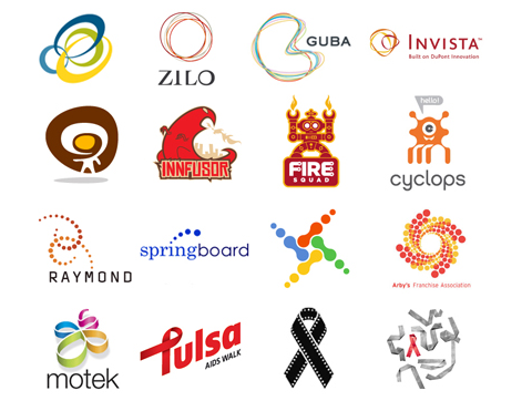
There are many different kinds of stunning logos. Some are aesthetic, some conceptual, and some cultural. It is also becoming disturbingly clear that logo design has become a public sport. As the public controls their own media more and more-Tivo-ing this, blogging that, YouTube-ing and Googling everything else-people are no longer satisfied to simply consume what is placed before them: They have opinions they want to share. So when a large corporation reveals its new identity, there are hundreds of internet sites flinging their opinions back at it. Even when the village board of Remote votes on a new logo for its two police cars, citizens take to the streets waving pitchforks and copies of their own designs. Committeecide seems to be rampant.
The full 2007 logo design trends report follows. Whether we are noting social, conceptual or aesthetic trends, remember that none of them exist in a vacuum or in a single moment in time. They are results of many trends before them and are developing taproots as we speak.

You can also look at more current Logo Design Trends here.
Source: Logo Design Trends Report 2007
The quality of design sites around has just been escalating and escalating. Last year FreelanceSwitch has published two articles on finding design inspiration – 34 Places to Get Design Inspiration On and Off and the follow up 60 More Places to Get Design Inspiration. Now, they have just delivered 33 New Places to Get Design Inspiration. Most of them are nicely designed with really useful design resources.


Source: 33 New Places to Get Design Inspiration


