One of the CSS3 properties designers have been longing the most for is undoubtedly the border-radius property. With CSS3 border-radius property it’s possible to create the so popular rectangles with rounded corners exclusively via CSS – no images needed.
CSS3 aren’t supported by all browsers yet. The border-radius property is supported by Firefox (since version 3.0), Safari (since version 3.1) and Chrome (since the first version), but it’s not supported by Internet Explorer or Opera (it should be implemented in Opera 10).
Although Firefox, Safari and Chrome support this property, they do so in slightly different modalities. For the sake of simplicity, BloggingCSS shows you how it is supported by Firefox and then explain the differences in Safari and Chrome.

Requirements: Firefox 3.0+, Safari 3.1+, Chrome 1.0+
Demo: http://www.bloggingcss.com/en/tutorials/the-css3-border…
License: License Free
Searching within the page is a major browser functionality, but what if we could code a search box in Javascript that would do the same thing? David Walsh has shown us how to create a Search & Highlight Plugin with MooTools.
However, this is not perfect at the moment. One glaring issue is that if you search for a word, then unhighlight the word, and then look for that word with the next word (“Lorem” => “Lorem ipsum”), the searcher doesn’t find the second word due to the way the nodes are in place.

Requirements: MooTools Framework
Demo: http://davidwalsh.name/dw-content/mootools-highlight.php
License: License Free
Would you like the Scrolling Background Effect like youlove.us? The technique is actually a lot simpler than it looks, it’s based around scrolling a very tall gradient image behind some transparent PNG images. The header image has a transparent background and solid text, while the main page is actually an image with the heading text as transparent cut outs.
The JavaScript is where the real magic happens. They have made use of the jQuery library and Alexander Farkas backgroundposition.js script to help them make the background move. The final result looks very nice. However, it might consume a lot of your CPU resources.

Requirements: jQuery Framework
Demo: http://youlove.us/blog/the-youloveus-scrolling-background-effect…
License: License Free
WordPress is one of the most popular CMS for blogging. There are lots of Useful Plugins and Free Themes available on the internet. Some of them are very beautiful and useful, some of them are not.
BlogPerfume has compiled a list of “45 Best Free WordPress Themes of All Time” and “45 Essential WordPress Plugins for Pro Blogging“. I am sure you would find them useful if you are using WordPress as your blogging platform.
45 Best Free WordPress Themes of All Time

45 Essential WordPress Plugins for Pro Blogging

Currently, there are two commonly used techniques on displaying columns, the fixed columns and the liquid columns. With fixed columns, there will be certain viewport resolutions, where it leaves excess white space where a column was just not able to squeeze in. The downside of liquid columns is that we are restricted to having a fixed number of columns per row.
SohTanaka has thought of a solution: Smart Columns with CSS & jQuery would be able to benefit the situations is to take the good of both scenarios and mash it into one. Allow as many fixed columns to line up across the viewport. Take excess white space and evenly distribute them to each of the columns to complete the full row. This way the columns will always fit perfectly.
And also, It keeps a default fixed width as the base, so that the columns are reasonably within the intended columns sizes while maintaining enough flexibility to accommodate for the expandable viewport.

Requirements: jQuery Framework
Demo: http://www.sohtanaka.com/web-design/examples/smart-columns/
License: License Free
Most people getting started with JavaScript these days are faced with the challenging task of picking a library to use, or at least which one to learn first. Aaron Newton of Clientcide saw numerous posts that boil down to “MooTools or jQuery?”
He has published “jQuery vs MooTools” aims to help you make that choice. He tried to highlight the differences in philosophies between the two codebases and highlight their advantages and disadvantages.
jQuery focuses on expressiveness, quick and easy coding, and the DOM while MooTools focuses on extension, inheritance, legibility, reuse, and maintainability. jQuery is easy to get started and see quick results but can turn into code that’s harder to reuse and maintain, while MooTools takes longer to learn and requires you to write more code upfront before you see results, but afterwards is more reusable and more maintainable.
Both frameworks keep their cores rather lean, leaving it to you and others to write plug-ins and extensions. MooTools takes a more holistic approach and gives you tools to write anything you can imagine beyond the scope of the DOM, but pays the price by having a steeper learning curve.
MooTools extensibility and holistic approach gives you a superset of jQuery’s features, but jQuery’s focus on a slick DOM API doesn’t preclude you from using the native inheritance methods of JavaScript or from using a class system like MooTools if you want it.
Do you think so? Which framework do you choose?
Source:Â jQuery vs MooTools
Recently, I have been doing research on Web Caching. And I have found Caching Tutorial for Web Authors and Webmasters , which is a detailed, informational document published by Mark Nottingham.
A Web cache sits between one or more Web servers and a client or many clients, and watches requests come by, saving copies of the responses — like HTML pages, images and files — for itself. Then, if there is another request for the same URL, it can use the response that it has, instead of asking the origin server for it again.
Web Caching can reduce latency, because the request is satisfied from the cache instead of the origin server, it takes less time for it to get the representation and display it. This makes the Web seem more responsive.
And also, Web Caching can reduce network traffic, because representations are reused, it reduces the amount of bandwidth used by a client. This saves money if the client is paying for traffic, and keeps their bandwidth requirements lower and more manageable.
You can also get more information about the type of web caches, how web caches work, how to control them, tips for building a cache-aware site and etc…
Source: Caching Tutorial for Web Auhors and Webmaters
License: Creative Commons License
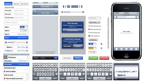
The iPhone is a fantastic phenomenon. It’s a communications device, a multimedia platform and much more all rolled into one single tool. Everyone wants in on this device. With millions of iPhones out there, it makes sense to have your content, or application available on that platform, but how do you go about doing this?
WebDesignerDepot has published How to Get Started with iPhone Dev, which is an introduction to the various ways of getting content and applications onto the iPhone. It is by no means a full guide, but it can point you in the right direction and give you an overview of what is involved in the process.

Source: How to Get Started with iPhone Dev
Ethan Marcotte has raised an issue about Fluid Grids, that working with non-fixed layouts can be more difficult once you introduce fixed-width elements into them. By default, an image element that’s sized at, say, 500px doesn’t exactly play nicely with an container that can be as large as 800px, but as small as 100px. What’s a designer to do?
He has wriiten a little script that makes Fluid Images. In short, it cycles through your document, swaps out the images for a transparent GIF, and applies the AlphaImageLoader property to each one. Then, whenever the window’s resized, the script automatically recalculates the proper, proportional height and width of the image, and resizes the spacer graphic accordingly. You can see it in action, and download the script.

Requirements: –
Demo: http://unstoppablerobotninja.com/entry/fluid-images/
License: License Free
Quality is a word that a lot of people like to use when describing their web design services. But what is quality, how do you know if a design is quality or not. There’s quite a few ways to spot quality within web designs.
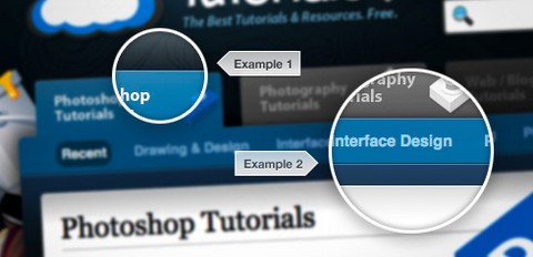
Function has put together a few pointers, and collected some examples to explain just how they look for quality within a website design. It Includes Spacing, Pixel Perfect Detail, Typography, Organization of Elements and etc… The post is extremely well-written and informative with some really good examples. It is one of the best posts I have read for a long time.
Once you can see just what goes into making a quality web design, you can use the techniques to perfect your own style.

Source: http://wefunction.com/2009/04/quality-within-web-design/


