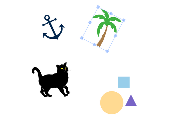
In this article, I’ll introduce you to Fabric.js—a powerful JavaScript library that makes working with the HTML5 canvas element a breeze. Fabric provides a missing object model for canvas, as well as an SVG parser, a layer of interactivity, and a whole suite of other indispensable tools. It is a fully open-source project, licensed under MIT, with many contributions over the years.
I started developing with Fabric three years ago after discovering the pains of working with the native canvas API. I was creating an interactive design editor for printio.ru—my startup that allows users to design their own apparel. The kind of interactivity I wanted existed only in Flash apps in those days. Now, very few libraries come close to what is possible with Fabric, so let’s take a closer look.
Why Fabric?
Canvas allows you to create some absolutely amazing graphics on the Web these days, but the API it provides is disappointingly low level. It’s one thing if you simply want to draw a few basic shapes on a canvas and forget about them. If you need any kind of interaction, to change a picture at any point, or to draw more complex shapes, the situation changes dramatically. Fabric aims to solve this problem.

Native canvas methods allow you only to fire off simple graphic commands, blindly modifying the entire canvas bitmap. Do you want to draw a rectangle? Use fillRect(left, top, width, height). Want to draw a line? Use a combination of moveTo(left, top) and lineTo(x, y). It’s as if you’re painting a canvas with a brush, layering more and more oil or acrylic on top, with very little control. Read the rest of this entry »
Whether you’re starting a number of websites yourself or you’re a Web Designer constantly creating new websites for clients, if you use WordPress, you know there are countless themes available. While WordPress themes are always quite customizable, it’s so much easier to just find what you’re looking for somewhere else. But it can be quite time consuming if you have a particular need outside of a generic theme.
That’s why this Mighty Deal from DXThemes is perfect for you as it contains 17 different WordPress themes covering a wide range of categories. Save yourself time and especially money by just grabbing this bundle and getting your themes up and running in a matter of minutes.

This massive collection of high-quality WordPress themes normally costs $289, but for a limited time only, you can get all 17 premium themes included in this bundle for just $17. That’s over 90% off the regular price and works out to just $1 per theme.
If you haven’t been living under a rock for the past year or so, you know that responsive Web design is one of the biggest trends these days. Introduced by Ethan Marcotte, the concept is simple: develop a site using methods that enable it to adapt and respond to different devices and resolutions.
When I first learned of this, I was instantly intrigued — particularly with the notion of using media queries, which I immediately applied to my own freelance site. I even wrote an article about the process: “Respond to Different Devices with CSS3 Media Queries.†(I strongly encourage you to read that article before delving further into this one. Go ahead. I’ll wait.)
As a result of my first media queries endeavor, I quickly realized I was missing a key part of the responsive design equation: flexibility.
Challenges with Fixed Widths
My freelance site is a fixed-width design, meaning all the width, margin and padding settings are specified in pixels. Traditionally, this has been my preference when building sites because it’s easier and faster for me.
But when writing the media queries for my fixed-width site, those easier and faster aspects rapidly disappeared. Why? Because with a fixed-width design, I found that I needed extremely detailed and verbose media queries to adjust for every single pixel value in my CSS. I was basically creating an entirely new layout for every potential resolution. Not easy. Not fast. Not fun.
Then I had the pleasure of listening to Mr. Marcotte speak at In Control 2011. He discussed responsive design as a theory and then dove into practicalities, like the fluid grid. Read the rest of this entry »
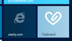
The Windows 8 Start screen is the best place to find and stay connected to all your favorite apps and content. App tiles are alive with activity and show you fresh and tailored content so you know what’s new in your world.
We’ve written about the Internet Explorer 10 browsing experience on Windows 8. This articles shows you how to put your site logo right next to apps on the Windows 8 Start Screen—complete with site-centric visuals and badge notifications to let you know there is new content. I’ll also walk through the few lines of code you need take your site from looking like the left tile…to the right tile here:

Pinned Sites – More than Favorites
Consumers on Windows spend most of their time on the Web and we know from Windows opt-in telemetry (officially, the Microsoft Customer Experience Improvement Program), that they go back to the same set of sites time and again. Pinned sites on Windows 8 make it fast and easy to immediately get to your sites. With badge notifications, site tiles come alive with up-to-date information and help you know when new content is available. Read the rest of this entry »
Fonts. Most people probably don’t give them a second thought. But if you’re a designer, you pretty much view the world through font-colored glasses.
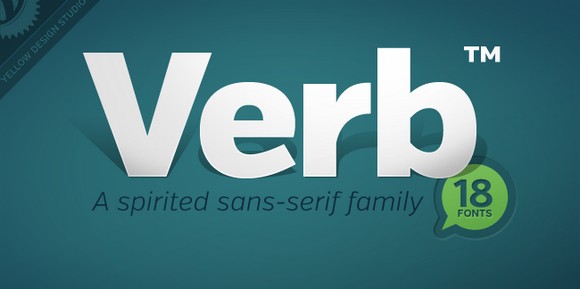
Graphic artists know that the right font can elicit the perfect mood from your users. Finding the right one, however, can sometimes be tricky. If you’re looking for something new, it can be an exhausting hunt. Luckily, you’ve got us on your side! And with this action-packed Mighty Deal from Yellow Design Studio, you can get your designing mitts on the custom-made Verb Font Family, and save money too.
The Verb font family normally sells for $270 (Desktop or Web Font versions), but for a limited time only, you can grab either the Desktop or Web font version of Verb for just $9!. That’s an insane 97% off the regular price.

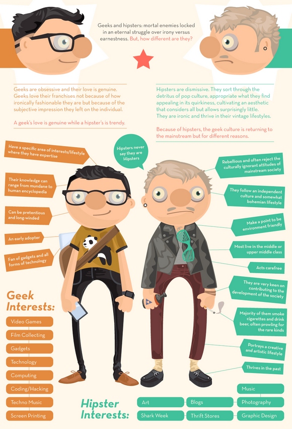
Geeks and Hipsters: mortal enemies locked in an eternal struggle over irony versus earnestness. But, how different are they?
Geeks are obsessive and their love is genuine. Geeks love their franchises not because of how ironically fashionable they are but because of the subjective impression they left on the individual. A geek’s love is genuine while a hipster’s is trendy.
Hipsters are dismissive. They sort through the detritus of pop culture, appropriate what they find appealing in its quirkiness, cultivating an aesthetic that considers all but allows surprisingly little. They are ironic and thrive in their vintage lifestyles. Because of hipsters, the geek culture is returning to the mainstream but for different reasons.
Click to Enlarge

Source: http://www.becomecareer.com/geeks-hipsters/
Web standards are always changing. Like WebSockets, yesterday’s prototypes become tomorrow’s mature standards. One of the latest prototypes that’s gaining momentum in standards bodies is the implementation of the W3C DeviceOrientation Event Specification draft on HTML5Labs.com. This specification defines new DOM events that provide information about the physical orientation and motion of a device. Such APIs will let Web developers easily deliver advanced Web user experiences leveraging modern devices’ sensors.
With the Device Orientation API, developers can explore new input mechanisms for games, new gestures for apps (such as “shake to clear the screen†or “tilt to zoomâ€) or even augmented reality experiences. The prototype’s installation includes a sample game to get you started in understanding the API.
How This Works
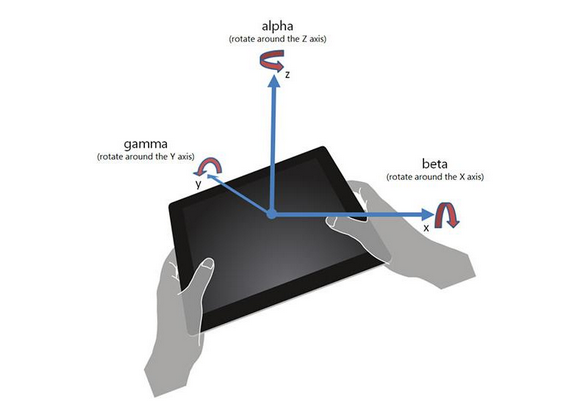
The Device Orientation API exposes two different types of sensor data: orientation and motion.
When the physical orientation of the device is changed (e.g. the user tilts or rotates it), the deviceorientation event is fired at the window and supplies the alpha, beta, and gamma angles of rotation (expressed in degrees):

Read the rest of this entry »
Davin Wilfrid – Product Director/Community Manager, Future Insights
As community manager and event emcee, Davin is in charge of keeping the party going by bringing all the cool content from Future Insights conferences to the Future Insights site.
1. How did Future Insights get its start?
Future Insights started as Carsonified conferences. The founder of Carsonified, Ryan Carson, sold his conference business to focus full time on Treehouse, a fantastic service that teaches you to code through interactive tutorials. Carsonified had produced tech conferences for years, so we’ve still got a ton of institutional memory and the great conference producers who made the Future of Web Design, Future of Web Apps, Future of Mobile, and Future Insights Live conferences a success.
2. How do you differentiate Future Insights and other similar events and conferences?
There are a few ways. First, all we do is produce tech conferences, so we spend 100% of our time researching the right content, finding the best speakers available, and planning things to ensure people get every dime of value for the price of their ticket. Second, the scope of our events tends to be larger than others. Instead of sticking people in one room for two days, we usually plan out two or three (or five, in the case of Future Insights Live) different tracks in different rooms. This gives people more options on site. Third, we professionally record every session at our events, and make them available to attendees after the fact. This way you never really miss a thing.

Read the rest of this entry »
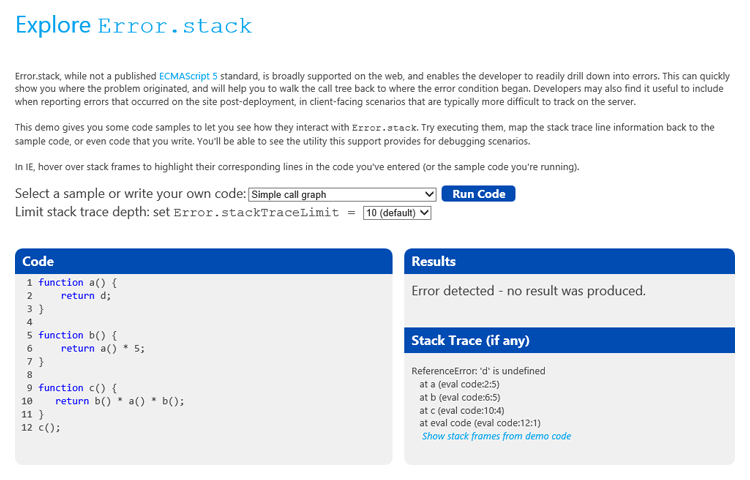
Modern browsers like Internet Explorer 10 support for Error.stack, which enables Web developers to diagnose and correct bugs faster, especially those that are difficult to reproduce. Developers can build amazing apps with the capabilities of Web platforms that power today’s modern browsers as well as apps in Windows 8. The increasing power and complexity of these apps means developers need better tools like Error.stack for handling errors and diagnosing bugs. In this article, I’ll show you some simple debugging techniques to help save you time.

Debugging Applications
Structured error handling in JavaScript rests on throw and try/catch – where the developer declares an error and passes the control flow to a portion of the program that deals with error handling. When an error is thrown, Chakra, the JavaScript engine in Internet Explorer, captures the chain of calls that led up to where the error originated – also referred to as the call stack. If the object being thrown is an Error (or is a function whose prototype chain leads back to Error), Chakra creates a stack trace, a human-readable listing of the call stack. This listing is represented as a property, stack, on the Error object. The stack includes the error message, function names, and source file location information of the functions. This information can help developers rapidly diagnose defects by learning what function was being called, and even see what line of code was at fault. For example, it might indicate that a parameter passed into the function was null or an invalid type.
Let’s explore with an example of a simple script that attempts to calculate the distance between two points, (0, 2) and (12, 10): Read the rest of this entry »
I’m currently spending most of my time explaining to students, hobbyists, professional developers and teachers how to build games using HTML5. I then recently thought: rather than keeping all these details for small audiences, wouldn’t it be smarter to share it with you?
This article is then based on my own experience. I will probably omit some crucial things some of you may know. But it will try to update this blog post along with my own new discovers and of course based on the feedbacks you will kindly provide in the comments or via Twitter.
But why are so many people currently interested in HTML5 Gaming?
Well, simply because today, we can really use HTML5 to target multi-platforms using the same code: for desktop machines of course (with IE9/IE10, Firefox, Chrome, Opera & Safari), for iOS & Android tablets & phones and Windows 8, and its future associated millions of tablets & PC, is also warmly welcoming HTML5 Games! I then frequently see some HTML5 gaming projects ported to each of these platforms with almost no effort.
What’s more, the modern JavaScript engines performance coupled with the GPU hardware-accelerated graphics layers enable us to build great games in HTML5 with confidence.
Note: we will only talk about the <canvas> tag of HTML5 and about SVG in this article.
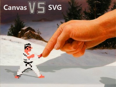
Canvas & SVG: 2 ways to draw on the screen

The first thing you need to understand before building your first HTML5 game is how to draw nice objects on the screen. There are 2 ways to do that and to better understand their differences, you should start by reading this article from Patrick Dengler (member of the SVG W3C Working Group): Thoughts on when to use Canvas and SVG
On my side, I’ve re-used parts of Patrick’s materials to build a 45min internal session for my Microsoft’s colleagues last year. You can watch it via this video I’ve made (using HTML5 <video> of course!): Read the rest of this entry »
