Surviving the Zombie Apocalypse with HTML5 & SVG
As browser adoption of HTML5 continues apace, developers are finding more and more options for creating elegant, highly responsive UIs. In the case of Scalable Vector Graphics (SVG), what’s old is new again, and quite slick.
The SVG spec has been around for a while now. Under development since 1999, the spec, or more accurately a family of specs, describes an XML-based file format for vector graphics. An SVG block defines the individual components of a vector image, such as paths, shapes, fills, strokes and other features. This provides a lightweight option for certain types of graphics that might otherwise have been created in Adobe Illustrator or Inkscape and then exported to a raster format. It also promises a raft of potential functionality in manipulating an image on the fly—hence the “scalable†part of SVG.
With widespread adoption of HTML5 standards, browsers are taking SVG in new directions, such as emphasizing the <svg> tag for inline SVG, using CSS for styling, and opening up the DOM so that SVG images can be created or manipulated on the client side with JavaScript.
To demonstrate, this series of walkthroughs will aim to benefit humankind in two ways. One, it will cover SVG examples that are compatible across browsers, while pointing out some of the differences in SVG adoption. Two, it will more or less accurately predict one’s chances of surviving a zombie apocalypse.
Step One: Prepare
Before starting, it’s helpful to know which browser will be targeted. While all modern browsers have adopted SVG to some degree, its implementation still varies in many ways—some minor, some significant. For example, the Synchronized Multimedia Integration Language (SMIL) spec describes how to animate SVG through the <animate> element. This gives a developer the chance to add both user interactivity and independent attribute changes over time, without ever leaving the <svg> element. Unfortunately, not all browsers yet recognize SVG/SMIL animation (though alternative forms of SVG animation do exist).
“Can I Use…† provides a thorough side-by-side comparison of all major desktop and mobile Web browsers and indicates which of their versions recognize various HTML5 features. Particularly useful is its drill down on specific SVG features, like use of Inline SVG and SVG Filter Effects, which have just been added to Internet Explorer 10.
Step Two: Create the SVG Element
This particular SVG Zombie Apocalypse Survival Predictor will use three separate SVG elements: a pane for the “city,†a control panel for the risk factors, and a pane for the prediction meter itself.
To start, create a 600×400 root element called “cityBoxâ€:
<!DOCTYPE html>

<html lang="en">

<head>

<meta charset="UTF-8">

<title>Planning for the Zombie Apocalypse with HTML5 and SVG</title>

<script>

</script>

<style>

</style>

</head>

<body>

<svg id="cityBox" width="600" height="400">

</svg>

</body>

</html>
Voila. Invisible box. It’s winter in Zombieland. A border can be added through CSS styling, either with the “style†attribute in the <svg> element itself or by defining the style up in the header, thusly:
<style>

#cityBox {

border: 1px solid #000000;

float: left;

}

</style>
Step Three: Add Text
While developers have many ways of handling text on the page, doing it through SVG opens the door to a lot of interesting options, such as changing character offsets, stretching text, rotating sentences or fitting text to a path.
Before trying any of these, though, add a title to the cityBox element:
<svg id="cityBox" width="600" height="400">

<text x="300" y="50">

Surviving the Zombie Apocalypse

</text>

</svg>
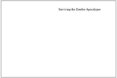
Figure 1: SVG Element with
The x,y coordinates define the baseline of the first character. Remove them from this example, and the text pretty much disappears off the top of the SVG element.
Styling for the SVG text element comes in three flavors: the “style†attribute, a defined style or individual SVG attributes. Note, however, that certain attributes seem to misbehave depending on the method used and the browser. For example, defining “font-family†works for all browsers no matter where it goes. However, “font-size†is implemented inconsistently. Defining it in the <style> header doesn’t work in either Chrome or Internet Explorer. Defining it in the “style†attribute of the element, as in the following example, works in Chrome but not in Internet Explorer:
<text x="300" y="50" id="titleText" style="font-size: 36;">
The only technique that works in both browsers is defining “font-size†as an attribute within the <text> tag. So, for demo purposes, and maximum cross-browser compatibility, that’s how it will be done here.
<text x="300" y="50" font-family="sans-serif" font-size="36" text-anchor="middle" stroke="#000000" fill="#000000">
Note that, as with CSS, stroke and fill colors can use color names or hex values. Also note the “text-anchor†attribute, which defines the position of the text in relation to the x,y origin. Since it defaults to “leftâ€, this example sets it to “middle†and defines the point of origin to be the center of the <svg> element.
Here’s another interesting quirk about “text-anchor†and text in general: if the <text> element exceeds the boundaries of the <svg> element, what happens next depends on the browser. In Chrome, anything outside the edges of the <svg> element is cut off. However, in Internet Explorer, the text extends outside the boundaries of the <svg> element.
Like other vector images, SVG text has both stroke and fill. By default, a <text> element displays a black fill, with no stroke. In this example, a black stroke has been added, as seen in Figure 2. Not only does it thicken the text, but as will be seen later in this series, the color of the stroke can be animated for an interesting effect.
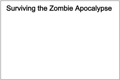
Figure 2: element with formatting
Step Four: Images
While the point of SVG is ostensibly to create graphics, sometimes it’s better to incorporate an existing SVG graphic onto the page rather than create it from scratch. This is especially true when the graphics are being created by vector design software—such as Microsoft Expression Design, Adobe Illustrator, or Inkscape—or when they’re taken from SVG clip art libraries such as Wiki Commons.
The City pane of the Zombie Apocalypse Survival Predictor will eventually display all the elements of a zombie apocalypse. But to start, it’ll have just a single human. A single, terrified human running for his (or her) life. The human in this case originally started in Inkscape and was saved as an SVG file (human.svg). (Note: all .svg graphics files used in this walkthrough are courtesy of http://openclipart.org.)
The <image> element can work in a couple of different ways, one of which is supported across browsers and one of which is not.
First, the easiest method. Within the <svg> element, add the following:
<image id="human" x="275" y="175" width="50" height="50" xlink:href="human.svg" />
This tag adds the svg file referenced externally (“human.svgâ€) and places it at 275,175, which is the center of the city after compensating for image size. Speaking of size, the image is then scaled to 50×50. In this case, it’s not necessary to know the original file size. The image is automatically transformed so that its largest dimension matches the specified parameter, and the other dimension is scaled proportionally. The result should be something like Figure 3.
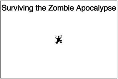
Figure 3. Auto-Scaled SVG Image on Chrome
Unfortunately, it doesn’t always come out like this. In many browsers, such as Firefox and Internet Explorer, the width and height attributes define the view area rather than the image size, with the result being a cropped image starting from the upper-left coordinate, as in Figure 4.
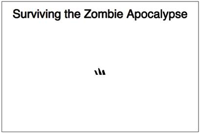
Figure 4. Auto-Scaled SVG Image on Firefox and Internet Explorer
There are a couple of ways to solve this. One is to edit the image itself and resize it to the desired dimension. But this sort of defeats the purpose of using a scalable graphic. So instead, a transform will be applied.
Opening the “human.svg†file in a text editor shows the current image dimensions in the metadata, in this case:
width=”342.70523″
height=”482.82114″
But don’t be fooled into thinking that these attributes can be manually edited and everything will come out right. Not so. Because of the rest of the XML data embedded in the SVG file, changing the width/height metadata will result in an image mask that behaves unpredictably based on the browser.
Instead, use the width and height values to create a new <image> element:
<image id="human" x="2750" y="1750" width="343" height="483" transform="scale(.10,.10)" xlink:href="human.svg" />
In this example, width and height are set to the image’s actual values (rounded). Scaling the largest dimension (height: 483) down to 10 percent creates an image close enough to 50×50. Note, however, that “transform†attributes affect element origin as well. So the original x,y coordinates of 275,175 need to change to 2750,1750 (divide the original value by the scale amount: 275 / .1 = 2750) to maintain the same placement. This results in Figure 5, taken from Internet Explorer.
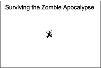
Figure 5: element with transform=scale, as seen in Internet Explorer
Now the panicked little human looks the same in every browser. Or at least every browser tested for this walkthrough.
Step Five: Basic Shapes
Now that some of the trickier stuff is in place, the control panel will go back to the basics that most SVG tutorials start with: simple shapes. SVG defines several shape elements: <line>, <rect>, <circle>, <ellipse>, <polygon> and <polyline>. Entirely new shapes can also be created using the <path> element, as well.
The Predictor Control Panel will consist of triangular “step†controls for scaling quantities, text labels, and a couple of circles with images. To start, create the <svg> element and its style (which has a 1 px border for now for dev purposes).
Under <style> add the following:
#controlPanelBox {

border: 1px solid #000000;

float: left;

}
In the <body> of the page add:
<svg id="controlPanelBox" width="400" height="400">

</svg>
For creating triangles, both the <polygon> and <path> elements work well. The following two elements look identical, as seen in Figure 6:
<polygon points="50,50 100,25 100,75" stroke="black" stroke-width="1" fill="red" />

<path d="M 50 50 L 100 25 L 100 75 L 50 50" stroke="black" stroke-width="1" fill="red" />

Figure 6: <polygon> (left) and <path> (right)
With the <polygon> element, each point in the polygon is defined absolutely and the shape is automatically filled. With the
element, the origin point is defined in the data (“dâ€) attribute as the Moveto (“Mâ€) value. Each succeeding Lineto (“Lâ€) point draws the path, ending with the point of origin. This last point closes the path and creates the polygon shape. Without it, the red fill will still be in the shape of a triangle, but the stroke will be missing its last leg.
One nice trick with paths is that the Moveto and Lineto values can be relative, just by using lowercase instead of uppercase. This allows the path to be moved around easily simply by changing the Moveto value. For example, the following two elements result in an identical shape, also the same as Figure 6:
<path d="M 50 50 L 100 25 L 100 75 L 50 50" stroke="black" stroke-width="1" fill="red" />

<path d="M 50 50 l 50 -25 l 0 50 l -50 -25" stroke="black" stroke-width="1" fill="red" />
For this reason, while polygons are generally easier to create, relative paths make more sense for the control panel. Several triangles will be used, so two versions can be created (mirror images), then copied and repositioned just by changing M values.
Each set of controls will also have a couple of <text> elements to serve as a label and a text field. The latter of these will be modified through JavaScript later in this series based on interaction with the controls.
So for the first parameter in the control panel, the existing human population, the set of elements should look like this:
<path id="zombieLess" d="M 50 50 l 50 -25 l 0 50 l -50 -25" stroke="black" stroke-width="1" fill="red" />

<text id="zombieLabel" font-size="15" font-family="sans-serif" text-anchor="middle" fill="red" x="175" y="25">

City Population (000s)

</text>

<text id="zombieText" font-size="25" font-family="sans-serif" text-anchor="middle" fill="black" x="175" y="60">

0

</text>

<path id="zombieMore" d="M 300 50 l -50 -25 l 0 50 l 50 -25" stroke="black" stroke-width="1" fill="red" />
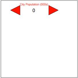
Figure 7: controlPanelBox element with City Populaton control
As an added bonus, elements can be nested within a Group <g> element. The group as a whole can be named, styled and manipulated, with the results being applied to each member of the group. In this case, each control will be grouped just for organization.
Thanks to relative path definitions, a quick copy and paste creates the start of two identical control sets. After changing the Moveto points, origins, ids and text content, the page now has three Step controls:
<g id="zombieGroup">

<path id="zombieLess" d="M 50 50 l 50 -25 l 0 50 l -50 -25" stroke="black" stroke-width="1" fill="red" />

<text id="zombieLabel" font-size="15" font-family="sans-serif" text-anchor="middle" fill="red" x="175" y="25">

City Population (000s)

</text>

<text id="zombieText" font-size="25" font-family="sans-serif" text-anchor="middle" fill="black" x="175" y="60">

0

</text>

<path id="zombieMore" d="M 300 50 l -50 -25 l 0 50 l 50 -25" stroke="black" stroke-width="1" fill="red" />

</g>

<g id="mallGroup">

<path id="mallLess" d="M 50 150 l 50 -25 l 0 50 l -50 -25" stroke="black" stroke-width="1" fill="red" />

<text id="mallLabel" font-size="15" font-family="sans-serif" text-anchor="middle" fill="red" x="175" y="125">

# of Shopping Malls

</text>

<text id="mallText" font-size="25" font-family="sans-serif" text-anchor="middle" fill="black" x="175" y="160">

0

</text>

<path id="mallMore" d="M 300 150 l -50 -25 l 0 50 l 50 -25" stroke="black" stroke-width="1" fill="red" />

</g>

<g id="redneckGroup">

<path id="redneckLess" d="M 50 250 l 50 -25 l 0 50 l -50 -25" stroke="black" stroke-width="1" fill="red" />

<text id="redneckLabel" font-size="15" font-family="sans-serif" text-anchor="middle" fill="red" x="175" y="225">

Rednecks

</text>

<text id="redneckText" font-size="25" font-family="sans-serif" text-anchor="middle" fill="black" x="175" y="260">

0

</text>

<path id="redneckMore" d="M 300 250 l -50 -25 l 0 50 l 50 -25" stroke="black" stroke-width="1" fill="red" />

</g>
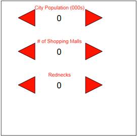
Figure 8: controlPanelBox element with relative <path> elements
For the last set of controls, this app needs the most basic shape of all: the circle. A <circle> element works by defining three primary attributes: center-x (“cxâ€), center-y (“cyâ€) and radius (“râ€). By default, fill is black and the stroke doesn’t exist. But
since this is a toggle control, the current selection will be indicated by a thick, red stroke, while the inactive selection is a thin, black stroke. Both of them have a white fill, forming a circle that can potentially hold an image. Or a zombie.
<circle id="slowCircle" cx="75" cy="325" r="40" stroke="red" fill="white" stroke-width="4" />

<circle id="fastCircle" cx="275" cy="325" r="40" stroke="black" fill="white" stroke-width="2" />

Figure 9: Zombie Circles
The zombie image is handled the same way as the human image was—dimensions are defined as the actual dimensions of the graphic, then a “transform†attribute is applied to scale it to .16 of the original size. This scale applies to the x,y origin as well. Also, because SVG elements are rendered in order, the images need to appear after the circles:
<circle id="slowCircle" cx="75" cy="325" r="40" stroke="red" fill="white" stroke-width="4" />

<image id="slowZombie" x="375" y="1875" width="175" height="304"

transform="scale(.16,.16)" xlink:href="zombie.svg" />

<circle id="fastCircle" cx="275" cy="325" r="40" stroke="black" fill="white" stroke-width="2" />

<image id="fastZombie" x="1630" y="1875" width="175" height="304" transform="scale(.16,.16)" xlink:href="zombie.svg" />

Figure 10: Zombie Circles with Zombies
Lastly, a label/text field pair are added, and the whole thing is grouped:
<g id="speedGroup">

<circle id="slowCircle" cx="75" cy="325" r="40" stroke="red" fill="white" stroke-width="4" />

<image id="slowZombie" x="375" y="1875" width="175" height="304" transform="scale(.16,.16)" xlink:href="zombie.svg" />

<text id="speedLabel" font-size="15" font-family="sans-serif" text-anchor="middle" fill="red" x="175" y="315">Zombie Speed</text>

<text id="speedText" font-size="25" font-family="sans-serif" text-anchor="middle" fill="red" x="175" y="350">Slow</text>

<circle id="fastCircle" cx="275" cy="325" r="40" stroke="black" fill="white" stroke-width="2" />

<image id="fastZombie" x="1630" y="1875" width="175" height="304" transform="scale(.16,.16)" xlink:href="zombie.svg" />

</g>
At this point in its development, the Zombie Apocalypse Survival Predictor should look like Figure 11.
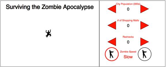
Figure 11. Completed Zombie Apocalypse Survival Predictor (thus far)
What’s Next
Obviously, anyone using the Predictor in its current state would be dead meat. Or undead meat as the case may be. Or just food. The next steps in this series will build on existing controls covered here by adding a pane for the prediction scale, some animation and some JavaScript to make buttons do things.
In the meantime, the project thus far can be viewed at: http://justinwhitney.com/zombies/zombies_part1.htm
Additional examples of SVG in action can be viewed at:
SVG Filter Effects in Internet Explorer 10
About the Author
Justin Whitney builds Web sites and mobile apps in a bunker in rural East Texas while prepping for the end of civilization.


