CSS Units of Measure: Going Beyond the Pixel
Working with CSS in Web documents, we often find ourselves using the fundamental screen unit, the pixel—a square, nondivisible part of every display device (well, visual screens anyway) that distributes little sources of light in a regular, perpendicular grid.Because the majority of Web developers’ work focuses on creating pixel-perfect manifestations of designs delivered in pixel-based, noninteractive image formats, we tend to forget that the Web offers more than just pixel values for expressing lengths and sizes with CSS. This knowledge is fundamental for dealing with responsive Web design, where understanding how CSS length units work is crucial to correctly assigning sizes to objects and aligning elements on the page.
In this article, I’ll look at these units of measure and describe how they behave and apply to elements in documents. (Keep in mind that a fair bit of book typesetting is done in CSS as well, so it’s not just HTML documents we’re dealing with.)
Relative vs. Absolute Units
In terms of measurement, every length is expressed in relation to some basic unit. All measurement systems provide a standard set of units with which to compare and calibrate all other units and measurement devices.
Units (as far as CSS goes) can be absolute or relative, depending on whether their basic unit depends on the context within which it’s used. For computer displays, the basic unit is the pixel, to which all other units are recalculated when objects are finally rendered to the screen. Although the pixel is treated as a relative unit, it is nevertheless dependent on two parameters: the screen’s physical size and its resolution. I’ll cover how pixels relate to physical units later in the article.
Other units, such as percentages (denoted by the % symbol), are dependent on the context of their use. They can express a proportion of a container’s width or height or a proportion of the current font size or line height.
First, let’s cover absolute CSS units.
Absolute CSS Length Units
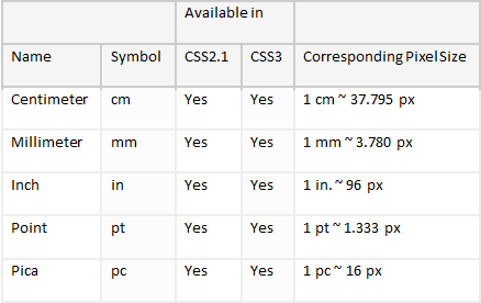
Absolute CSS units (see Table 1) express a length that is not dependent on the context of use—an inch is an inch, regardless of where it is measured. There is, however, a discrepancy that you should be aware of when you’re using nonpixel absolute units, and that is display pixel density.
Table 1 Available CSS Absolute Units

A display has an inherent property that is measured in pixels per length unit. The convention is to use the inch as the basic unit of length to measure the number of pixels that fit inside a display (expressed as dots per inch, or DPI). As you might guess, different displays have different pixel densities.
A typical HD TV display has a resolution of 1920 × 1080 pixels and (for the sake of this example) a physical size of 40 × 22.5 inches. Taking either dimension and dividing the pixels by the length, you get the display’s DPI:
1920 px / 40 in. = 48 DPI
A low DPI value such as this tells you that the pixels on this display are rather large, because a TV is meant to be viewed at a distance, which makes the pixels appear smaller than they would at arm’s length.
In contrast, mobile devices are meant to be viewed at less than arm’s length, but they still need to fit in the palm and pack enough resolution for characters to be legible—or else they risk having to expose the user to keyhole browsing because of the extremely low pixel resolution, which forces the user to scroll across the document instead of enabling him to see the whole block of text.
The current spur of growth in high-end, high-performance mobile devices has culminated in high density display in use on various Windows Phone, Android and iOS devices, of which the Retina display is one of the earliest examples of high-DPI displays. Its original resolution was 960 × 640 pixels, and it had a diagonal size of 3.5 inches, which makes its pixel density 326 DPI. Comparing this value to the one calculated for the TV, you can see that the mobile device has almost seven times as many pixels per inch as the TV.
If you know a display’s DPI, you can calculate the length in pixels by multiplying the length by its DPI. Say you have a cropped image that’s 2 × 1.5 inches and want to display it on the TV:
2 in. × 48 DPI = 96 px 1.5 in. × 48 DPI = 72 px
A 96 px × 72 px image on the TV would cover only a tiny portion of the display area, but it would be rendered true to its physical size. On the other hand, rendering the same image on the Retina display gives a very different result:
2 in. × 326 DPI = 652 px 1.5 in. × 326 DPI = 489 px
Judging by the pixel sizes, the object displayed on the Retina display would render at 6.8 times the size of the object on the TV. But, interestingly, the object would render at the same physical size on both displays.
Yet, when you specify absolute units in Web pages, you often (if not always) get different results. A centimeter-wide image is rendered at different sizes on different devices. It appears large on TVs and small on mobile devices. Two reasons account for this: one is historical, and the other is readability.
In terms of readability, it wouldn’t make sense to display documents at their true physical sizes on different size screens, since that would imply that you were reading them at the same distance. Also, the pixel density would make documents displayed on larger devices seem blurred while, conversely, rendering the same document on smaller devices takes too much space.
To overcome this, early operating system developers adopted a fixed DPI value that would map absolute units to pixels directly, ignoring the real DPI value of the device. Apple first adopted a DPI value of 72, while Microsoft opted for 96. Eventually, everyone adopted 96 as the norm, including for browsers.
This fixed value applies only to display screens (media types such as those designated by the keywords screen and scan), however. Printer devices do apply correct absolute units, so it’s safe to assume that a print layout will print exactly as it is laid out, regardless of the printer type and make.
Relative CSS Length Units
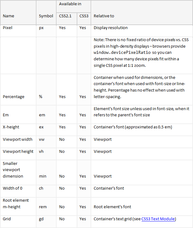
In contrast to absolute units, relative units in CSS (see Table 2) have no fixed values with which to be compared. Some are relative to the container they’re used in, others to the display properties (viewport width and height). The only relative unit that is consistently rendered at the same size across different browsers and displays is the pixel (a white lie, it turns out, when dealing with high-density displays, discussed later).
Table 2 CSS Relative Units and Their Relation to Reference Elements

Pixels (px)
The px unit is always relative to the physical pixel on the given display device. A 20 px × 20 px rectangle will always be rendered at the same pixel sizes, regardless of the display type.
Retina and high-end Android displays render all Web pages at some multiple of their pixel resolution. To take full advantage of the display resolution, you can use oversize images and scale them down to make them appear sharper on such devices.
The Apple Retina display, for example, exactly doubles the DPI value of the screen in previous-generation iPhones. The browser renders all pixel dimensions at double the size, displaying a 20 px ×
20 px rectangle at 40 px × 40 px to offset the higher pixel density (at 1:1 zoom, pinch-zooming a web page skews this ratio).
Other device manufacturers have followed suit with their own offering of high-density displays, especially on high-end Android devices, where pixel densities vary considerably, running the gamut from 100 to 350 DPI. As a consequence, browsers on these devices adopt these values to stick to one of the common viewport widths on an otherwise arbitrarily wide screen. You can detect the device pixel vs. CSS pixel ratio by reading the window.devicePixelRatio property in JavaScript or using the DPI media query, enabling you to set additional CSS properties to .
It follows that pixels on the Web almost never render at their device pixel’s size and should be treated as a relative unit. There is, however, an upper limit to how dense the pixels will be packed in future devices—the human eye is generally unable to resolve individual pixels above 300 DPI at arm’s length, which is the expected viewing distance for such devices anyway. Currently, future devices aren’t expected to increase resolution in this respect, since there would be no noticeable increase in display clarity.
Percentages (%)
Percentages are probably the most well known of the units used in Web design, leveraging the power of proportions to reflow documents according to the space available to render them. Percentages are used most extensively in fluid Web page layouts where one size (tries) to fit all by defining proportions relative to their container or inherited font size.
It is a simple unit to understand: when you are working with box-model dimensions, the unit is relative to its parent’s dimensions. By default, this size includes the content box and excludes padding and border sizes.

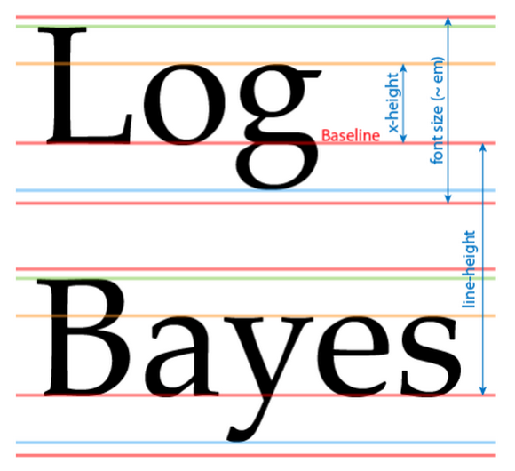
Figure 1 Font metrics mapped to CSS attributes
When you are using the unit with typography-related dimension attributes, a different handling logic is required for each of the attributes (see Figure 1 for attribute reference):
- font-size: Relative to the inherited font-size
- line-height: Relative to the current element’s font-size
- letter-spacing: Has no effect
When you define line-height, be aware that it’s always relative to the current font size, not it’s container’s line-height:
p { font: normal 16px/200% serif }
The preceding example evaluates line-height to 32 px, regardless of its container’s line-height.
Ems (em)
Ems is a handy typographical unit that takes its measure from the current element’s font-size. Historically, this unit was used to express dimensions relative to the width of a font’s letter M (minus its kerning), but it has evolved to encompass non-Latin scripts and is now an arbitrarily defined unit, set by the designer and coded into the font itself.

Figure 2 Two Fonts Rendered at the Same Size and Aligned Along the Baseline (left: News Gothic, right: Garamond)
At a given absolute size, a font’s apparent height might differ between font faces (see line-height in Figure 1). This effect is purely visual though, because the vertical measure (baseline positioning) doesn’t change when font faces are changed. (See Figure 2.)
When ems are used on the root element to define font-size, size is relative to the initial value—in other words, the browser’s default as set in the preferences dialog in the user’s profile.
As with percentages, the context of use for ems depends on which CSS attribute you are using it in. For every attribute this unit always relates to the current element’s font-size. The exception is font-size itself, which always refers to its parent’s font size.
X-Height (ex)
A similar unit to ems, ex denotes the height of the X character for the current font. This value is also defined by the font itself, but it is currently estimated by browsers to be one half of an em.
The same rules apply to ex as for em, so check the previous list of exceptions.
Viewport Width (vw) and Viewport Height (vh)
If you’ve ever tried to use elements dimensioned relative to the viewport size, you’ve basically been limited to two options: attaching elements as direct children to the element and sizing using percentages or using percentages on all elements and then calculating the inverse to compensate for the reductions.
To enable the use of viewport-relative sizes, you can use vw and vh in any element, no matter how deep within the hierarchy. The unit will always represent a percentage of the current viewport. For example, to create a box that is 50 percent of both the viewport width and height, simply use:
#mydiv { width: 50vw; height: 50vh; }
In contrast to percentages, the sizing context for viewport never changes, which means it’s safe to use this unit anywhere without fear of its size changing because of inherited sizing.
Smaller Viewport Dimension (vmin)
This unit behaves exactly as vw and vh, but with a twist: it equals whichever is the smaller of vw or vh. To illustrate this principle, take a simple div and apply the vmin unit to its dimensions:
#mydiv { width: 100vmin; height: 100vmin; }
Declaring width and height this way yields a square that exactly fits the viewport and never has its contents clipped, effectively making this the largest square that fits inside the viewport.
Width of 0 (ch)
This is a typography-related relative unit that doesn’t measure the height but rather the width of the character 0 (the number zero). If the current font family doesn’t contain the symbol, it takes the average width of all characters. The specification is currently a bit fuzzy about how this value should be measured, so it recommends taking the default value of 0.5 em when the 0 symbol is not present in the font.
The ch unit is very useful for defining horizontal typographical grids because multiples of this unit roughly correspond to the width of a string of the same number of characters. Here’s an example column that contains roughly 40 characters per line:
#mycolumn { width: 40ch }
Root Element m-height (rem)
Sometimes it’s useful to refer to the original font size somewhere deep inside the hierarchy and express font sizes using the root element. To address this use case, you can use the rem unit, which always refers to the font size in <body>:
#mydiv { font-size: 2rem; }
The text within this element will always be set at twice the size of the text of the <body> element, regardless of where inside the DOM you put it.
On Compatibility
CSS3 is no different from other cutting-edge technologies. While browsers are slowly implementing features and aspects of CSS3, some of the units I’ve described have been on the backburner of the features implemented. Currently, the browser that supports the most of the length units described in this article is Chrome, which supports vw, vh and vmin in a March 2012 changeset. Internet Explorer support has also improved significantly, as IE9 and later provide support for vw, vh and rem, as shown here. Also, Gecko has supported the rem unit since version 1.9.2.
Until we see wider support in other browsers, I’m afraid you cannot use these units with fallbacks because the behavior of these units prohibits you from emulating them by using other units without using JavaScript. Even so, responsive design and progressive enhancement will allow you to rely on sensible defaults and alternatives in case these units are not available by simply providing an alternative size declared before any use of an unsupported unit, for example:
#mycolumn { width: 320px; width: 40ch; }
In this case, the browser that doesn’t understand these units will use the previously declared value instead. Since some of the preliminary implementations of these units behave differently among
browsers, you should test these features extensively to see where fallbacks and workarounds are necessary.
For more information regarding CSS3, have a look at the supplementary content attached to this document.
About the Author
Klemen SlaviÄ is a front-end engineer at Celtra Inc., working on the company’s self-service ad Web application and mobile runtimes. He currently holds MCT and MCPD Web certifications and is also an ACE in Photoshop. He’s a strong proponent of open Web technologies.
He started programming in 1996, working his way up from writing fractal renderers in Logo and BASIC into the Windows environment with Visual Basic 6 and eventually moved to the Web. He fell in love with HTML, CSS and JavaScript, which is currently his primary career and hobby focus.
In his free time he likes to keep on top of various emerging Web technologies, closed and open-source alike, and enjoys working on media-rich projects and performances. To get a birds-eye view, head over to his about.me page.


