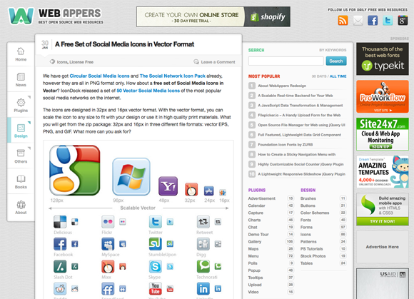
WebAppers Redesign Updates #1
First of all, thank you very much for all of your opinions and suggestions about the redesign. You guys have pointed out some of the most important things I missed when designing. Most of them are very useful and helped me improved the new design dramatically.
Sticky Navigation Menu No Longer Sticky
I have now set the navigation menu on the left hand side to be fixed position. A little Up Arrow button will be appeared when you scroll, so that you can quickly go to the top of the page if needed.
#05-12-2012 Update
The Navigation Menu is now sticky again, but used simple CSS: Fixed Postion instead. So it still follows your scroll but in a smooth way.
Content Area is Bigger than Ever
The content area is bigger for larger screens now. I have set the font size bigger, so it makes the content area more stand out. I have also made the sidebar background a bit darker, so that it won’t distract you from reading the content.
Better Contrast
The color of headings and titles are changed. It makes better contrast for them with the text of the content. And it’s more comfortable reading the text now. The links are now more obvious and visible too.
CSS Image Sprites
This should be the biggest mistake I have made. Preloading images for mouseover images on navigation menu did not work very well apparently. I have used CSS Image Sprites for mouseover images for navigation menu and most popular section now.
Still Responsive
It’s still a responsive design. You can always test it out in browser with different resolutions: 1280px, 1024px, 800px, 600px and 320px.
There are other bits and pieces I have made changes. Added the small indication for sub menus and etc.


