Tips on developing creative websites that will wow your clients
Web designers: we’ve got fabulous news for you.
With the global market expanding without limits, clients are more demanding than ever before. They understand that the highly competitive business realm requires creative websites. That’s good news: as competition increases, web development projects become more challenging. That’s good news for Be Theme too as it is the largest and extremely versatile.
It’s important to realize that the high level of competition demands creative websites for the most demanding eyes. They clearly understand the need for websites that are flexible and conversion-optimized. That’s more good news: This is your opportunity to wow these clients by building great creative websites for them.
Bonus GREAT news: Below you can find the 5 simple steps to creating a website that’s both eye-catching and built to convert visitors into users.
5 steps to building astonishing creative websites
Step 1: Choose a mesmerizing color palette
When it comes to creativity, choosing a color palette needs to follow a few simple rules:
- it needs to attract attention instantly
- it needs to be on-brand
- it needs to visually support the messages
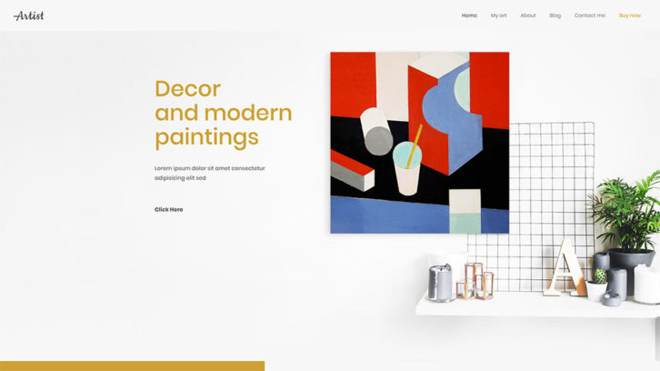
Artist has BOLD color touches that instantly attract attention.
You can find another great example of the eye-grabbing color palette on this pre-built website included in Be Theme.
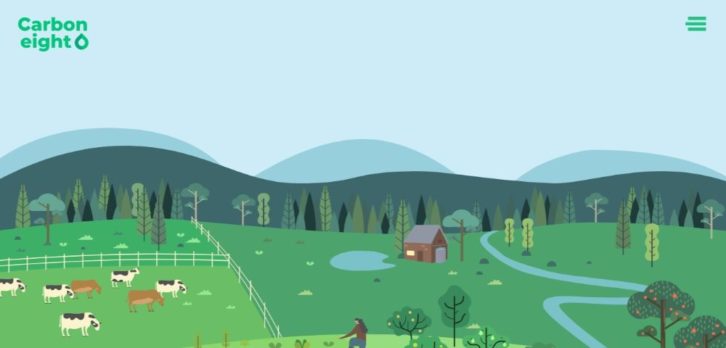
Carbon8 does a great job at aligning the color palette with its brand – deep green and shades are abundant (and makes for a visually memorable website).
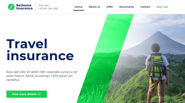
BeInsurance uses a subtle, crisp color palette. It is perfect for reinforcing their message: Give crisp, clear images to gain the clients you need.
And if you’re looking for a color palette that appeals to a larger audience, BeFestival can be a perfect example.
Step 2: Display crystal-clear pics
This one should be a no brainer.
People want to know EXACTLY what your business offers them. It’s not just a matter of “I like it†or “I’m not a fan of bright-colored iconsâ€.
The clear presentation allows your clients to present their products and services with flair and clarity. They need that extra edge compared to all the existing competition they are up against.
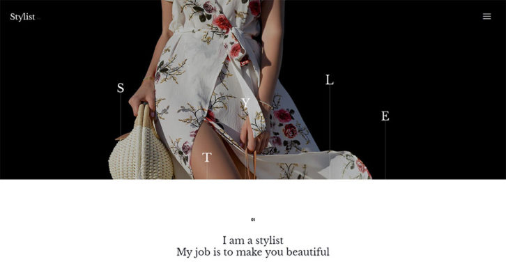
BeStylist proudly displays images with flair. Just by looking at these images, you can tell how easy it is to use and you can even figure out how the color codes work.
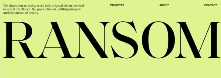
You can do a similar website with RansomLTD. It is a pre-built website designed from scratch to display High-Density digital images. (there are SO many of them out there in dire need of a better website).
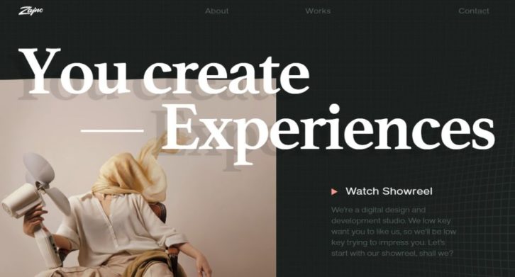
But you can also choose a more general pre-built website like Zajno to display crystal-clear pics to display your creativity.
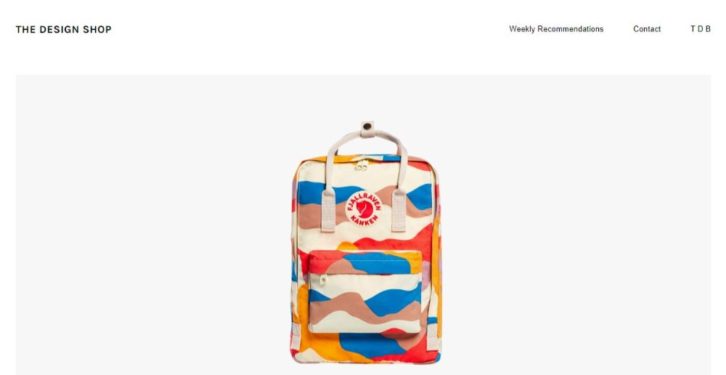
The Design Shop displays your products with flair and creativity. It allows visitors to have a pictorial view of your products — compelling and crisp.
Step 3: Show visitors how your creativity benefits them
Showing people how your creativity serves them is a powerful tactic. It helps visitors imagine themselves as actual customers.
BeMarketing has a video on the homepage that shows how people will benefit from the practical elements of your products.
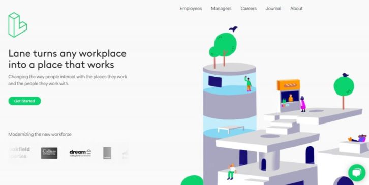
Lane displays the flexibility and functionality of workplace design. A fabulous way to express your structural designing perspectives.
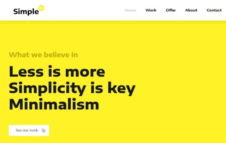
BeSimple has a minimalist view with just the right graphics and pics. It’s more than text and offers a better view.
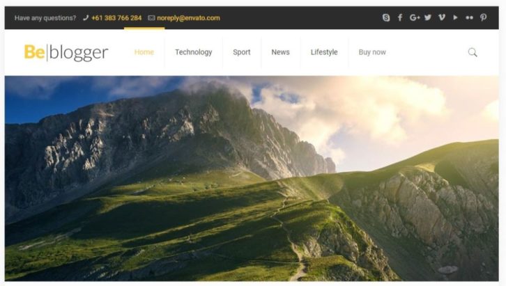
BeTravelBlogger is a travel blogger’s dream. Present your travel escapades with a great layout of graphics and snippets.
Step 4: (Over)use “white†space
White space is the #1 visual element you need to have on your website. That means you need as much space as possible to highlight your creativity.
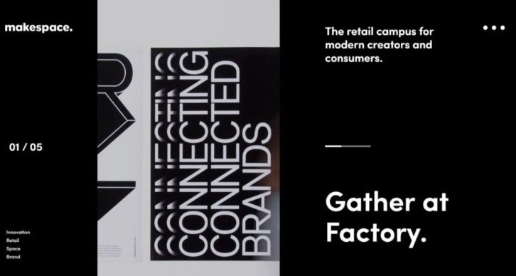
Makespace lets you imagine and create. It has a clean design that allows the eye to focus on the most important elements.
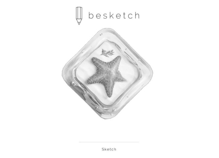
You can create a similar creative website with BeSketch or The Drive New York. These are pre-built websites where white space is used to enhance the experience and emphasize the critical elements on the page.
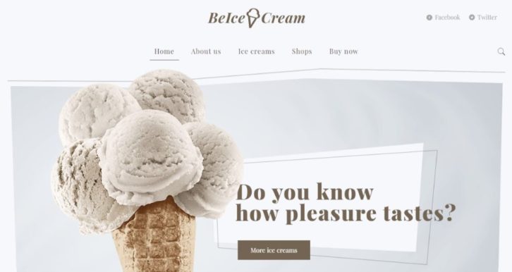
BeIcecream is perhaps THE most extreme when it comes to white space. It’s part of their brand and it drives the message home like none other.
Step 5: Make your CTAs grab them by the eyeballs
If you want the website to convert visitors into users, then you need CTA buttons they can’t ignore. You’ve got to make the big, bold, and brighter than the sun—this way, you get their attention and compel them to click.
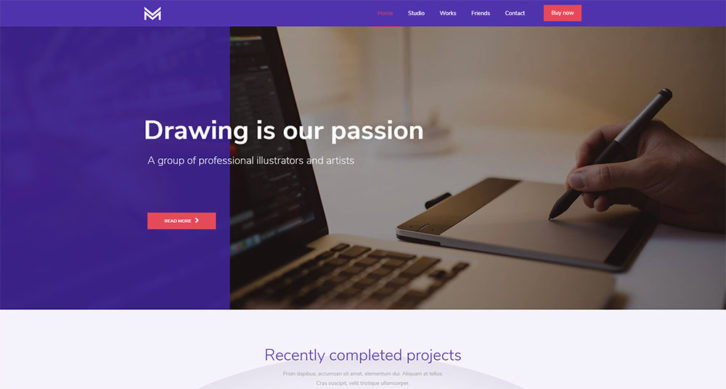
BeDrawing has a CTA button clearly stands out above the fold: it’s got a bold color, big enough to draw your attention to it the second you’re done reading the headline. It’s centered on the page (acting like a “gate†that you need to click to move forward).
Stuart uses clearly defined buttons for the CTA (the one you want your visitors to click).
Another way to direct attention to your CTA is to have it match other elements on the page. A great example is BeKids, where the blue of the CTA button matches some of the visual elements in the hero section.
Conclusion on these creative websites
These are just a few surefire steps and ideas to build creative websites that are both eye-catching and built for conversion. Follow these simple tactics to create a website that attracts attention with stunning visuals and clever white space. Also persuades the right people to use the services and products you offer.
However, if you have to juggle multiple projects and you’re under a tight deadline, you can safely use a pre-built website. Make sure that it is built from the ground up specifically for your creative businesses.
You’ll find the most generous gallery of creative websites on Be Theme – over 450+ pre-built websites to choose from and customize to your liking.
These pre-built websites are both functional and visually impressive. They have interactive elements, stunning effects, and intuitive navigation. All you need to do is personalize it to fit your business and you’re good to go!


