15 Examples of Cool One-Page Websites & What Makes Them Special
Creating a single-page website should be easier than building an X-page website. Right?
Not exactly.
In fact, the opposite is true. Getting your message or messages across using multiple pages requires some effort. This is if you’re going to get it right. Getting your message across on a single page requires more than “some†effort. It can be a genuine challenge.
It’s really a matter of putting a lot of good information into a small space; without cramming or crowding.
These 5 critical elements are designed to guide you through the process. You’ll find where white space can be your friend. You will see which navigation types engage visitors, and which scare them away – and more.
5 Critical Elements that Can Make or Break Your Design
#1 Identify the GOAL and Work Toward It
Kicking off your design effort before identifying your one-page website’s goal? It is a classic example of putting the cart before the horse. Set the goal first, and then plan and create a design that will achieve it.
There may be an occasional (read that, rare) exception when a one-page website is designed to satisfy more than a single goal. In general, you want to stick to a single goal for your one pager, and a single goal only.
What is your goal? Is it
– to sell something,
– to present a portfolio,
– to announce an event,
– or, something else?
If you have a firm goal on mind, your project will stay on track. You’ll avoid doing dumb things like designing a page that takes forever to load. Forever being anything > 10 seconds.
Several examples:
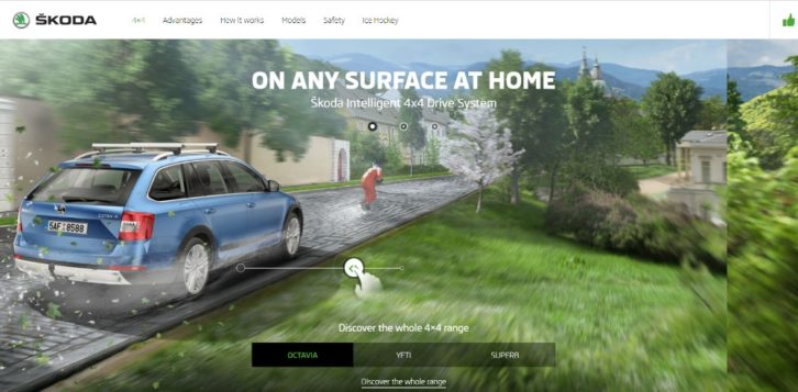
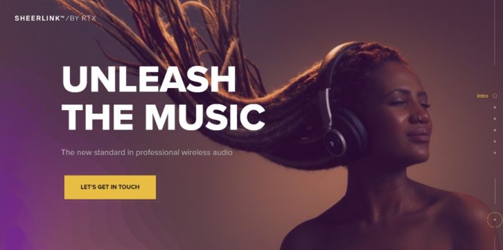
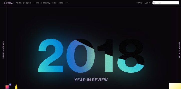
This website features a cool interactive effect above the fold that’s been carefully designed so as not to drag down the load speed.
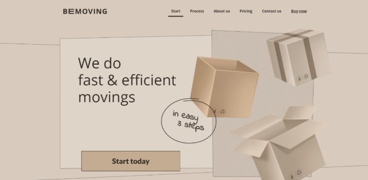
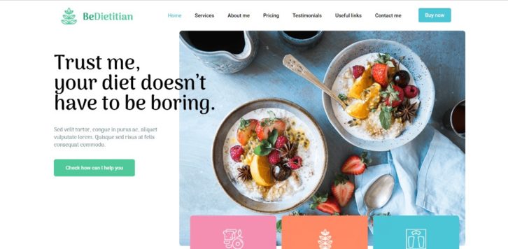
This Be Theme pre-built one-pager tricks you by featuring a static image that appears to be dynamic; thereby avoiding a load speed issue.
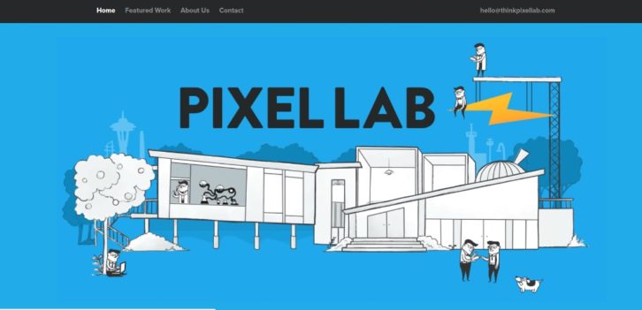
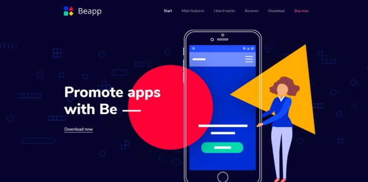
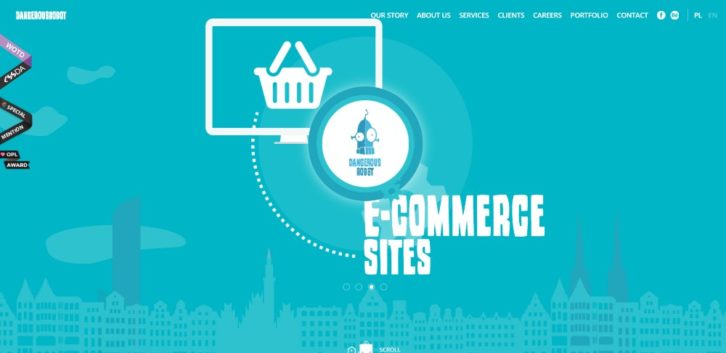
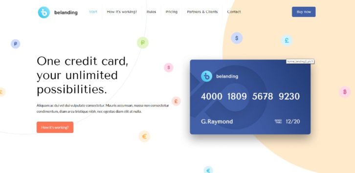
Tiny animated items liven up this page’s illustration without slowing anything down.
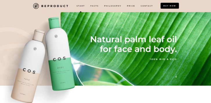
Try avoiding fancy stuff. A page’s fresh look may be all you need to make a great selling point.
Here’s an excellent example of the power of large engaging images and sliding panels.
A dry, lengthy technical dissertation is a poor way to promote an app. A cool presentation like this one will do the trick.
#2 TEXT: Keep Text to the Minimum & Make Sure It’s Easy to Read
Clunky blocks of text will cause many of your site’s visitors to head for the hills. They didn’t come to read a novel. Bold headlines, bullet lists, concise paragraphs, and images are best. Most people still like to see colored pictures in their reading material.
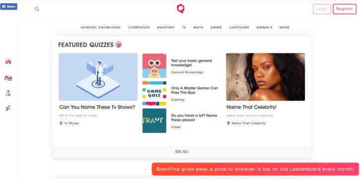
This website is so entertaining and engaging that you might choose to go through it a second time; or a third or fourth.
Neat organization coupled with a one-pager’s fresh look, can be all it takes to make the sale.
The key information is above the fold, and bullet lists help to keep the message concise and straightforward.
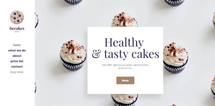
Do you have a sudden urge to eat a cupcake? Enough said.
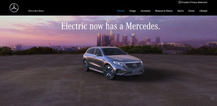
When you advertise a vehicle with the stature of a Mercedes, you can focus less on text and more on high quality imagery.
#3 VISUALS: Identify the Right Patterns & Use Negative Space Wisely
Establishing a good flow isn’t always easy. It can be helpful to know that people generally scan an image in a Z pattern and text in an F pattern.
Knowing this can help you decide on text and image placement. This will do a good job of guiding a visitor’s attention to the critical stuff.
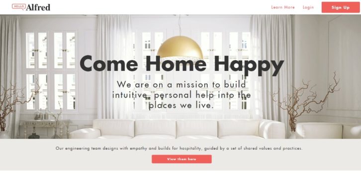
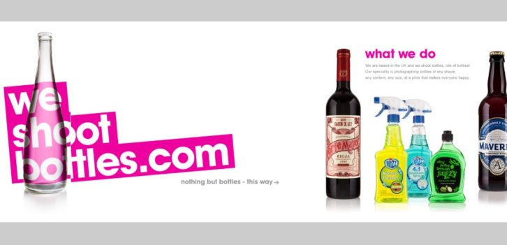
This website illustrates how white space, when properly used, gives a sense of order.
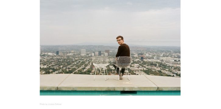
This website uses white space as a canvas, upon which is placed this wildly creative content.
This pre-built one-page website uses white space to maintain a sense of order. The white space also makes the various sections appear to pop out.
Here’s how you can use a mix of different design principles to create an amazing visual splash. Creating a design like this is not necessarily as easy as it looks – but you can do it.
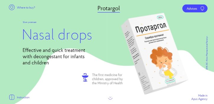
Have you been assigned to produce a page promoting nasal drops that will generate excitement and sales? Here’s one that breaks the mold with an ingenious mix of animations, slides, and a generous use of white space.
#4 NAVIGATION: Making It Easy to Navigate & Entertaining to Scroll
Navigation involves getting from here to there. What could possibly go wrong? As it turns out, plenty could go wrong on a one-pager.
Alternative navigation is the key. Use clicks instead of scrolling, and when scrolling is called for, make it auto scrolling. You’ll have happier users (some of whom will even feel a sense of power when using auto-scrolling). Make good use of stick menus and sidebar menus too.
This website puts these 3 auto-scrolling links to practical use.
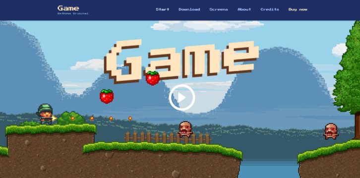
The Be Game pre-built website’s navigation experience is quite entertaining.
This pre-built website demonstrates how to scan a page with 3 mouse scrolls.
Placing a menu on the top and one on the left is a good way to help a visitor navigate your site.
#5 CALL TO ACTION: Identify the Type or Style of CTA You Want. and Don’t Hesitate to Use It
We addressed the need to work to a goal in #1. This is the final step. Your visitor has come this far, and you want your goal to be achieved. It’s not all that hard. Place your CTA button above the fold and make sure it stands out.
A single CTA button may be all you need since your one-pager has a single goal. But there are times when you may need to or more, e.g., “Learn Moreâ€, multiple products or plans.
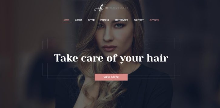
In Be Hairdresser, the CTA button is properly placed above the fold. You’ll also see one in the menu.
These two CTA buttons are placed above the fold to give users a choice.
This site uses a simple opt-in form with a CTA button you can’t miss.
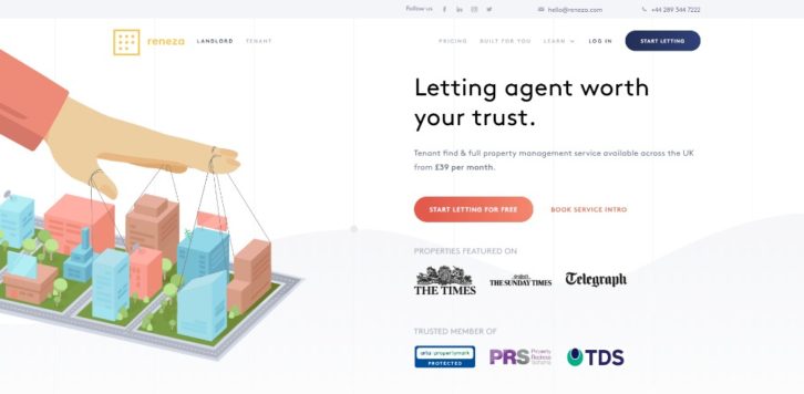
Reneza uses CTA buttons judiciously and with an appropriate choice of colors and text sizes.
Wrapping It Up
It’s one thing to understand the importance of these 5 critical elements of one-page website design. When the going gets tough however, it can be quite something else when you’re trying to put them into practice. You may find yourself tempted to cut corners.
This can be especially true when you start mixing them; in which case you might find a shortcut appealing:
The shortcut in question? Use pre-built websites. They’ve already incorporated these 5 critical elements.
Be Theme is a great resource. Its huge library of 400+ pre-built websites feature more than 60 one-pagers. Each of which you can easily customize to fit your needs.


