15 Fresh Pre-Built Websites for Web Designers & Their Small Business Clients
Freelancing is not always a bed of roses. Freelancers enjoy more freedom in terms of their work habits, but that freedom can come with a price. They often face challenges that office-bound workers tend to avoid. More specifically, distractions and occasion lapses in discipline and self-control.
If these challenges are not faced head-on, a lessening in productivity can result. And this can lead to extended work hours, reduced income, or both.
Today, we are offering tips designed to help a web design freelancer meet and overcome these challenges, while enjoyiing a boost in productivity.
Tip #1) Get your projects off to a quick start with the latest Be Theme pre-built websites.
Don’t start from scratch like these guys who invented a new way of designing websites.
Be Themes’s pre-built websites make it possible for you to turn out work of the highest quality, and save a ton of time in the process. You can, for example, skip wireframing, prototyping, and best of all – coding.
Pre-built websites are quick and super easy to install, as you can see by watching this cool 40-second video.
One more advantage: you won’t end up looking like these guys!
15 new pre-built websites for small businesses
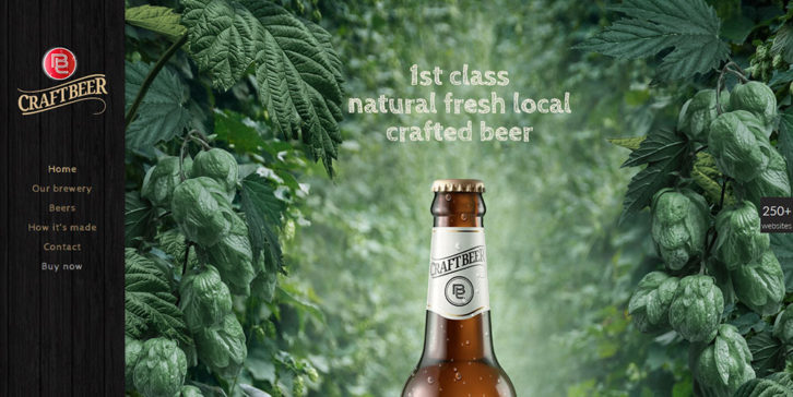
This Craftbeer pre-built website features large, attractive images on every page. A parallax effect ensures that the emphasis is always on the product. The Muffin Group team knows how to attract customers. It shows!
eLearning has become super popular the last few years. If you have a business in this rapidly growing niche, depending on a so-so website would be a shame. This pre-built website design is fresh looking and easy to navigate.
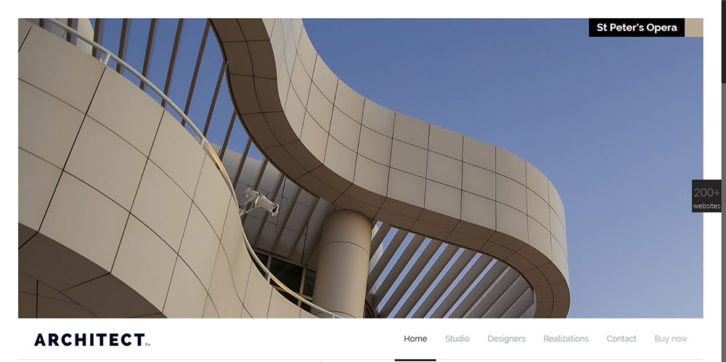
This pre-built website looks as if its designer had a degree in architecture. The product is front and center, and the unique value proposition stands out clearly against the semi-dark background.
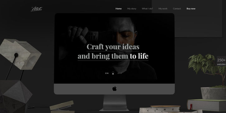
Yet another example of the impact a dark background can have on a website’s look and feel. You can of course change this default background to any color you choose. Like all pre-built websites, Be Artist is completely customizable.
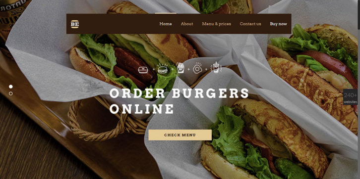
This hip design is destined for a burger delivery or catering service. You can almost smell and taste each of the images; which is what you want in a food-oriented business’s website.
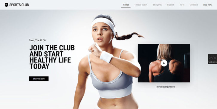
A sports or fitness club’s website doesn’t have to remind you of a smelly gym. This Sports Club pre-built website, with its cool fade-in and parallax effects, has a modern design that any gym facility would love to have.
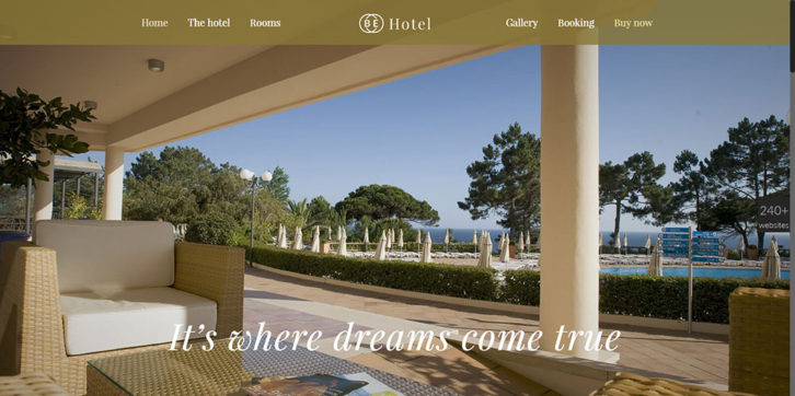
A hotel’s website should feature images that practically demand that you get on the phone and reserve a room. In addition to the engaging images, the relevant sections (location, room choice, pricing, and booking) are included.
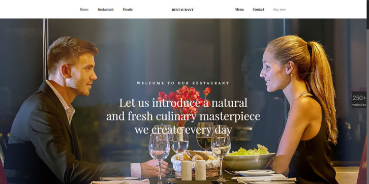
Like the previous pre-built website, this dashing restaurant design includes a nice slider effect; adding to its dynamism. Why not give your client a website that the competition simply cannot match?
As far as presenting an interesting and engaging user experience is concerned, this web design, built around a variety of perspectives, will be difficult to beat. The hero image is enough to draw visitors in.
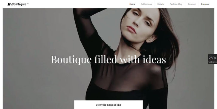
Have you ever wanted to use a background video in the hero section of your website, but weren’t certain how best to go about it? Be Boutique shows you how. This pre-built website’s structure will make you portfolio look amazing as well.
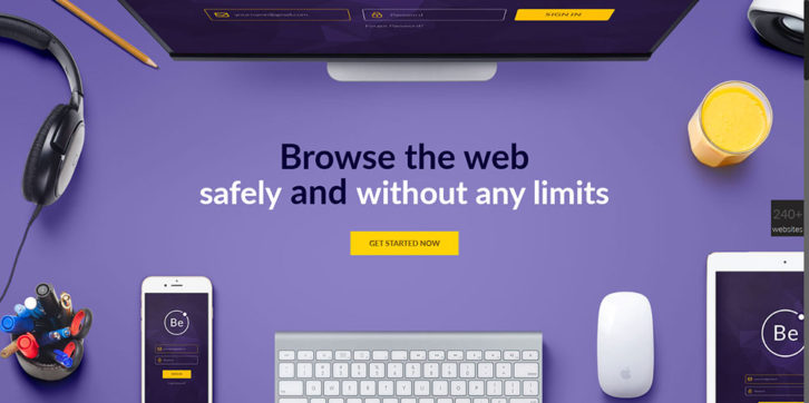
Cold, stodgy, dull, and overly formal, is an apt description of many corporate websites. Be VPN shows you how a corporate website can be well-structured and formal, but friendly as well; with a casual twist.
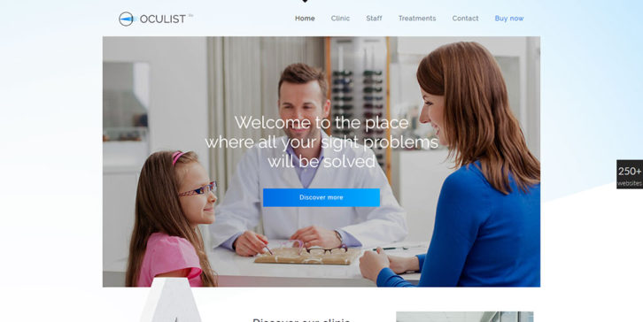
Had your eyes checked lately? If you’re looking for an oculist, you’ve likely noticed how horrible some of their website designs are. If you have an eye specialist for a client; suggest this fresh and trustworthy pre-built website template.
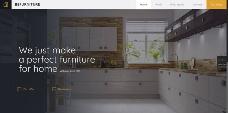
Do you have a client that sells furniture? Impress that client by showing him this great looking design. Its large images and awesome slider effects used to showcase the products are bound to make a good impression.
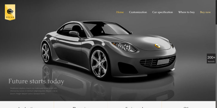
Combine an impressive hero image with plenty of white space and a thoughtful use of colors, and you have Be Car; an elegant pre-built website with a luxurious look and feel.
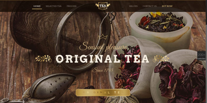
This pre-built website, with its vintage and minimalist vibe, is destined for a tea shop. Note how the dark menu, along with a careful choice of font styles, gives this design an exceptionally welcoming look.
Tip #2) Maintaining a regular schedule is all-important.
With no one to look over your shoulder (one of the joys of being a freelance designer), you are apt to slack off. You need a structure to rely on; and setting and sticking to a regular schedule for your work provides that structure. It also helps you stay motivated. Once you sit down to work, it’s important to avoid distractions. If you must check your e-mail, do it first thing. Avoid other social media activities until your workday is completed.
Make sure to schedule sufficient downtime. Doing so will help to keep you fresh and invigorated.
Tip #3) Set clear boundaries for your work and yourself.
It’s important that your work does not interfere with your home life, and vice versa. It’s all too easy to devote excessive time to your work, and it’s equally easy to allow your home life to interfere with your job. Establish a clear boundary between the two by setting aside a separate space where you can work without being distracted. While working, ignoring any outside interference will help you stay focused. Don’t be afraid to stop at quitting time if you’re in the middle of something. Doing so makes it just that much easier to get off to a quick start the next day.
Tip #4) Follow the Pomodoro technique.
The Pomodoro technique (often referred to as the “tomato theoryâ€) involves taking regular short breaks during a lengthy work session. It has proved to be a genuine productivity enhancer, and it works like this:
After every 45 minutes devoted to work, take a 15-minute break. Some experts say 52 minutes and 17 minutes is optimum; but that sounds a lot like splitting hairs.
Once you get into the habit, you’ll find that the periodic breaks won’t slow you down one bit. Your brain consumes a lot of energy. Give it an occasional break.
Summing Up – Some Dos and Don’ts
Do These:
Design a work schedule. Stick to it.
Set aside a space that’s dedicated to work, and make yourself unavailable during your work hours.
Save time and effort. Take advantage of what Be Theme’s 250+ pre-built websites offer.
Review what you’ve accomplished each day. Doing so will help keep you motivated.
Don’t Do These:
Don’t let yourself become isolated. Take the time to talk shop with peers and colleagues.
Don’t work for long periods without taking one or more breaks.
Don’t neglect your boss, team members, or clients while working on a project. Stay visible.


