Automatic Art Direction with Cloudinary’s Responsive Images Breakpoints Generator
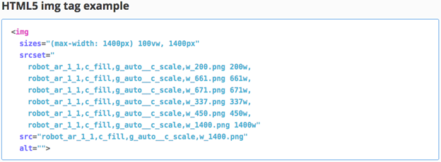
Earlier this year, Cloudinary released the Responsive Breakpoints Generator to help developers automate the process of generating optimal sets of responsive image resources. This tool makes it easy to generate *resolution-adaptable* images – upload any high-resolution image to get the responsive image markup and an optimal set of resources to back it up.
The new version, just released, pairs Cloudinary’s smart-cropping features with the HTML5 `<picture>` element in order to dynamically crop images to different aspect ratios for display on different sorts of devices. So no matter what type of device your website is viewed on, the most important parts of the image that remain are front and center.
The Responsive Image Breakpoints Generator is free and open-source.


