How important are Hover Effects in a Good Online Shop?
The hover’s positive impact on user experience makes it a popular feature in modern eCommerce websites. The hover effect is generally used to offer added information. And do so instantly, or to guide the user towards a call to action; saving clicks in the process in both cases.
Hence, it’s not at all difficult to understand how it can contribute to a richer user experience.
The hover effect is not apt to become a distraction, since it requires movement of the cursor or a screen touch to trigger it. It is up to the user to initiate it.
Users like it, and since fewer clicks can lead to more conversions, shop owners like it too; which is why you’ll find this useful design trend in this, and other eCommerce WP themes.
Hover Effects and eCommerce Go Hand in Hand
Let’s take a close look at the most popular ways in which the hover effect can be used to enhance a website’s UX.
- It enables you to instantly display additional key information about a product – a brief description, the number of items in stock, and so on.
- A user hovering over a product can be shown different views, zoom effects, or a key detail.
- Hovering can cause an image to change shape, or color, or show an object from a different perspective. Hovering works especially well with used in combination with a minimal product page design.
- Hovering can be used to help a user navigate to another page or link, instead of having to navigate through menus.
- The hover effect is an effective way to direct a user to a call for action.
You’re by no means limited to the above options. They just happen to be the those that are most commonly used. There are many different functionalities that can be triggered by hovering.
It’s really up to you. Just think of ways in which you can make life a little easier for the user, by saving that person time (and a few clicks). With XStore, putting you’re your ideas for using this special effect into practice should never be a problem.
4 Cool eCommerce Page Hover Effects
In an eCommerce website, the internal pages tend to take on added importance. Almost any product page is a potential landing page, and it should be treated as such.
If a landing page focuses on a single product, you can include all the supporting information you want, but that’s not always the best approach. User’s don’t want information overload. What they prefer is information on demand, a feature you can provide using the hover effect.
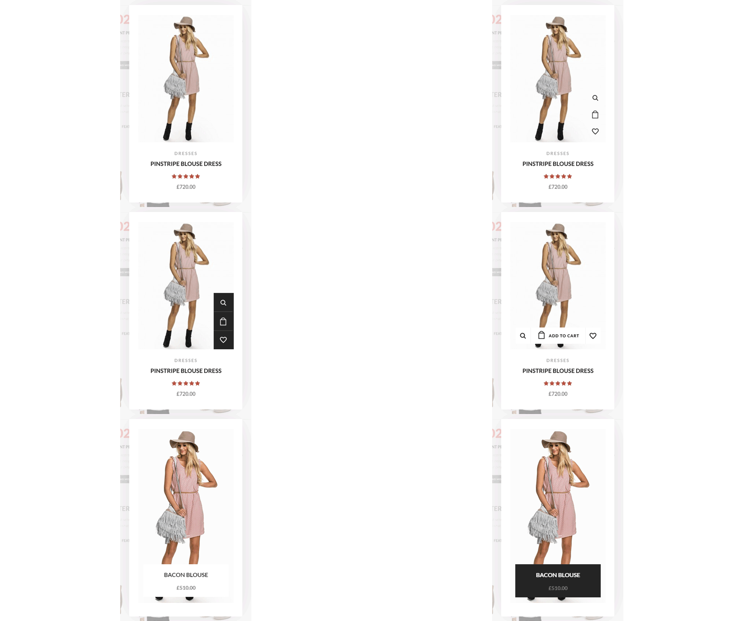
Since hover effects can positively impact conversion rates, it makes sense to use them in strategic places on landing pages. Doing so allows you to take full advantage of minimalist page designs, as shown in this XStore example:
Hover effects in action
Hover over the image of the pinstripe blouse, and the price appears. Or the dress could be shown from the back, in another color, or the available colors could be displayed.
Another option, which could easily be displayed with the price, would be to display cart and wish list buttons. This relieves the user of having to look for the cart button, which in fact, would no longer be needed.
Hovering over an image could cause it to be displayed in a darker shade; an effect called grounding, which provides a greater sense of visual equilibrium.
Another possibility is to incorporate a vertical photo effect. When the user hovers and touches the cart button, the current contents of the cart are displayed.
Any of these four examples may meet your needs, but there are no limits as to the informational content you would like to present, or how you would like to present it.
XStore – An eCommerce WP Theme with Unlimited Possibilities
XStore is a new creation by the 8Theme Power Elite ThemeForest author. It is the culmination of several years of experience in determining and implementing what eCommerce web designers need and are looking for.
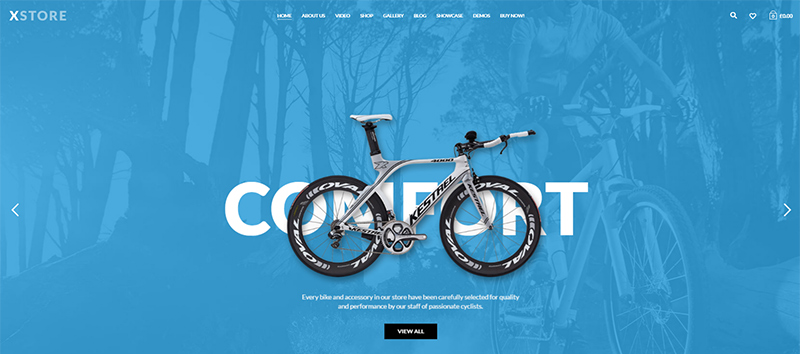
Check out the bike store demo that comes with XStore
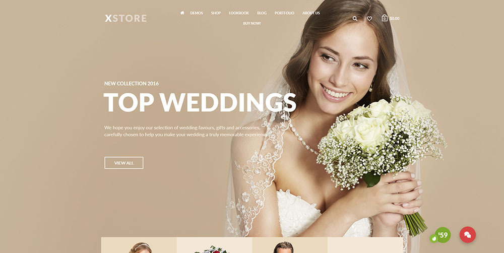
Inspire yourself with the wedding Demo Store
- XStore’s demos, are fresh, modern, and packed with potential. They are also difficult to describe in words. Paying a visit to the XStore website will show you just how easily these demos can be transformed into awesome eCommerce websites.
- The center of activity is the Admin Panel, the command central from which you choose among the many design options, and put them into play.
- Columns, grids, and sidebars, slideshow effects, 9 different shop styles, and a selection of product page types, are just a few of the options you can work with.
- Slow page speeds, the bane of online store owners, will never be an issue. Lightning-fast page loading is an XStore-built website given.
Visual Composer is your page builder, Revolution Slider is part of the package, as are megamenus and blog layout options. The possibilities for creating stunning eCommerce sites are virtually endless. Best of all, you can make it all happen without any need for coding.


