4 Fresh Web Design Trends in Beautiful Pre-Built Websites
You usually don’t take a hit and miss approach when making website design decisions. While you might like to try new approaches from time to time, even those are normally based on sound theoretical approaches that often take into account up-to-date website design principles and trends.
Many, if not most of these trends, are directed toward making websites more engaging to users, and to driving up traffic and conversion rates for clients.
Just like you, Be Theme’s professional pre-built website designers keep in tune with the latest design trends. As a Be Theme user, you’ll always have what you need to consistently produce high-performance websites to the delight of both your clients and the end users.
There are 200+ modern, customizable pre-built websites to choose from that, like those shown here, take into account current design trends. They are extremely easy to install, and installing and customizing them requires no coding skills.
These pre-built websites express:
- a respect for the principles of visual hierarchy, enabling you to build websites that influence user flow and decisions.
- a strategic use of special effects.
- more images and less text, including the use of hero images on home pages and key landing pages.
- effective use of minimalist design for mobile application.
How the Latest Be Theme Pre-Built Websites Follow Current Design Trends
Many if not most of today’s websites are seemingly carbon copies of one another. Themes will differ, but the layouts often look as if they all were based on a common template. Part of the reason for this is the growing number of mobile users, which has tended to place certain constraints on web design.
Does that mean there is little room left for innovation on your part? The answer – a resounding no. Past and present design trends create all sorts of design opportunities for you to put into practice, ranging from the use of hero images and minimalist design, to long scroll, flat design, and the use of special effects that help to tell a story.
The examples shown here incorporate many the latest trends. In addition, these pre-built websites can be installed with one click and are incredibly easy to customize. There are more than 200 to choose from, with each one seemingly better than the next.
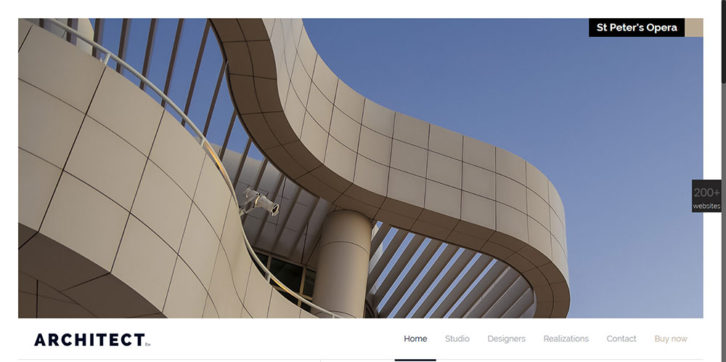
Like the Architecture example, this website’s home page has an appealing, ultra-modern look.
- The conceptual relationship between the website’s theme and its graphics elements is solid.
- The look and feel is consistent throughout.
- The use of minimalistic icons is appealing, and an interesting play with perspective is also worth noting, as can be seen in the pricing page.
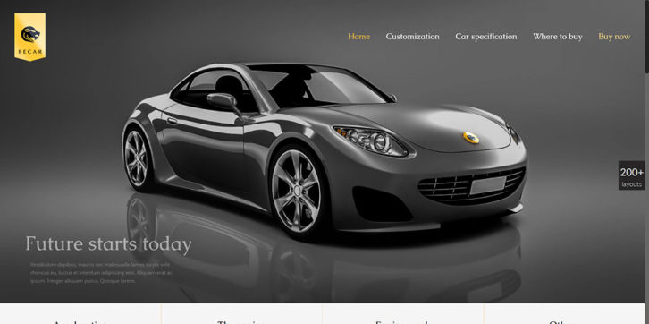
The homepage of this website all but guarantees a great UX.
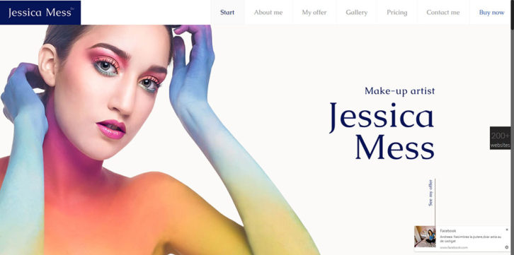
The hero shot not only relates to the website’s concept, but it provides an especially impressive and engaging introduction to the user as well.
The yellows and greys make a pleasing combination in the various buttons and icons – smooth, and well used .
The use of white space contributes to this website’s look and feel. Overall, the way the design elements are arranged and used communicates a sense of elegance and balance that is not always found in automobile-related websites.
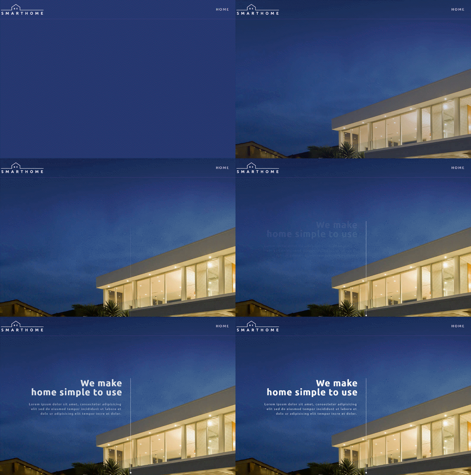
This pre-built website obviously has a modern look. Several design trends have been put into play to set it apart.
- A minimalist approach, combined with an attention-getting hero image, and a clever use of perspective, all contribute to the overall look and feel.
- A visual hierarchy approach has been followed to ensure design elements, including colors, fonts, and the use of space, have been placed in their proper relationships.
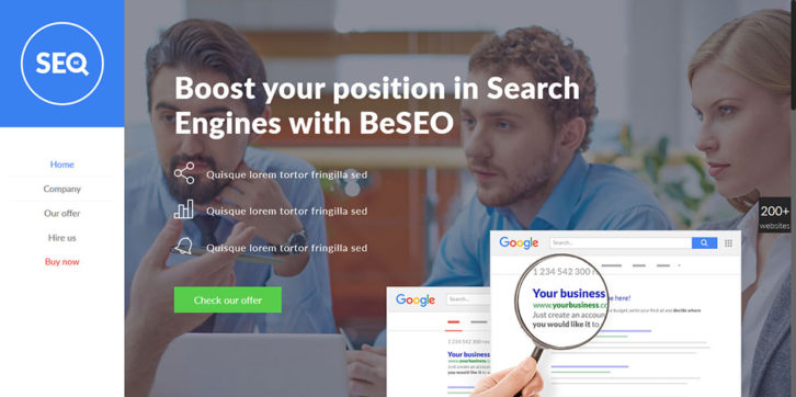
The Be SEO website addresses a vastly different theme. It has a different look and feel from the preceding one, but several current design trends have nevertheless been taken into account.
- The corporate identity has a human touch. It is stated in a friendly, rather than a formal fashion.
- Good use is made of color (neon vintage 80s) and white space.
- The icon design is in keeping with the website colors, and the card-like design used is always an appealing approach.
Six very important design trends are incorporated in this website, giving an awesome effect:
- The header is subtle. It is neither inconspicuous nor distracting. It performs its intended function.
- Minimalist icons provide a pleasing effect.
- This one-page website (long scroll) offers an excellent UX for both PC and mobile users.
- A hover effect adds to the gallery presentation.
- The hero shot says it all as far as the theme is concerned. It tells a story.
You’ll Benefit In Many Ways as a Be Theme User
You’ll find multiple benefits await you as a Be Theme user, not the least of which is access to modern, professionally-designed websites like those shown here. These websites take but one click to install, and they are incredibly easy to customize. Be Theme is like that. It’s an easy website-building tool to use, and an extremely powerful one as well.
You will be impressed with where its 40 core features can take you as far as producing awesome deliverables clients and users alike will love. You’ll be impressed with the speed and ease these core features allow you to make that happen.
You will have a powerful page building tool combination at your disposal with the Muffin Builder and the Muffin Options (Admin) Panel. Thanks to Be’s Shortcode Generator, you can incorporate a huge range of special and highly detailed features without ever having to use a single line of code.
You’ll discover that Be Theme is not only the biggest WordPress theme of them all, but also the best. Be’s huge user community will attest to that.


