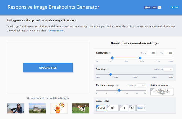
One image for all screen resolutions and different devices is not enough. An image per pixel is too much – so how can someone automatically choose the optimal responsive image sizes?
Responsive websites, even the most modern ones, often struggle with selecting image resolutions that best match the various user devices. They compromise on either the image dimensions or the number of images. It’s time to solve these issues and start calculating image breakpoints more mathematically, rather than haphazardly.
Responsive web design requires developers to determine the image dimensions that best fit their website. This breakpoints generator tool helps developers automatically find the optimal image sizes needed for the best viewing experience in web and mobile apps on a variety of screen sizes.
Common responsive image solutions tend to generate images based on a fixed set of image width values, disregarding the actual saving in file size bytes. To solve this problem, Responsive Image Breakpoints Generator uses Cloudinary’s advanced algorithms to easily generate best matching breakpoints for each uploaded image.
The algorithmic concept is to find image width values that offer a significant reduction in file size. Images are analyzed to find the best breakpoints on an image by image basis, rather than creating all possible image resolutions, and enables developers to easily create ‘picture’ and ‘img’ HTML5 elements based on the calculated breakpoints.

Requirements: –
Demo: http://www.responsivebreakpoints.com/
License: License Free
Medium Editor is a clone of medium.com inline editor toolbar. It uses contenteditable API to implement a rich text solution. MediumEditor has been written using vanilla JavaScript, no additional frameworks required. View the MediumEditor Options documentation on all the various options for MediumEditor.

Requirements: –
Demo: https://yabwe.github.io/medium-editor/
License: MIT License
The Bjango App Icon Templates are a comprehensive set of app icon templates for Photoshop, Illustrator, Sketch, and Affinity Designer. The templates cover Android, iOS, OS X, Apple TV (tvOS), Apple Watch (watchOS), Windows, Windows Phone and web favicons. Where possible, they’re set up to automate exporting final production assets. All free and open source, released under the BSD license.

Requirements: –
Demo: https://bjango.com/designresources/
License: BSD License
While employment in some industry sectors has suffered or stagnated during the past decade, Internet business has thrived. There have been significant increases in online purchases, and Internet advertising has become a $20B industry. As a result, eCommerce companies, website designers and developers, and supporting businesses account for nearly half of the 1.2 million Internet-related jobs created over the past 10 years.
Exciting new career paths are opening. At the same time, web design has become more challenging because of an increased focus on user experience (UX) and the need to keep customers happy and coming back for more. As daunting as these challenges can sometimes be, if you have the right tools at your disposal they can be easily overcome.
What is the nature of the UX challenge?
Most eCommerce websites are designed in accordance with the business objectives of the client, the eventual website owner. The business objectives of the average Internet user also need to be considered by the website’s creator, and by its owner as well. The typical Internet user can at times be a difficult and quirky customer.
He or she has:
- an attention span of around 8 seconds. The attention span of a goldfish is longer.
- a need to have rapid access to information, coupled with a diminished ability to analyze that information in depth once itbecomes available.
- a lack of patience. Page loads exceeding 2 seconds will tax a typical user’s patience.
- An ever-increasing ability to demand service from anywhere, 24/7.
Website designers need to take these idiosyncrasies into account, and the tools they use have to provide solutions to the problems these idiosyncrasies can create. Modern websites need to be designed with flow in mind.
Modern Look and Feelkeeps Users Engaged

Image source:Uncode WordPress Theme – Blog Metro layout
 Knowing what information users are seeking is key to a website’s success, but it’s only half the battle. How that information is presented is not only important, but can be critical in terms of the need to attract customers, keep them interested, and lead them to a call for action. Read the rest of this entry »
We’ve already introduced you to the special discovery of 2015, Monstroid, chosen, so far, by 3,000+ users. It is a gigantic, multipurpose WordPress theme aimed at both professionals and do-it-yourselfers. Monstroid is dubbed the “theme on steroids,†which symbolizes its constant expansion with new features and child themes. Today, we’d like to focus on the latter.
First, let’s figure out what a child theme is. In simple terms, it is a theme built with a parent theme called a framework, e.g. Cherry Framework in the case of Monstroid. Framework structuring is an optimal solution for WP themes, as there’s no need to update each of them when updates of the WordPress core are released. Instead, just update the framework itself, and that will suffice.

As a matter of fact, Monstroid is a child theme too, but is the most sophisticated one among others available in its package. Let’s recap some of its major features. Here they are.
- Installation Wizard is a one-of-a-kind tool allowing you to install the full package of this giant theme in a few clicks, without FTP.
- Innovative Backend Features of Monstroid can optimize your website management and performance. For example, Shortcode Template Editor allows you to create templates for shortcodes and modify their elements. With the help of Static Area Builder, it’s easy to customize header and footer areas by dragging and dropping. CSS Minifier can improve the performance of your site by compressing a few CSS files and grouping them into one.
- Premium Plugins are integrated into Monstroid to let you extend the functionality of your site without overpaying. For example, MotoSlider enables you to create responsive, multi-layered slideshows with both images and videos. There is also MotoPress Editor for building complex layouts in a drag-and-drop interface.
- eCommerce Functionality is provided by means of WooCommerce integration. Packed with ready-made store pages, Monstroid provides you with an opportunity to run an e-store out of the box.
Read the rest of this entry »
Placemat got some pretty nice placeholder nouns for your site. The three current endpoints are https://placem.at/people, https://placem.at/places, and https://placem.at/things. Any one of those will actually give you a valid image back on its own, but you probably want to do something a little bit fancier. The good news is that all three endpoints accept the same parameters, so there’s not too much to remember. Everything is controlled via a few simple query string parameters: width, height, text, text color, overlay color, overlay blend mode and etc…

Requirements: –
Demo: https://placem.at/
License: Creative Commons 2.0 License
If you’ve been searching far and wide for high-quality free vector graphics, a quick look through the superb selection should convince you that your efforts have finally been rewarded. Most of these are royalty free and many are yours for the asking.
Vector graphicsserve a multiplicity of purposes.You can use them tohighlight your brand. Some are begging to have a storyline attached to them. Others can serve as a genesis for ideas. Vector graphics are oftenbetter than photographic images at describing processes, and they can also serve as powerful infographics tools. Someconvey a great amount of information; others simply add to the balance and attractiveness of a website’s content.
Sources of these design elementsare not difficult to find. A problem you are apt to run into however is a lack of uniform quality, poor organization,or no organization at all. You may find yourselfsifting through mountains of graphical elements to find ahandful of gems worth keeping. That’s not the case here. The vector graphics that you will find below are taken from the 1001 FreeDownloads inventory, and are quality items.
Sometimes there are strings attachedwhen something is free. Free items can come with extras you don’t want or need, extras that can at times clutter up your computer. That’s not the case here. All that is asked of you is to acknowledge the source of some of the graphics you will use on your website, which is only common courtesy. There is a limit of 50 downloads a day – but 50 graphics vectors will usually be enough to keep you busy – at least for a day!
Clicking on any of the headings below will take you to the vector. You can download the image you’ve selected, browse through the many graphical element offerings, or both. Happy downloading!
Travel Icons for Design. Vector illustration

Set of Business Working Elements for Digital Marketing

Read the rest of this entry »
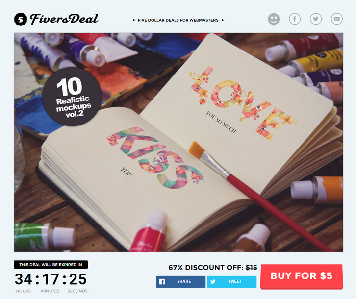
FiversDeal is a deal site that promote creative products for the price of $5 for a very short period (usually 48 hours). Here we have 10 Professional photo shoot mock-Ups in high resolution this week. This Art Equipment Mockups is great to present your art, sketch, illustration, etc in photo-realistic appearances. Available in layered Photoshop format and it’s easy to use, thanks to smart objects feature.
This mockups also comes up with 3 final filter that you can chose to fit your style. Photorealistic Result. High Definition. Easy Change of Design. 3 Final Effects. Great Perspectives. Organized Layers and Folders. You can also subscribe to get more fiver dollar deals.

Prepo for Mac and iOS helps you prepare, share and preview App artwork and icons. The skinny Drag and drop artwork for quick @2x to @1x conversion and preview Icon artwork in context. Prepo stores all your artwork into a project window ready for batch export or use QuickDrop for super fast @2x resizing. Speed up your workflow and boost your productivity. Preview your designs in context in real-time on your local device or even to remote devices. Prepo takes all the drudgery out of screen resolution optimisation for designers and developers.

Requirements: –
Demo: http://wearemothership.com/work/prepo/
License: License Free
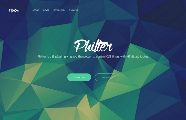
Philter provides an easy way for almost anyone to post-process their content in the web. Using Philter is as easy as writing an attribute in HTML. Philter also supports hover effects. This nice effect of grayscale transition was created by Philter with one simple attribute. And some drop shadow, of course.
Have you ever wanted to apply some filters but they didn’t work as you expected? Have you ever wondered why there’s no particular filter? Well, Philter has you covered. Check out their custom filters! There ain’t much of these filters yet but further on they will be introducing more and more of them.

Requirements: –
Demo: http://specro.github.io/Philter/
License: MIT License


