Harp is a zero-configuration static web server with built in pre-processing. It supports Jade, Markdown, EJS, LESS, Stylus, and CoffeeScript. Harp is great for rapidly building front-end web applications, documentation, and blogs.
Harp intelligently compiles assets as the browser needs them, so it’s insanely fast. All you have to do is Save and Refresh. You can keep your code clean and organized: reuse common elements with partials, and maintain a consistent site design with layouts. Whether you’re making a GitHub project page, or a mobile application using Apache Cordova/PhoneGap, you can easily compile your code to HTML, CSS & JavaScript and host it anywhere.

Requirements: –
Demo: http://harpjs.com/
License: License Free
Flatic is a large user interface kit containing hundreds of web elements, which will help you design whole websites in Photoshop with ease. Sets of icons, and actions have been included in the kit. The package Includes more than 100 elements. You can check out the full preview here.

Requirements: –
Full Preview: http://www.webappers.com/img/2013/10/Flatic…
License: License Free
Audio looping seems like a basic feature that you’ve probably come to expect from your favorite media player. Web Audio API is an API designed to manipulate and play audio assets on a Web page or application. It is an amazing foundation for games, synthesizers, audio players, trackers and more. All within the comfort of your browser. Support is excellent with Chrome, Opera, Safari and Firefox* all on board.
It probably took more JavaScript than you thought to make simple loops but with just a bit more work you can really kick things up a notch. Visualizers, volume control, special effects and so much more.

Requirements: –
Demo: http://forestmist.org/share/web-audio-api-demo/
License: License Free
The Web began as markup only, and then some script and styling. For many developers, especially us veterans, it’s hard to imagine a Web without plug-ins. Since the earliest days, browser plug-ins like Flash and ActiveX have been the main way to create rich online experiences for more sophisticated Web experiences.
And yet through the efforts of the industry and community, we have returned to a plug-in free Web once again. Much Web browsing today occurs on smart phones and tablets have limited or no support plug-in. Modern browsers like Chrome, Firefox, and Internet Explorer 10/9 have embraced and implemented Web standards like HTML5, CSS3, and JavaScript which, in most cases, now reach feature parity with plug-ins (more on those differences later) and are more interoperable across browsers. With more than 75% of all browsers in North America now compatible with HTML5, market researcher Forrester recently said it’s time to say “so long” to plug-in. “The tide,” pronounced Forrester analyst Peter Sheldon, “is turning.”

How the heck did we get here? And, more importantly, where are — where should — we be going?
In this six-part series, we’ll take a hands-on look at the evolution of the Web to what many (including me) see as a shift toward plug-in free. I’ll focus on common Web experiences that have already been written with a plug-in and show you how to convert, and enhance them with HTML5. Read the rest of this entry »
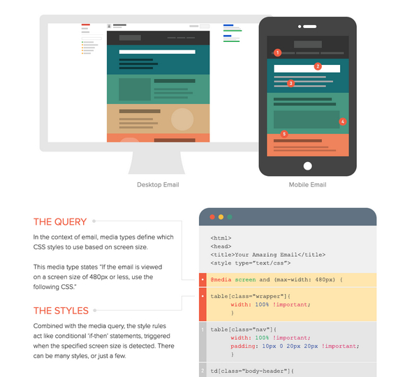
Responsive email design has been growing steadily in popularity. Some brands turn to responsive design techniques to create better experiences for their subscribers, and in many cases, increase their click and engagement rates.
The foundation of responsive email design is built upon CSS3 media queries, which can be confusing and complicated to learn. And like everything else in email, they don’t work quite the same way in our inboxes as they do on the websites we view in browsers.
This is a how-to guide for responsive email design. See what is possible with responsive email design, how to implement media queries in your design, and support for responsive emails in various mobile email applications.

Source: https://litmus.com/blog/the-how-to-guide-to-responsive-email-design…
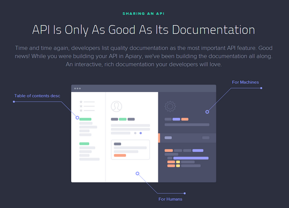
Apiary helps you build beautiful APIs with collaborative design, instant API mock, generated documentation, integrated code samples, debugging and automated testing. Apiary is powerful, open sourced and developer-friendly. As easy as writing Markdown, but comes with a mock server, tests, validations, code samples and your language bindings.
A server mock is a quick way to experiment with an API – even before you start writing code. Two clicks will link Apiary to a repository of your choice. It’s up to you whether you make the API Blueprint private or public and let community to contribute. They update your doc on each commit, and they push commits to the repo whenever you update your documentation at Apiary.

Requirements: –
Demo: http://apiary.io/
License: MIT License
Massive Design Bundle is a ginormous, mega design bundle features over 2GB of creative items to make your life easier and your projects even cooler. You’ll find a plethora of goodness in here including icons, vintage graphics, slick carousels, HTML5 templates, poster mockups, infographics, stickers, labels, backgrounds, patterns, templates and loads more. There are even large coupons and discounts for killer services like stock images libraries and web hosting.
You’d normally pay loads more than $1,000 for this amazing resource-packed bundle, but for a limited time only, you can get the whole enchilada for just $49. That’s an unfathomable 95% off the regular price.

Keypress is a robust Javascript library for capturing keyboard input. It’s an input capture library with some very special features, it is easy to pick up and use, has a reasonable footprint (~9kb), and has no dependencies.
Some keys have unreliable support and should mostly be avoided. Print, Scroll Lock, Pause/Break, and Insert have unreliable keyup or keydown firing in Windows or OS X, so I suggest avoiding them, although Keypress does still allow them.

Requirements: JavaScript Framework
Demo: http://dmauro.github.io/Keypress/
License: License Free
Responsive Elements makes it possible for any element to adapt and respond to the area they occupy. It’s a tiny javascript library that you can drop into your projects today. The element is aware of it’s own width. It responds and adapts to increasing or decreasing amounts of space. You can easily explicitly declare which elements you want to be responsive using a data-respond attribute.

Requirements: JavaScript Framework
Demo: http://kumailht.com/responsive-elements/
License: MIT License
FullPage.js is a simple and easy to use plugin to create fullscreen scrolling websites (also known as single page websites). It allows to create fullscren scrolling websites as well as adding some landscape sliders inside the sections of the site. It is designed to fit to different screen sizes as well as tablet and mobile devices.

Requirements: –
Demo: http://alvarotrigo.com/fullPage/
License: MIT License


