Examples of Thoughtfully Designed Sign Up Pages
For web apps, the vast majority of time and effort spent on the marketing side of the site is spent on the homepage, and on the features. Sadly, it’s all too easy to neglect the actual sign up page itself – but this is one of the most crucial pages on the site, and so many things affect how well it turns visitors into customers. The sign up page can literally make or break the success of your web app.
To give you some inspiration around improving your sign up page, we’ve collected some examples of thoughtfully designed, creative and clever landing pages. Each of these sign up pages have been crafted with care and attention, and do a great job of leading the potential user into a fully fledged, signed up member of the site. We hope you find this collection useful for your next web app project.
Ballpark
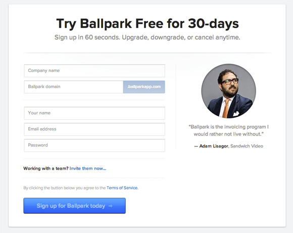
The signup page for Ballpark – a time tracking and invoicing service designed for freelancers and small businesses –uses an impossible-to-miss testimonial to help further entice prospective customers to sign up.
Base
Sales and CRM platform Base uses an incredibly short signup form. There’s only two form fields – email address and password – which decreases the likelihood that the visitor will be turned off by lengthy, needless questions. Once you’ve chosen your plan, clicking “Start free trial†results in the short form appearing in a lightbox, removing all other distractions.
Campaign Monitor
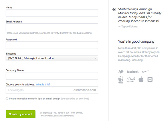
While the signup form for Campaign Monitor is quite lengthy, they’ve made some great design decisions. Including a small selection of logos from other companies that use the service is a great way of encouraging visitors to convert. Knowing that the platform is trusted by brands like Twitter, Facebook and Apple implies helps to reduce any perceived risk in using their service.
Asana
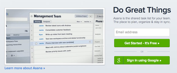
Task management companyAsana have chosen to allow users to signup (at first) with just their email address, which means it’s incredibly easy and quick to get started. They also allow visitors to sign up using their Google account, if they’d prefer, and do a good job of selling visitors on why they should join using a promotional video right next to the signup form.
Buffer
Buffer, the popular social media sharing tool, makes signing up for the service effortless by allowing you to sign in through whichever method you’d prefer, whether it’s Twitter, Facebook, LinkedIn or by creating a standard Buffer account.
Stripe
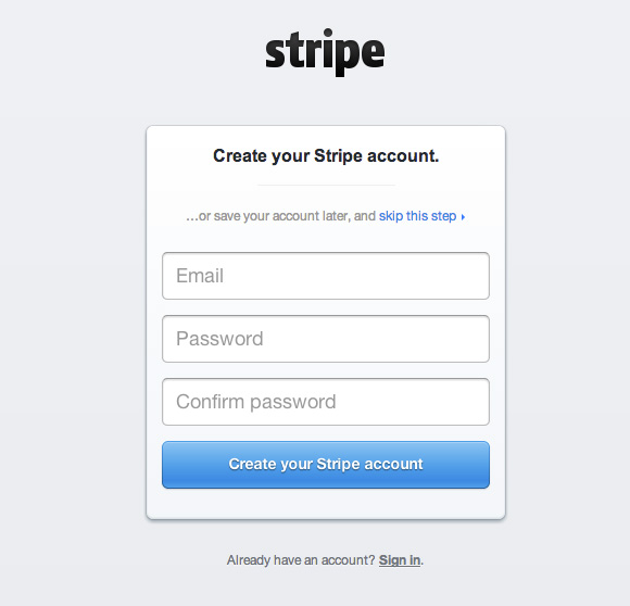
Payments startupStripeis particularly innovating as it allows users to skip the sign up process completely and get straight into trying out the app.You can play with the settings of your new account, get to grips with the dashboard and try things out before agreeing to give them any of your details – and when you’re ready to save your account, all your settings will be stored with it.
Huffduffer
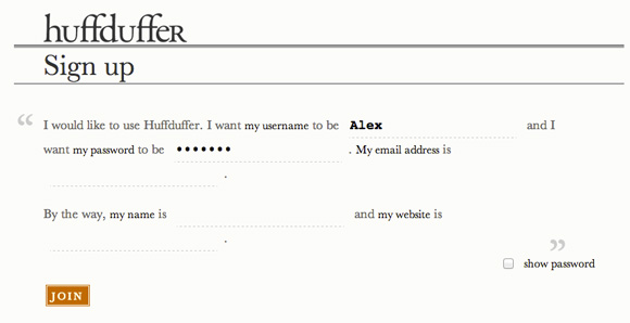
Huffduffer is a service that makes it easy to create and share your own podcasts. The signup form is particularly unusual because it uses the form of a madlib – instead of regular form fields, you’re encouraged to fill them in in the style of a story. It’s not necessarily advisable to use this route with your own web app, but for Huffduffer it seems to work and is a creative and interesting idea to test.
Squarespace
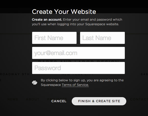
Squarespace is a hosting and CMS service that makes it easy for people to create and manage their own websites. Their signup process involves you first picking a design that you like – before eventually being presented with the signup form. It’s quite a clever move from Squarespace – by first browsing and picking a theme that you like, you’ve already become invested in the app and are perhaps a bit more likely to sign up.
Zapier
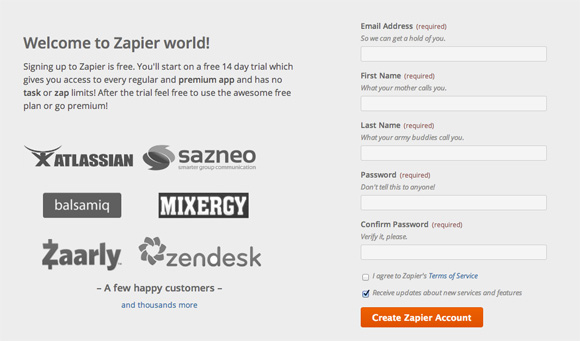
Zapier, a service that helps you automate tasks by hooking up to multiple APIs, adds some personality to their form fields with the copy on the prompts. Under the First Name field it reads “What your mother calls youâ€, while under the Last Name field it reads “What your army buddies call youâ€. This attention to detail may be off-putting for some, but for Zapier it works well by showing a bit more personality before you’ve even started using their service.
KISSmetrics
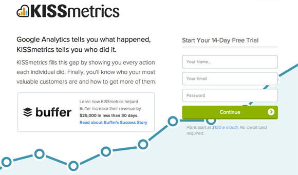
KISSmetrics, the analytics company that rivals Google Analytics, has made the bold choice of putting their signup form on their homepage. By putting it front and centre, they ensure that as many of their visitors as possible see it. The form itself is short and sweet, like the rest of the landing page, and the big, bold “continue†button just begs to be clicked.
Have you found any examples of sign up pages that deserve to be included in our roundup? We’d love to hear about what you’ve found in the comments.
About the Author
Alex writes for Print Express, a printing company that specialises in business cards, posters & postcards. In his spare time he studies web and print design and enjoys learning to code.


