Gradual Engagement to Increase Your Conversion Rate
The difference between a 5 step registration flow and a single step registration flow is less than the difference between a single step registration flow and none at all.
The goal of this article is to present arguments for why using Gradual Engagement is a good design principle for web and mobile applications. The ideas listed below are directly drawn from our experience of using Gradual Engagement principles when designing Filepicker.io.

When you’re designing your new-user flow for your website or mobile app, the de-facto approach is to send them as soon as possible to a registration page. But there’s another way, a way that emphasizes gradually building a relationship with your user before asking them to register for an account. It’s called Gradual Engagement and can be surprisingly effective at increasing your overall conversion rate and user stickiness. While gradual engagement is not a new concept, it’s increasingly important in this era of mobile apps and social logins.
Present value upfront
The principle of gradual engagement is this: rather than presenting a registration form to someone who just landed on your site, why not show them why you’re worthwhile right off the bat? Popular examples are sites like Kayak.com, where you can immediately start searching for flights (read: getting value out of the service), and only later register for an account. News sites from the New York Times to Hacker News also use gradual engagement, allowing visitors to read stories and even providing recommendations for future stories, providing immediate value and over time guiding the user to create an account once they are hooked. Website designers can sometimes forget that the whole reason why someone is registering for your service is because they want what’s on the other side – if you can present them that value earlier on, or at least a piece of it, you’re much more likely to capture their interest, and more importantly, trust.

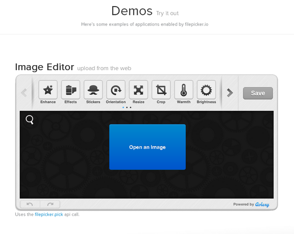
At Filepicker.io we found that our demos page and our API documentation page hold the most valuable content for our customers. We are a deeply technical product and so our customers are web and mobile developers. The demos page helps our developers experience how our APIs would work inside their product. Once they have had a chance to experience the end product, their next port of call is the documentation that helps them understand how to implement our API. When we realized that both these content sources represent proof of value, we designed our website such that developers got a chance to explore the sample code and understand the APIs well before signing up to use the product.
The era of Social Logins: Not just another sketchy app
Login via Facebook and other social networks is wildly popular these days, given that it reduces development time, reduces the number of usernames and passwords that your visitors have to remember, and surfaces valuable social information that can increase personalization and virality.
A lot of Filepicker.io’s customers are consumer web and mobile applications. In talking to customers we have learned that these social logins, however, are a double-edged sword. Social logins are easy to implement but may increase your drop-off rates. As users become more conscious about their online privacy, unless you’ve already earned their trust, they may be very hesitant to fork over their social graph to any random site. While there are few exact numbers on this, shared wisdom puts typical drop-off rates on “Login with Facebook†and similar buttons at around 50%.
A great way to reduce this drop-off rate while still retaining the benefit of these social logins is by putting the registration step after you’ve shown the user not only that you are a professional, high-quality site, but also that the user will receive some real value from your service. Now, when they’re presented with the question of whether or not to authorize your application, the quality of your product has already done the majority of the work convincing them to follow through. Huffington Post does a very good job of this, and has gotten massive social engagement because of it.
No Registration Needed and the Psychology of Free
As was seen in the mobile application space, giving something away for free can lead to dramatically more adoption than a paid app, even if the cost of the app is less than a dollar. Even making something cost as little as a penny causes users to react entirely differently. In the same way, allowing people to use your product without having to register leads to that same level of frictionless consumption that free apps have on mobile devices. With gradual engagement there is always the concern that if you don’t have the user register, you’ll lose the ability to engage them over email or they’ll simply wander off, but as the free vs. paid app debate as shown on the mobile side, the massive increase in adoption often dwarfs any drawbacks. Plus, you’ll have a better chance to upsell them on any premium plans now that they have a sense of how compelling your product is.
The Mechanics of Gradual Engagement
By now you’re hopefully sold on how gradual engagement can have a positive impact on your key metrics. Let’s see how you can add this to your site. The most common way is to create a unique, anonymous user account when the visitor first engages with your site, and then store that user id in their session, just as you would if the user had logged in to an account they had created. You can then offer the same functionality of personalization, recommendations, etc., but all tied to their anonymous user account that was created for them. When you’ve demonstrated enough value and earned their trust, then the registration flow is simply filling in the missing entries in their user account – email, password, and anything else you might need.
When we were designing the Filepicker.io website we spent some time researching additional resources on Gradual Engagement. Some of the good resources on this topic are
Signup forms must Die post by Luke Wroblewski
Leading a horse to water: the path of gradual engagement by Andi Graham
Gradual Engagement by Peak Usability
About the Author
Brett van Zuiden is the Co-Founder and CEO of Filepicker.io, a Y Combinator startup from San Francisco that provides a Filesystem-as-a-service for web and mobile apps. Filepicker.io’s API connects websites and mobile apps to data from Dropbox, Facebook, Box, Google Drive, Evernote, Instagram, Flickr, Picasa, and 15 other platforms. Brett’s past experience includes working as a front-end engineer at Google. He was selected as one of the top five graduating Computer Scientists at MIT.


