How to Create a Windows 8 RSS Reader App with HTML5
Starting from scratch, we’re going to learn through these 2 tutorials how to build a small RSS reader with HTML5, CSS3 and WinJS, the Microsoft JavaScript framework for Windows 8. We will then build a WinRT application targeting the Windows Store. We’ll try also to follow the Windows 8 UI design guidelines by using Expression Blend 5. If everything goes fine, you should be able to follow these 2 articles in 30 minutes.

This first article will help you to create the welcome screen that will use a WinJS ListView control. This control will display all the blog posts recently published via nice thumbnails. The 2nd one will work on the detail view displayed when you’ll click on one of the items. At last, you’ll find at the end the final solution to download. See it as useful complementary resources if you need to clarify some parts of this article.
Pre-requisites: to follow these tutorials, you need first to:
1 – Download/buy & install Windows 8 RTM on your machine:  where you also have a 90-day trial version available. 2 – Download & install Visual Studio 2012 Express RTM for Windows 8:  which is free or you can use the paid versions of course.
Note: If you’ve got a Mac, it works perfectly fine thanks to BootCamp or inside a virtual machine handled by Parallels for instance
Note 2: this article has been updated on 21/08/2012 to implement the changes in the UI & in the code between Windows 8 Release Preview and RTM. In a general manner, if you need to migrate your application from RP, you should read this document: breaking changes document. In our case, the only impact was linked to the new UI & naming of Visual Studio.
Note 3: I’ve added a complementary post dedicated to WordPress and Community Server here: Windows 8 HTML5 Metro Style App: RSS reader in 30min – building your WordPress version
Here is a brief summary of what we’re going to see in this article:
- Step 1: creating a blank application
- Step 2: creating the HTML & CSS base of our main page
- Step 3: first contact with Blend
- Step 4: loading the data with XHR and bind them to the ListView control
- Step 5: using a template and modifying the design with Blend
- Step 6: source code to download Note: these tutorials are based on the Tools for building Metro style apps session of the BUILD delivered by Chris Sell & Kieran Mockford. I’ve simply updated it for Windows 8 RTM.
Note: these tutorials are based on the Tools for building Metro style apps session of the BUILD delivered by Chris Sell & Kieran Mockford. I’ve simply updated it for Windows 8 RTM.
Step 1: creating a blank application
First thing you need to do is to launch Visual Studio 2012 and create a new JavaScript –> Windows Store Blank App project via “File –> New Projectâ€:
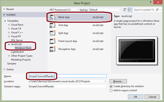
Name it “SimpleChannel9Reader †as we’re going to download the RSS stream of the Coding4Fun section of Channel9 available here: http://channel9.msdn.com/coding4fun/articles/RSS
Step 2: creating the HTML & CSS base of our main page
Open the “default.html†file which describes the first page that will be displayed when you’ll launch the application. Instead of the following HTML part:
<p>Content goes here</p>
Insert this one:
<div id="main"> <header id="banner"> <button id="backbutton" class="win-backbutton"> </button> <h1 id="maintitle" class="win-title">Welcome to Channel 9!</h1> </header> <section id="content"> </section> </div>
We now have a global div container with the “main†id embedding 2 sub-containers named “banner†and “contentâ€. The header will be obviously displayed at the top of the page and the content section will be displayed just below.
Let’s add a bit of CSS to that by opening the “default.css†file stored in the “css†directory. You’ll see that there is already some predefined CSS to handle the various available Windows 8 views thanks to Media Queries.
In these 2 articles, we will concentrate our efforts only on the “fullscreen-landscape“ state. So jump into this section and insert the following piece of CSS:
#main {

width: 100%;

height: 100%;

}

#banner {

width: 100%;

height: 100%;

}

#backbutton {

}

#maintitle {

}

#content {

width: 100%;

height: 100%;

}
This simply indicates that we’d like to take all the available space for our 3 main containers.
Run your application by pressing the F5 key or by clicking on the following button:

Logically, you should now see this screen:
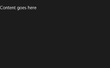
And you should also see an obvious design problem: the back button and the title are not aligned. Let’s resolve this by using Blend 5!
Step 3: first contact with Blend
Launch Blend and navigate to the folder where your SimpleChannel9Reader project is. Blend will then show that:
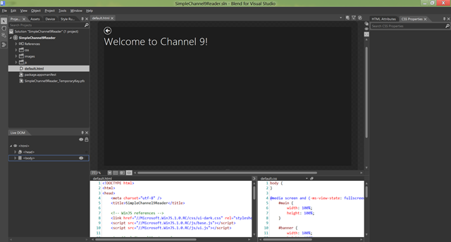
The goal here is to create 2 grids. The first one will be for the main container. It will be defined by 1 column that will take all the available width & by 2 lines. The 2nd one will be defined by 1 line & 2 columns for the back button and the title.
Let’s start by the select the “main†element by using the “Live DOM†window:
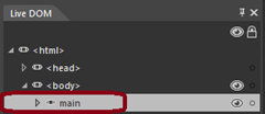
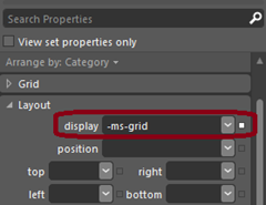
Jump to the “CSS Properties†part, select the #main rule and in the “Layout†window, switch the display to “-ms-gridâ€:
We’re going to use the CSS Grid Layout specification currently only supported by IE10 but that should soon land in other browser. If you’d like to know more about the type of layout supported in the Metro mode, you can read this article: Choosing a CSS3 layout for your app.
If you simply want to discover the CSS3 Grid specification, feel free to play with this IE Test Drive demo: Hands On: CSS3 Grid Layout
Ok, now that the display is properly switched into grid, we need to define our grid. For that, jump to the “Grid†part and declare the following properties:

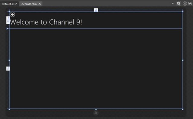
We will have a unique column spanning through the complete width of the screen (whatever the resolution will be) and 2 lines. The first line will have a “fixed†height size of 132px and the other one will take the remaining space. You can see this inside the Blend designer surface:
Now, we’re going to move the “content†element into the 2nd line. Select it into the “Live DOMâ€, choose the #content rule and move to its “Grid†properties. Change the “-ms-grid-row†value to 2. You can also move the “banner†element to the row 1 but it will be there by default otherwise.
We’re now going to split our first line into 2 columns in order to move each element in the right places. Select the “banner†element, switch its display property to “-ms-grid†and define 1fr line & 2 columns of 120px and 1fr:

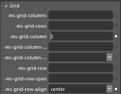
Move the “maintitle†element into column 2 and center it vertically thanks to the “-ms-grid-row-align†property changed to “centerâ€:
Select the “backbutton†and jump to the “Layout†part. Set a 54px top margin and a 40px left margin. If you haven’t missed something, you should now see that on the design surface:
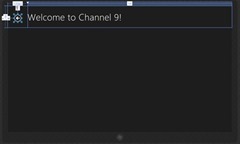
Save all changes via “File†-> “Save All†and go back to Visual Studio. Open “default.css†and you’ll see that Blend has generated some “clean†CSS in the right rules:
@media screen and (-ms-view-state: fullscreen-landscape)

{

#main {

width: 100%;

height: 100%;

display: -ms-grid;

-ms-grid-columns: 1fr;

-ms-grid-rows: 132px 1fr;

}

#banner {

width: 100%;

height: 100%;

display: -ms-grid;

-ms-grid-columns: 120px 1fr;

-ms-grid-rows: 1fr;

}

#backbutton {

margin-top: 54px;

margin-left: 40px;

}

#maintitle {

-ms-grid-column: 2;

-ms-grid-row-align: center;

}

#content {

width: 100%;

height: 100%;

-ms-grid-row: 2;

}

}
Simply check that the application works fine by pressing F5.
Step 4: loading the data with XHR and bind them to the ListView control
Ok, let’s now dig a little bit into the code.
First thing to do is to insert the control that will be in charge of displaying our articles’ thumbnails on the welcome screen. We’re going to use WinJS for that.
The WinJS library or “Microsoft Window Library for JavaScript SDK†is made to help the JavaScript developers implementing the new Windows 8 UI experience in an easy way. It provides a set of controls, a templating engine, a binding engine, Promises to handle the asynchronous calls, helpers to handle Namespaces, etc.
In Windows Store projects, you’ll find this library in the references section of the “Solution Explorerâ€:
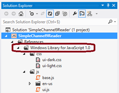
Inside, you’ll find the default style sheets with the 2 dark & light themes provided as well as the JavaScript code. Feel free to have a look to it. It could be interesting to learn by reading the code.
In our case, we’re going to use the ListView control which creates a grid layout to display the list of elements.
Open “default.html†and inside the section tag, type this piece of HTML:
<div id="articlelist" data-win-control="WinJS.UI.ListView"></div>
Currently, it’s only a simple classical div. However, it’s annotated with the data-win-control attribute which indicates that we’d like to use the WinJS library to transform this simple div into a JavaScript ListView control.
This operation is done thanks to a magical line of JavaScript code you’ll find into “default.jsâ€. Here it is:
WinJS.UI.processAll();
This asynchronous operation will parse the DOM to find all the elements tagged with “data-win-control†attributes to transform them into real WinJS controls implementing the new Windows 8 UI experience for you. If you remove this line by mistake, all your div will become again some simple div.
We now need to feed this ListView with some data grabbed from the RSS feed. In the function bind to the “onactivated†event, add this piece of code just above the processAll() line:
articlesList = new WinJS.Binding.List();

var publicMembers = { ItemList: articlesList };

WinJS.Namespace.define("C9Data", publicMembers);
You’ll need then to declare the “articlesList†variable at the top of the function just below the “app†one for instance.
We’re declaring here a Binding.List() type. It’s the type to use to bind your data to the WinJS controls. It contains for instance some methods that will help you to add some data in background and thanks to the binding mechanism; it will be reflected into the view automatically.
Moreover, you may have noticed that we’re using some clean JavaScript code by using modern patterns like the “module pattern†for instance. For that, we have an anonymous self-executed JS function into “default.jsâ€. We then need to find a way to expose some public data to external functions. That’s why we’re implementing the Namespace concept into the associated WinJS helper. It helps us to easily define what we’d like to expose. In our case, we will have a public “C9Data†object that will have an “ItemList†property containing our future elements to display.
We now need a function that’ll grad the data from the RSS feed, parse them and create some JS objects on the fly to push them into the famous binding list. Here is mine:
function downloadC9BlogFeed() {

WinJS.xhr({ url: "http://channel9.msdn.com/coding4fun/articles/RSS" }).then(function (rss) {

});

}
This function starts by running an asynchronous XmlHttpRequest to the specified URL. The code defined into the Promise (into the .then() if you want) will then be executed only once the request will be finished and the data received. It’s then here that we need to filter the data via this piece of code you have to insert into the anonymous function:
var items = rss.responseXML.querySelectorAll("item");

for (var n = 0; n < items.length; n++) {

var article = {};

article.title = items[n].querySelector("title").textContent;

var thumbs = items[n].querySelectorAll("thumbnail");

if (thumbs.length > 1) {

article.thumbnail = thumbs[1].attributes.getNamedItem("url").textContent;

article.content = items[n].textContent;

articlesList.push(article);

}

}
I hope that this code will be self-explicit. It selects the “item†nodes, access to their interesting properties to map them to an “article†object created on the fly on the “titleâ€, “thumbs†& “content†properties. Please keep in mind the name of those properties; we will use them later on. At last, this function finishes by adding this new object to the binding collection.
We now need to run this function during the starting phase of our application. This code should run once the DOM parsing will be done to build the WinJS controls. So, to do that, use this line of code:
WinJS.UI.processAll().then(downloadC9BlogFeed);
We have to specify to the control its data source. Jump back into the HTML code and modify the div associated to the ListView to change its options:
<div id="articlelist" data-win-control="WinJS.UI.ListView" data-win-options="{ itemDataSource: C9Data.ItemList.dataSource }"></div>
At last, we need some basic CSS to help the control to know how to draw each of its items. Jump to the “default.css†file and add these 2 rules:
#articlelist {

width: 100%;

height: 100%;

}

#articlelist .win-item {

width: 150px;

height: 150px;

}
This CSS indicates that our ListView control should take all the available space of its container and that each of its items (via the “.win-item†classâ€) should take 150 by 150 pixels.
Run the solution by pressing F5. You’ll have something as ugly as that:
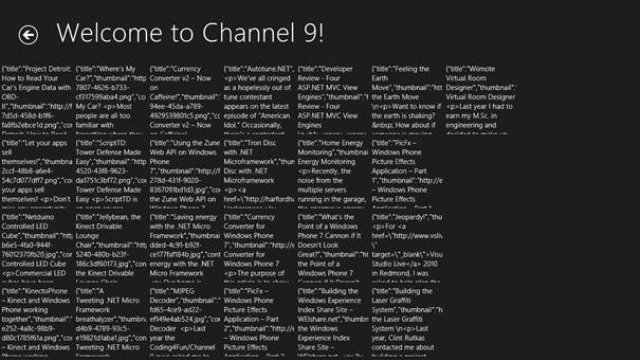
But don’t panic, this ugly output is the expected behavior! We still have a bit of design to work on. But you can already see that the binding works correctly and that the control works fine with touch’ & mouse experiences. Moreover, the control automatically scales to the various resolutions. You’ll then not have the exact layout (number of columns & lines displayed) that the above screen in your case.
Step 5: using a template and modifying the design with Blend
We now need to change the way each element is drawn. This is exactly the purpose of the templating engine. A template is only a piece of HTML marked with WinJS attributes.
Navigate to the “default.html†page and add this piece of HTML just above the “main†part:
<div id="C9ItemTemplate" data-win-control="WinJS.Binding.Template" style="display: none;"> <div class="listItemTemplate"> <div class="listItemImage"> <img data-win-bind="src: thumbnail" /> </div> <div class="listItemTitle" data-win-bind="innerText: title"> </div> </div> </div>
It’s an HTML template marked with the “WinJS.Binding.Template†value. This will help WinJS to know what to do with this special piece of HTML after the processAll() execution. You’ll find also the usage of “data-win-bind†to define binding expressions. It will help the binding engine to know which JavaScript properties from the data source to map to the appropriate HTML nodes. Except that, you can use some classic HTML.
We now need to configure the WinJS control to not use the default template anymore but to use the new one above instead. It’s done by simply changing the options:
<div id="articlelist" data-win-control="WinJS.UI.ListView" data-win-options="{ itemDataSource: C9Data.ItemList.dataSource, itemTemplate: C9ItemTemplate }"> </div>
If you now run the application, you should have this screen:
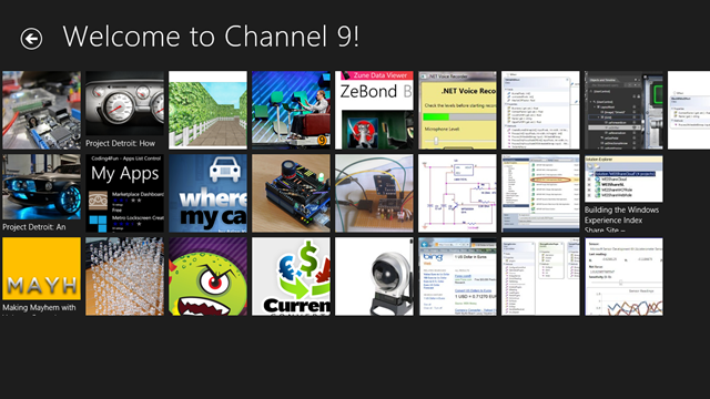
It’s better but we’re not done yet. To go further in the design review, we need the help of our friend Blend.
So, let’s go back into Blend. It will ask you to reload all the modifications you’ve done inside Visual Studio. Once done, you’ll have that:
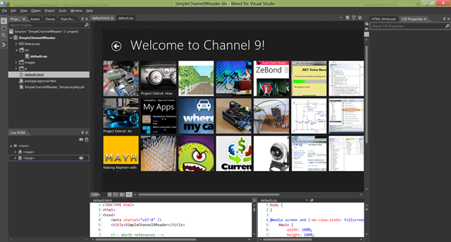
Aren’t you surprised? You should! Indeed, we see here the same visual output you will have when you’ll press F5 in Visual Studio. This means that Blend 5 is dynamically executing the JavaScript part of your application directly inside the designer! This is an awesome feature.
Thanks to that, you will be able to directly work on real data without being forced to put in place what we call “mockingâ€. It’s the cool part of JavaScript. Blend was able to execute the JS code that launch the XHR request and build the WinJS objects.
Under “default.cssâ€, let’s add 2 new CSS rules. Click on the “+†button on the main media query:
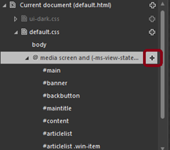
And add these new selectors:
.listItemTemplate and .listItemTemplate img
Select the #articlelist .win-item rule that will highlight each element of the ListView control with the “articlelist†ID.
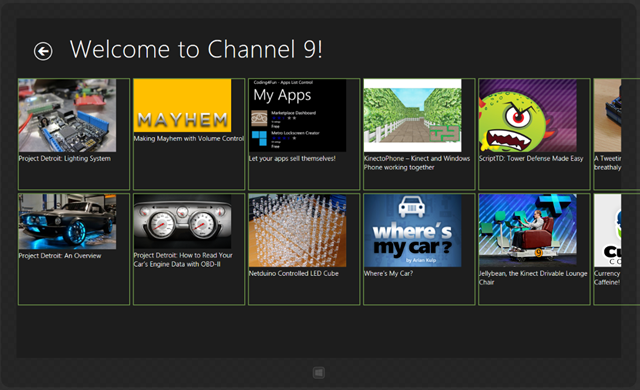
Change the size of these elements to go from 150px by 150px to 250px by 250px. You simply need to jump into the “Sizing†part of the right panel.
The layout should be updated dynamically. If not, you can force a refresh of the design surface by clicking on the dedicated button:

And here is the result you should have:
We’re now going to resize the template’s images. For that, use the “Selection†pointer and click on one of the images:
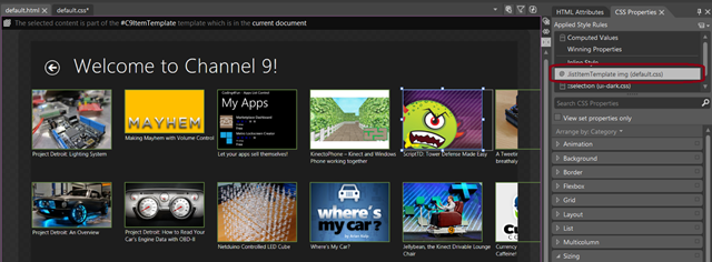
You can see the current applied CSS rules in the “Applied Rules†section. Click on “.listItemTemplate img†and resize with your mouse the image you’ve just selected. All the other images matching the same selector will then dynamically reflect the changes in real time.
Rather than searching the appropriate size, I’m going to help you. Jump into the “Sizing†section and fix the following size: 234px width and 165px height.
To enhance a bit more our design, we need some more space between each element and to align our ListView control with the title.
Click on the “.listItemTemplate†selector, navigate to the “Layout†section and click on the “Lock†icon at the right of the “Margin†area. Select any margin and type 8px.
At last, to align the grid of the ListView control with the title, we need to move it from the left by 120px – 8px of the element margin we’ve just set.
Add a new selector by pressing on the “+†button and name it “.win-surfaceâ€. Fix a left margin of 112px.
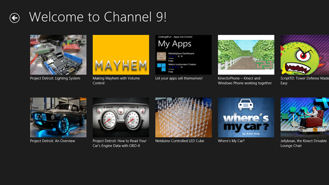
Go back to Visual Studio, accept the changes done and press F5. You should now have this kind of layout:
Step 6: source code to download
We’ve made good progress so far. We now need to display the detail of each article, to continue discovering the power of Blend as well as a couple of new cool CSS3 features. You can download the solution associated to this first article here: Simple Channel9 Reader Article1
About the Author
David Rousset is a Developer Evangelist at Microsoft, specializing in HTML5 and web development. Read his blog on MSDN or follow him @davrous on Twitter.


