Fresco is a beautiful responsive lightbox. It can be used to create stunning overlays that work great at any screen size, in all browsers on every device. To make things even more awesome Fresco comes with fullscreen zoom, retina-ready skins, supports for swipe events, Youtube and Vimeo integration for HTML5 video and a powerful Javascript API.
Fresco is licensed under the terms of the Fresco License. The Light version may be used freely on non-commercial domains. A Pro version can be purchased for commercial use.

Requirements: jQuery Framework
Demo: http://www.frescojs.com/
License: Fresco License
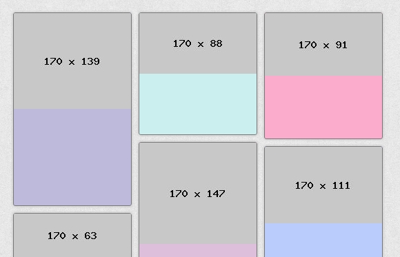
Shapeshift is a plugin which will dynamically arrange a collection of elements into a grid in their parent container. Shapeshift is intended to be a very bare bones version of these grid systems, however the drag and drop is what sets it apart from the other similar plugins. Position any item within the grid by dragging and dropping them into place. Shapeshift will try to find a logical place for it and display that to you.
Resizing the grid to accommodate for more or less space is automatically turned on in Shapeshift, so if your parent container has a 100% grid resizing the window will shapeshift the child objects around to accommodate for the new layout. You can even set CSS3 media queries on your objects and watch as they get shapeshifted around their new size.

Requirements: jQuery Framework
Demo: http://mcpants.github.com/jquery.shapeshift/
License: MIT License
Starting from scratch, we’re going to learn through these 2 tutorials how to build a small RSS reader with HTML5, CSS3 and WinJS, the Microsoft JavaScript framework for Windows 8. We will then build a WinRT application targeting the Windows Store. We’ll try also to follow the Windows 8 UI design guidelines by using Expression Blend 5. If everything goes fine, you should be able to follow these 2 articles in 30 minutes.

This first article will help you to create the welcome screen that will use a WinJS ListView control. This control will display all the blog posts recently published via nice thumbnails. The 2nd one will work on the detail view displayed when you’ll click on one of the items. At last, you’ll find at the end the final solution to download. See it as useful complementary resources if you need to clarify some parts of this article. Read the rest of this entry »
Gemicon is handcrafted icon set by Turqois, which there 3 different sizes (16, 32, 64). Each icon created with pixel-perfect shape layer on Photoshop. Download and get PNGs and PSDs file. There are over 600 icons for you to download. They are all Free and suitable to implement here and there for your next awesome project.

Requirements: –
Demo: http://gemicon.net/
License: License Free
ABalytics.js is a pure javascript library allows you to do simple A/B testing working only on your client-side code. All data is registered as custom variables in your website Google Analytics profile, so you don’t need to configure anything server side.
You simply mark the html elements you want to test on with a class, the substitution is automatic. There is no need to set anything up server side, the data is stored on Google Analytics. You can conduct multiple, independent experiments at the same time. Each experiment will use a custom variable slot. It is pure javascript, you just need to include GA.

Requirements: JavaScript, Google Analytics
Demo: https://github.com/danmaz74/ABalytics
License: MIT License
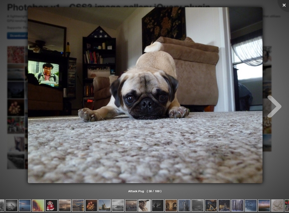
Photobox is a CSS3 Image Gallery JQuery Plugin. It is beautiful and posses a great look & feel. Both the script & CSS are only 7k each. It uses silky-smooth, hardware accelerated, CSS3 transitions and animations for better performance.
It works also on IE9 and above, but clearly not as nice as in normal browsers. Image can be zoomed in and out with mousewheel and navigated using mousemove to move around. The bottom row of thumbnails can be navigated by mouse movment. It supports keyboard keys for navigation and closing the gallery view.

Requirements: CSS3
Demo: http://dropthebit.com/demos/photobox/
License: MIT License
In essence responsive design is about adapting a website to best fit the device viewport. We use CSS media queries to build fluid grids and flexible media. Therefore, we can create a canonical web location without fragmentation of content or users. It’s a single codebase to develop and deploy. In theory, it is easy to navigate on any device.
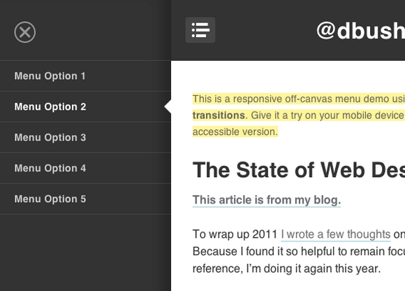
David Bushell has created a responsive off-canvas menu demo using CSS transforms and transitions. You can give it a try on your mobile device. This was purely a technical demo to see the performance of CSS transforms & transitions. Unfortunately, as many have fed back, there are rendering issues that cause flickering in some browsers.

Requirements: –
Demo: http://dbushell.com/demos/viewport/menu1/
License: License Free
Modern browsers like Internet Explorer 10 and 9 introduced sub-pixel font positioning as part of its hardware-accelerated rendering of HTML5 content. That was an important step into the future as it enabled zoom-independent text metrics—an important characteristic when touch gestures like pinch-zoom are part of the browsing experience on Windows 8 touch-enabled devices. This article shows how easy it is to help your fonts look better across many browsers by declaring Standards Mode.
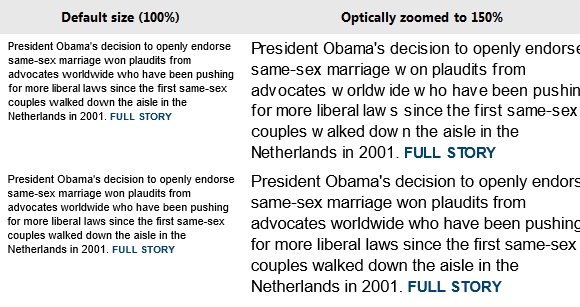
Zoom Example: Legacy vs. Standards Modes
Below are side-by-side comparisons showing text from a popular news site in 8 and 10 document modes at 100% and 150%. Note the especially poor letter spacing between some letters in the 150% 8 mode example (upper right).

Move to Standards Today
The best fix for this behavior is to move your pages Standards Mode. Compat Inspector is a valuable tool to help you migrate to IE9 or IE10 mode. Compat Inspector identifies potential issues and offers steps you can take to resolve them. In general, the HTML, CSS, and JavaScript markup and code you use with other browsers will work great in IE10 once any browser detection is replaced with feature detection and vendor-specific CSS prefixes are updated to include -ms- or unprefixed versions. Modernizr is a JavaScript library that can help with these issues. Read the rest of this entry »
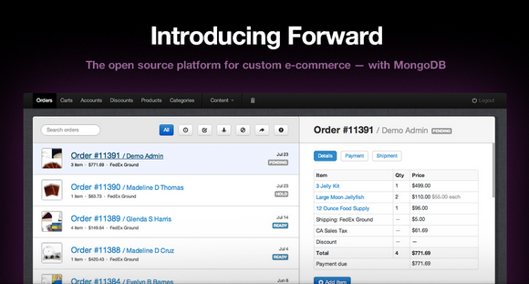
Forward is a full-featured, developer centric e-commerce platform that makes custom code easy, with powerful templates & expressive syntax. Every business needs a custom admin interface to fit its process. Sometimes it’s as simple as adding one more field to the shipment page and packing slip. Not having it leads to expensive workarounds or lost revenue.
It should be easy to build or customize your admin interface. Forward is built exactly the same way you would build a front-end store template, without complex programming. Design is important here too, so it’s developed with Twitter Bootstrap to make things easier. Combined with MongoDB by default, it’s now easier than ever to customize admin screens without complex schemas, or database migrations.
It is scheduled for public release in 2013. The code will be 100% free forever. You can also take a look at other eCommerce Solutions we mentioned some time ago.

Requirements: PHP, MongoDB
Demo: http://getfwd.com/
License: Apache License
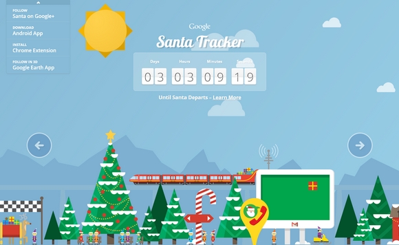
Google Maps Santa Tracker is created and developed by Google, with a little help from Santa’s elves. On Christmas Eve Google will be proudly showcasing a preview of Santa’s dashboard, the technology that powers his sleigh during his around-the-world journey.
Santa’s dashboard is featuring the latest and greatest in Google Maps technology and sleigh engineering, which will allow you to follow his progress around the world, and also learn a little about some of his stops along the way. You can go ahead and explore his village, you might just find some fun activities and meet some interesting elves.
Requirements: –
Demo: http://www.google.com/santatracker/
License: License Free


