Responsive Grid Layout Adapts to Different Screens
Posted · Category: Framework, MIT License
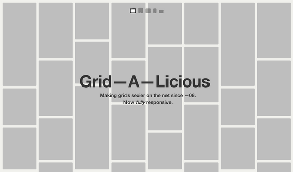
Grid-A-Licious is described as “Divs are placed in chronological order with a special grid”. It is responsive and adapts to different screens. It is fluid and float perfectly regardless of the screen size or device.
Grid-A-Licious 3 is totally rewritten and the biggest change since the previous versions of Grid-A-Licious is that the items in the grid aren’t using absolute positioning any more. They’re all floating. This will help many of you who are struggling with the grid content overlapping each other while loading. Also, this will probably speed up things as well.
Requirements: JavaScript Framework
Demo: http://suprb.com/apps/gridalicious/
License: MIT License
3 Comments


