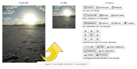
jQuery NailThumb helps you create thumbnails easily from high-res images, without any distortion, with one line of code. You can even decide thumbnail dimensions directly from CSS. Integrates prefectly with any media gallery, even more usefull in dynamic web application when you can face any shape or size.
If you want to add avatars to your application, it’s easier to use this plugin to let them fit any size you need, rather than to develop a functionality that restrict your user to upload avatars of the right size/sizes.

Requirements: jQuery Framework
Demo: http://www.garralab.com/nailthumb.php
License: GPL License
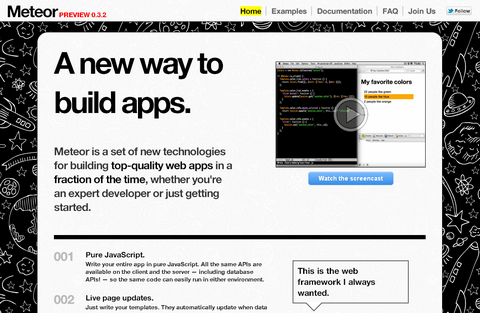
Meteor is a set of new technologies for building top-quality web apps in a fraction of the time, whether you’re an expert developer or just getting started. It is built around Smart Packages: little bundles of code that can run on a client, inside a cloud service, or both, and that can manage their lifetime inside the modern distributed environment.
Meteor provides a Smart Package to address each of the main challenges that developers face in this new world, such as updating a web page automatically when data changes, or performing a “hot code push” to update a running application without users noticing the change.
Developers can freely pick and choose the Smart Packages they would like to use in their app. Meteor then processes the Smart Packages together with their application into a self-contained bundle that is ready to deploy into the cloud.

Requirements: –
Demo: http://www.meteor.com
License: GPL License
WebAppers has been around since 2007, and I really enjoy hunting the best open source resources for web developers every single day. I always felt like WebAppers needs a new design, but I had no time to do it until a month ago.
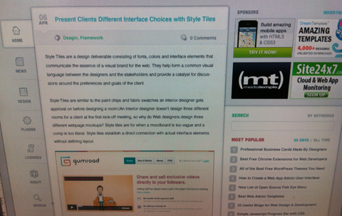
I have been busy working on the new design of WebAppers and I am pretty excited to get to this far. Here is a sneak peek of the new design of WebAppers.
You can Follow us on Twitter and stay tuned for the new design. Thanks again for all of your support. I will keep bringing you the best free resources around the world!

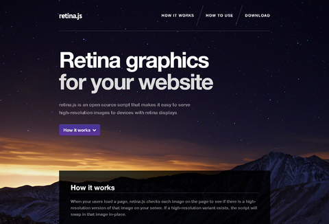
Retina.js is an open source script that makes it easy to serve high-resolution images to devices with retina displays.
When your users load a page, retina.js checks each image on the page to see if there is a high-resolution version of that image on your server. If a high-resolution variant exists, the script will swap in that image in-place.
The script assumes you use Apple’s prescribed high-resolution modifier (@2x) to denote high-resolution image variants on your server.

Requirements: JavaScript Framework
Demo: http://retinajs.com/
License: License Free
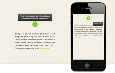
Tooltip is a splendid invention. Small detail in web design that plays a big role when it comes to user experience. Usually, tooltips are used to present a tiny amount of hidden content, that pops up when user moves a cursor over or clicks on a special target.
Osvaldas Valutis built a Responsive and Mobile-Friendly Tooltip using CSS and jQuery. It relies on a maximum width value when viewed on large screens, adopts to narrow environments and picks the best viewable position relatively to the target. It’s mobile-friendly. It pops up when a call-to-action button is tapped and disappears when tapped on the tooltip itself.

Requirements: jQuery Framework
Demo: http://osvaldas.info/blog/elegant-css-and-jquery-tooltip…
License: License Free
jPages is a client-side pagination plugin but it gives you a lot more features comparing to most of the other plugins for this purpose, such as auto page turn, key and scroll browse, showing items with delay, completely customizable navigation panel and also integration with Animate.css and Lazy Load.
With jPages you can create as many navigation panels as you want and you can choose exactly where to place them. The plugin is unobtrusive and it won’t apply any extra styles to the items you are paginating. And it is compatible with All Browsers and IE7+.

Requirements: jQuery Framework
Demo: http://luis-almeida.github.com/jPages/
License: MIT License
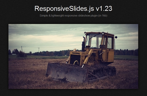
ResponsiveSlides.js is a tiny jQuery plugin that creates a responsive slideshow using images inside <ul>. It works with wide range of browsers including all IE versions from IE6 and up. It also adds css max-width support for IE6 and other browsers that don’t natively support it. Only dependency is jQuery (1.4 and up supported) and that all the images are same size.
Biggest difference to other responsive slideshow plugins is the file size (985 bytes minified and gzipped) + that this one doesn’t try to do everything. ResponsiveSlides.js has basically only two different modes: Either it just automatically fades the images, or operates as a responsive image container with pagination and/or navigation to fade between slides.

Requirements: jQuery Framework
Demo: http://responsive-slides.viljamis.com/
License: MIT License
Paperfold CSS takes a dom element, slices it into parts and arranges them like a folded paper in 3d space. It was a proposal for a visual folding-effect for hidden comments. It works best on Chrome and Safari. In Firefox there are still gaps in the folds (probably because of rounding). It is built using JavaScript, HTML5, CSS3, and released under Creative Commons License.

Requirements: –
Demo: https://developer.mozilla.org/en-US/demos/detail/paperfold-css…
License: Creative Commons License
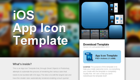
iOS App Icon Template is an App Icon Template that, through Smart Objects in Photoshop, attempts to automate the process of rendering the various sizes that needs to be bundled with iOS Apps.The idea is to edit the largest size and have the smaller sizes automatically rendered enabling a much quicker workflow when designing icons. You’ll also find a selection of ready-made textures that you can build on and easy export actions that spit out the exact files you need to deliver to Apple.
You’ll need Photoshop CS2 or later. Open the PSD file in Photoshop. Find and right click the layer called ‘EDIT THIS SMART OBJECT’ and hit ‘Edit Contents’. This opens the Icon.psb file – create your artwork in this canvas. After saving the Icon.psb, the multiple sizes in the Main PSD file should be automatically rendered. Use the Photoshop Actions bundled with the resource to export your icon files in both squared and rounded corner versions.
Requirements: Photoshop
Demo: http://appicontemplate.com/
License: License Free
Style Tiles are a design deliverable consisting of fonts, colors and interface elements that communicate the essence of a visual brand for the web. They help form a common visual language between the designers and the stakeholders and provide a catalyst for discussions around the preferences and goals of the client.
Style Tiles are similar to the paint chips and fabric swatches an interior designer gets approval on before designing a room.
An interior designer doesn’t design three different rooms for a client at the first kick-off meeting, so why do Web designers design three different webpage mockups? Style tiles are for when a moodboard is too vague and a comp is too literal. Style tiles establish a direct connection with actual interface elements without defining layout.

Requirements: –
Demo: http://styletil.es/
License: Creative Commons License


