How to Mobilize Atari Arcade in HTML5
This article recently appeared on the Atari Arcade Developer Center, a collaboration by the teams at gskinner.com , Atari and Internet Explorer.

Choosing a Target
By limiting to desktops and tablets in the first release, we narrowed our scope considerably, and were able to provide a semi-responsive layout with a single game size. Our reach included most standard resolution monitors, plus tablet form-factors like Surface and iPad.
But we quickly learned that we were missing something by not targeting the huge number of users on mobile devices. That is, a vast market that now accounts for about 12% of all global internet traffic, spanning all kinds of dimensions, resolutions, and processors. Our next task was identifying an approach to bring the arcade to the mobile web. We wanted to support a variety of resolutions, including higher DPIs in new devices like Windows Phone 8 and iPhone 5.
This article discusses the goals to mobilize the arcade, as well as some approaches, the issues we encountered, and some tips and tricks where we found value.
Taking Aim
We spent a good deal of time determining what was possible on different platforms to establish a feature set that was appropriate for mobile.
Our goal was to build a site that:
- Could re-use the majority of the site framework we had already built
- Scaled fabulously on any resolution
- Performed awesomely on newer devices
- Was intuitive to navigate with touch
- Could include some of our games at launch, and all of our games shortly after
- Could be extended to third party developers!
With this game plan, we set upon re-architecting the front-end of the site, and making the games elastic to support the resolutions we needed.
What Works?
The first task: eliminate platforms that just won’t work. With the wide array of platforms and models of phones, we did some focused testing on the following points:
- Technology. Some devices don’t have adequate canvas, JavaScript, CSS, or HTML support.
- Touch capabilities. All of the games are already touch-enabled, so we eliminated any candidates with only single-input touch support.
- Adequate resolution. Older browsers tack on a ton of browser chrome on mobile devices, and we needed enough real estate for our games to look great and display touch controls when required.
- Performance. Once it looked right, and functioned properly, we focussed on performance and monitored frame rates.
We tested a number of devices – the primary targets being Microsoft’s Windows 8 devices (to highlight the technical capabilities of the platform), and iPhones (to reach the widest market). We also tested on a number of Android phones to see what we could support.
The results were surprising. Not all phones are created equally, but the arcade ran quite well on almost everything we tested with.
- We got incredible performance on Windows Phone 8. It had the highest frame-rates, the site rendered as expected, and the multi-touch worked great. Unfortunately, we could only get our hands on a WVGA device (800×480) for launch, but we expect the WXGA and 720p devices will have no problems.
- The site and games performed great on the new iPhones, but it was clear from the start that Mobile Safari’s chrome consumed too much real estate. In order to support iOS5 in mobile Safari, the arcade needs to be pinned to the home screen to run in fullscreen. We then discovered that iOS5 and below have no hardware support in pinned site mode, so although we can support it, not all games perform well.
- We got mixed results on various Android devices we tested, including phones as well as a Nexus 7 tablet. The site and games mostly performed, but due to our short timeline, and the wide range of Android devices, we decided to focus on the other platforms first.
Interestingly, none of the devices had any trouble with loading and displaying our games, except for a hiccup with audio. We were impressed to see such consistent support across various mobile browsers.
Adapting to Surroundings
With the tech dust settled, we began the site redesign.
To hit our target devices in a single production cycle, we incorporated responsive and adaptive approaches that react to mobile visitors, and loads a scalable, flexible, percentage-based version of the arcade. It keeps everything contained in the viewport regardless of size or landscape aspect ratio. No media queries are required.
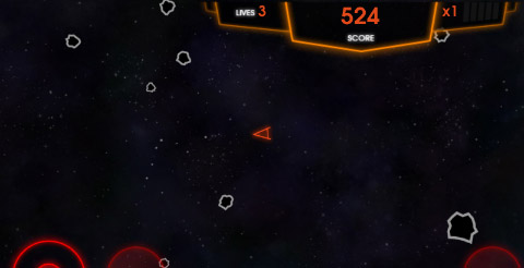
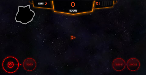
Check out the following comparisons of Windows Phone 8 (left) and iPhone (right):


We kept as much consistency in the DOM between the desktop and mobile site as possible. This let us use most of our existing site HTML and CSS structure – both of which required relatively minor edits to support the new views. We implemented a swipe-based mobile navigation which allowed us to push our artwork to the forefront, and make it easier and faster for fingers to get into the games.
The Arcade now responds to the user agent, and serves the fixed-size desktop version, the adaptive mobile version, or appropriate messaging for unsupported browsers and devices.
Initial Findings
To have the best possible gaming experience in a mobile browser, we had to get full screen, or at least as close as possible.
Windows Phone works great.
WP8 is almost there: it has a persistent browser bar at the bottom of the screen in both landscape and portrait modes (which can be easy to accidently touch), but more than enough screen real estate for an immersive in-browser gaming experience.
iOS 6 has full screen.
It works pretty well, but has some interesting issues. The full screen mode is really easy to toggle out of, and navigation buttons overlay the bottom area which can even scroll the screen if touched right. Worth noting is that full screen in Mobile Safari is a landscape-only feature, which worked out just fine for us.
iOS 5 falls back.
iOS5 gets close to full screen by virtue of a ‘pinned site’ on the users home screen. Without this workaround, Mobile Safari chrome reduces the viewport height by close to 50%. But beware: pinned sites do not get hardware support on iOS5. Some content will run poorly.
Native scroll and zoom
Mobile browsers natively include intuitive page scroll, over-scroll, and zoom. This is great for viewing web pages – but not games. Fortunately, we can block it almost entirely. This approach does not work in Windows Phone 7, which is another reason we chose not to support it. To block the native zoom, we use these meta tags:
<!-- Define the viewport -->
<meta name="viewport" content="width=device-width, initial-scale=1, minimum-scale=1, maximum-scale=1, user-scalable=0, target-densitydpi=device-dpi">

<!-- iOS helper -->
<meta name="apple-mobile-web-app-capable" content="yes" />
To prevent scrolling, we include this simple JavaScript:
document.addEventListener(
    "touchstart",
    function() { return false; },
    false
);
Adaptive Liquid Layouts
In our first release, we chose a single resolution to make game development straightforward, and settled on dimensions that worked on most displays and would still fit into the viewport on a Surface or iPad.
For mobile, we had to re-think our approach and come up with ways to make the games look as good on a small screen as they do on a large one. We couldn’t just scale the games, or simply float our assets in a liquid layout. We needed a hybrid approach, where our games both flex and scale.
Making it Fit
The first step was scaling the canvas. This provided a unique challenge, because mobile devices with higher pixels per inch (such as Windows Phone and iPhone 4+) automatically scale content to make it more readable. Through a series of tests we determined that:
- Windows Phone 7 and 8 (only tested on WVGA at the time of writing) scale content to 1.666x. Read more
here, and here - iPhone scales content to 2x. This can be determined by checking the CSS property window.devicePixelRatio, which is the number of actual pixels, divided by the number of device pixels or “dipsâ€.
This means that we have to counter-scale our content in order to fit it properly on each device. To do this, we multiplied the dimensions on most HTML elements (such as the container iframe) by the inverse of the scale factor(0.6 for WP, and the 1/window.devicePixelRatio for iPhone). Read more about devicePixelRatio.
var factor = 1;
if (iOS) {
    // devicePixelRatio evaluates to "2" on iPhone 4+
    factor = 1 / window.devicePixelRatio;
} else if (wp7 || wp8) {
    factor = 0.6;
}

var frame = document.createElement("iframe");
frame.width = 1024 * factor;
frame.height = 622 * factor;
On our game canvas however, we want to see the pixels instead of scaling our game down, and having the device double it up. So we used CSS scaling instead. When you change the dimensions of an HTML Canvas via CSS, the contents are scaled, rather than just changing the viewport size and relying on the browser to recalculate. This gives us almost exactly a 1/1 pixel ratio on the screen, which looks great on a small, high resolution device.
var factor = 1;
if (iOS) {
    // devicePixelRatio evaluates to "2" on iPhone 4+
    factor = 1 / window.devicePixelRatio;
} else if (wp7 || wp8) {
    factor = 0.6;
}

var canvas = document.createElement("canvas");
canvas.style.width = canvas.width * factor;
canvas.style.height = canvas.height * factor;
The resulting (unscaled) game size is passed into the game in the GameInfo class, and the game can render everything as usual.
// In game code
function startGame() {
    var btn = new createjs.Shape(btnGraphics);
    // Position on the bottom right
    btn.x = this.gameInfo.width - btn.width - 10;
    btn.y = this.gameInfo.height - btn.height - 10;
}
Reflowing the Games
With our new viewport set up, we were still left with a few challenges:
1. Content alignment
Since the games were developed with a single use-case in mind, when the canvas changes size, the positioning of assets needs adjusting.
Most of the time UI and game elements were already anchored to an edge or centered, but not always. It reminded us that we should be using edge alignment or percentage-based positioning wherever possible from the onset.

2. Content scaling
Some reflowing wasn’t so simple. In Super Breakout, brick sprites were designed to fit exactly 13 columns in the standard viewport size. To support a smaller screen, we started by scaling everything down. Fortunately, the bitmaps rendered just fine at a smaller size, but on a small screen we were left with 13 incredibly small bricks.
This encouraged us to include a straightforward method in the developer SDK that determined what sort of resolution we were dealing with, so that content can adapt. Rather than provide something like a DPI, we opted for a simple mode: Low, Normal, and High resolution. This property is now exposed in the helpful GameInfo class of the Atari Arcade SDK.
// On a tiny device, scale down
if (gameInfo.quality == GameLibs.GameInfo.QUALITY_LOW) {
    myBtn.scaleX = myBtn.scaleY = 0.5;

// On a high-resolution device, scale up
} else if (gameInfo.quality == GameLibs.GameInfo.QUALITY_HIGH) {
    myBtn.scaleX = myBtn.scaleY = 1;
}
When games are on higher-resolution devices, images and UI elements are scaled up. In an extreme example, WXGA and 720p Windows Phones have almost double the resolution as their WVGA counterparts – so we can almost double the sprite size to have a comparable game.
In the new mobile version, we include only 10 columns, and the assets scale to fit the available space. Fortunately, EaselJS makes scaling intelligent and simple. You can scale individual assets, containers with multiple children, or even provide alternate image sources to swap out with in high resolution environments.
function startGame() {
    // In high-resolution, scale the entire HUD
    if (this.gameInfo.quality == GameLibs.GameInfo.QUALITY_HIGH) {
        this.gameHud.scaleX = this.gameHud.scaleY = 0.6;
    }
}
On-screen Controls
When changing form factors, there’s always a risk that certain aspects won’t translate well.
One of our key concerns when we conceived our plan was the player’s hands. On a device like the Surface, only a small portion of the lower corners are obscured by the user’s hands when in touch mode. On a phone-sized device, that area grows considerably.
We can’t just scale down UI controls with the rest of the game – we need them large enough to give the user enough control. Our initial plan was to only roll out 3 games, the ones not requiring UI controls: Super Breakout, Pong, and Missile Command. However after some quick tests, we were convinced that Asteroids would work too.
And it did! Controls needed to be scaled down about 60%, but the game is still playable and fun.

We hope to be able to provide the rest of the arcade and any new games submitted by developers, in the mobile site soon.
More and More Testing
Device testing can be a pain. Simulators can get you halfway there, but there is no replacement for an actual device to test with. We have a formidable cache of devices that we use on a regular basis.

But there is lots of cool things you can do to make debugging and testing easier:
- Compat testing in IE10 provides great testing of previous IE versions without an antiquated test machine.
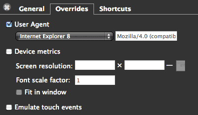
- Device spoofing in browsers allows a way to test user-agents and viewport sizes. Chrome and Safari have great
tools for this.

- To test responsive interfaces, simply scale your browser window.
- Remote debugging with Wienre provides awesome DOM inspection.
- Remote debugging with iOS6 and Lion provides full web inspection just by plugging in your device. Simply enable the inspector in the iOS Safari preferences, and access it via the Safari ‘developer’ menu on the desktop.
- iOS 5 users still have a rudimentary console, which can be turned on in the iOS Safari preferences.
- Run a webserver like MAMP or XAMPP, and devices can access the development version over an internal network.
- The new Test Harness HTML page that is included in the Atari Arcade SDK includes some options for spoofing mobile resolutions and touch interactions in the games. Have at ‘er!
Addressing Performance
As part of this project, we spent some quality time with Microsoft engineers and evangelists, which was incredibly insightful. Not only did we gain some awesome respect for the amazing team at Microsoft, but we learned some invaluable tips, tricks, and best practices that we have rolled into the Atari site, the Atari Arcade SDK, and the next versions of the CreateJS suite.
Most of us develop on blazing fast quad (or more) core machines, with awesome GPUs and more horsepower than we need. For this phase of the Arcade, we had to take a hard look at performance, and ensure that the arcade could move forward onto lower powered devices, including the just-released ARM-based Microsoft Surface.
Here are some bite-sized tips we took away:
- Leave the DOM alone. JavaScript -> DOM communication is expensive. Even things like adding/removing audio from the DOM caused huge performance hits.
- Reduce complexity and nesting in your DOM.
- Learn to use CSS transforms instead of positioning properties like top and left. CSS transforms are hardware accelerated, and super fast. Position changes via CSS are really slow. Note that many browsers still use a prefixed transform, so the approach is more complex – but the result is worth it!
// Old way
div.style.top = "100px";

// New way
var props = ["transform", "msTransform", "webkitTransform", "oTransform", "mozTransform"];
var found = false;
for (var i=0; i < props.length; i++) {
    if (props[i] in div.styles) {
        div.styles[props[i]] = "translateY(100px)";
        found = true;
        break;
    }
}
if (!found) {
    div.style.top = "100px";
}
Fun fact: IE10 has both prefixed and unprefixed transforms, so you will only want to apply one of them if you are looking for an extra boost in performance.
- Use CSS classes on elements instead of injecting javascript to manipulate styles.
- Pixel access on Canvas is expensive, since it needs to reach into the video buffer. Avoid it when possible. For this reason, EaselJS does not track mouseOver gestures unless you explicitly turn them on:
// Create a stage
var stage = new createjs.Stage(canvasElement);

// Enable the mouseOver with a frequency
// whic is the maximum number of checks per second.
stage.enableMouseOver(10);
- Touch events are really expensive. Avoid complex actions that result from touch input, and instead cache touch coordinates, and perform actions on the game tick, or using some form of invalidation.
And always, always test directly on target machines. Many of the above tips are indistinguishable on the desktop, or when simulated from the desktop. Once it's in your hands on a device, you'll really feel the changes.
What's Next?
Atari hopes to open the door shortly to developers that want to build mobile games using the Atari Arcade SDK that can be submitted to the arcade. With this latest release of the SDK, all the the necessary hooks, methods, and testing environment are available to start building and testing mobile games today. Hopefully, the submission process will extend to mobile in the near future.
So check out the resources below, clone the Atari Arcade GitHub repository, and have fun!
Resources
Pick up these awesome books. They are a few years old, but are incredibly helpful, and are required reading at gskinner.com for all developers and designers working with HTML.
Here's some additional resources and references for game development in HTML5.
- CreateJS
Learn more about CreateJS
Community Forum and Feedback
CreateJS on GitHub - More HTML5 and Flash goodness on gskinner.com and the gBlog
- 50 performance tricks from Microsoft //Build/ 2012
- Internet Explorer 10 Guide for Developers
- HTML5 Labs
- W3C
- Removing legacy IE Markup with Compat Inspector
- Feature Detection for HTML5
- IE Blog
- MSDN IE DevCenter
- IETestDrive
- Windows 8 / Internet Explorer 10 : Touch Friendly
- Windows 8 / Internet Explorer 10 : Plug-in Free
- Windows 8 / Internet Explorer 10 : Pinning Sites
About the Authors
Lanny McNie, Michael Graves, and Chris Caldwell are the senior staff of gskinner.com, an agency focused on building bleeding edge interactive and creative, and bringing value to platform owners, developers, and end users alike. We produce success stories that showcase and enhance technology platforms. We recently worked with Atari to bring re-imagine the Atari Arcade using webstandards like HTML5, CSS3, and websockets.


