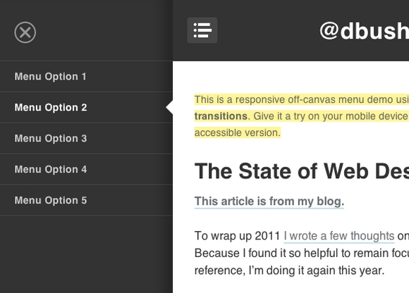
A Responsive Off-Canvas Menu using CSS Transforms
In essence responsive design is about adapting a website to best fit the device viewport. We use CSS media queries to build fluid grids and flexible media. Therefore, we can create a canonical web location without fragmentation of content or users. It’s a single codebase to develop and deploy. In theory, it is easy to navigate on any device.
David Bushell has created a responsive off-canvas menu demo using CSS transforms and transitions. You can give it a try on your mobile device. This was purely a technical demo to see the performance of CSS transforms & transitions. Unfortunately, as many have fed back, there are rendering issues that cause flickering in some browsers.
Requirements: –
Demo: http://dbushell.com/demos/viewport/menu1/
License: License Free


